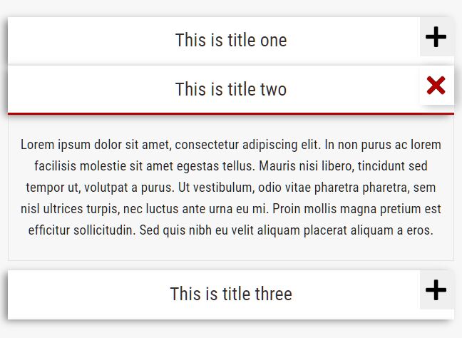
Accessible Smooth jQuery Toggle Panel & Accordion Plugin
| File Size: | 9.94 KB |
|---|---|
| Views Total: | 4090 |
| Last Update: | |
| Publish Date: | |
| Official Website: | Go to website |
| License: | MIT |
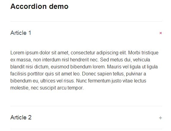
A lightweight jQuery & CSS3 based accordion plugin to create accessible, smooth toggle panels following the WAI-ARIA Design patterns.
Key features:
- Responsive design for any devices.
- Easy keyboard navigation.
- Super smooth sliding effects based on CSS3 transitions.
- If JS is inactive, content will be unstyled and displayed.
How to use it:
1. The markup structure to create toggle panels and an accordion.
<!-- Accordion -->

<div class="accordion">
  <h3 class="panel-title">Article 1</h3>
  <div class="panel-content">
    <p>Content goes here</p>
  </div>
  <h3 class="panel-title">Article 2</h3>
  <div class="panel-content">
    <p>Content goes here</p>
  </div>
</div>

<!-- Toggle panels -->

<h3 class="panel-title">Article 1</h3>
<div class="panel-content">
  <p>Content goes here</p>
</div>
<h3 class="panel-title">Article 2</h3>
<div class="panel-content">
  <p>Content goes here</p>
</div>
2. The required CSS/CSS3 rules for the accordion/toggle panels.
.js .panel-title {
  margin: 0;
}
.panel-title a {
  border-bottom: none;
  color: #292929;
  display: block;
  padding: 1.25em 0;
  position: relative;
  text-decoration: none;
  -webkit-transition: color 200ms ease 0s;
  -moz-transition: color 200ms ease 0s;
  transition: color 200ms ease 0s;
  width: 100%;
}
.panel-title a .icon {
  color: #9e9e9e;
  position: absolute;
  right: 0;
  -webkit-transition: all 200ms ease 0s;
  -moz-transition: all 200ms ease 0s;
  transition: all 200ms ease 0s;
}
.panel-title a:hover,
.panel-title a:focus {
  color: #37474f;
}
.panel-title a:hover .icon,
.panel-title a:focus .icon {
  color: #ec407a;
}
.panel-title a.active {
  color: #37474f;
}
.panel-title a.active .icon {
  color: #ec407a;
  -webkit-transform: rotate(45deg);
  -moz-transform: rotate(45deg);
  transform: rotate(45deg);
}
.js .accordion {
  border-bottom: 1px solid #ececec;
  margin: 2em 0;
}
.accordion .panel-title a {
  border-top: 1px solid #ececec;
}
[id^="panel-"] {
  padding-bottom: 2em;
}
3. Include the jQuery library at the end of the document.
<script src="//code.jquery.com/jquery-1.11.1.min.js"></script>
4. Add the following JS snippets into your JS file to enable the accordion/toggle panels.
$( '.panel-content' ).hide();

( '.accordion' ).attr({
role: 'tablist',
multiselectable: 'true'
 });

$( '.panel-content' ).attr( 'id', function( IDcount ) {
return 'panel-' + IDcount;
});
$( '.panel-content' ).attr( 'aria-labelledby', function( IDcount ) {
return 'control-panel-' + IDcount;
});
$( '.panel-content' ).attr( 'aria-hidden' , 'true' );

$( '.accordion .panel-content' ).attr( 'role' , 'tabpanel' );

$( '.panel-title' ).each(function(i){

$target = $(this).next( '.panel-content' )[0].id;

$link = $( '<a>', {
'href': '#' + $target,
'aria-expanded': 'false',
'aria-controls': $target,
'id' : 'control-' + $target
});

$(this).wrapInner($link);

});

$( '.panel-title a' ).append('<span class="icon">+</span>');

$( '.panel-title a' ).click(function() {

if ($(this).attr( 'aria-expanded' ) == 'false'){ //If aria expanded is false then it's not opened and we want it opened !

$(this).parents( '.accordion' ).find( '[aria-expanded=true]' ).attr( 'aria-expanded' , false ).removeClass( 'active' ).parent().next( '.panel-content' ).slideUp(200).attr( 'aria-hidden' , 'true');

$(this).attr( 'aria-expanded' , true ).addClass( 'active' ).parent().next( '.panel-content' ).slideDown(200).attr( 'aria-hidden' , 'false');

} else { // The current panel is opened and we want to close it

$(this).attr( 'aria-expanded' , false ).removeClass( 'active' ).parent().next( '.panel-content' ).slideUp(200).attr( 'aria-hidden' , 'true');;

}

return false;
});
This awesome jQuery plugin is developed by Webactually. For more Advanced Usages, please check the demo page or visit the official website.