Create 3D Card Flip Effects On Hover Using jQuery and CSS3
| File Size: | 147 KB |
|---|---|
| Views Total: | 16932 |
| Last Update: | |
| Publish Date: | |
| Official Website: | Go to website |
| License: | MIT |
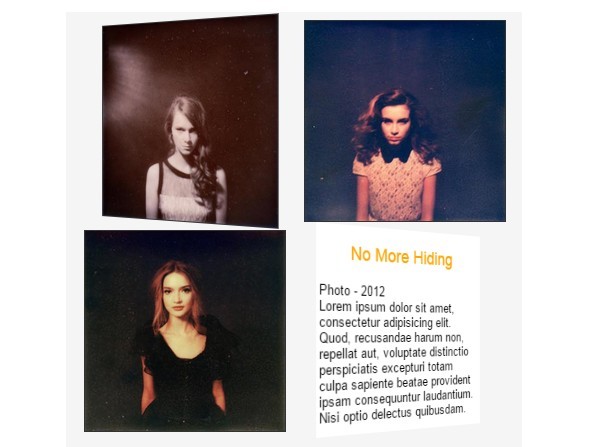
In this post we're going to create a simple image gallery that uses jQuery and CSS3 animations to flip images to display additional content when hovered over. Older browsers (detected with the help of modernizr.js) simply slide the additional content up.
How to use it:
1. Load the necessary jQuery library and modernizr.js in your document.
<script src="//ajax.googleapis.com/ajax/libs/jquery/2.1.3/jquery.min.js"></script>
<script src="//cdnjs.cloudflare.com/ajax/libs/modernizr/2.8.2/modernizr.min.js"></script>
2. Load the jQuery easing plugin for easing effects (optional).
<script src="//cdnjs.cloudflare.com/ajax/libs/jquery-easing/1.3/jquery.easing.min.js"></script>
3. Add an image with additional hover content into the gallery like so:
<div class="artGroup slide">
  <div class="artwork"> <img src="1.jpg">
    <div class="detail">
      <h3>Title</h3>
      <p>Details...</p>
    </div>
  </div>
</div>
4. The basic CSS to style the gallery.
.artGroup {
  display: block;
  width: 200px;
  height: 200px;
  position: relative;
  margin: 0 10px 10px 10px;
  float: left;
}

.artwork {
  display: block;
  width: 100%;
  height: 100%;
}

.artGroup img {
  width: 100%;
  height: 100%;
  position: absolute;
  display: block;
  border: 1px solid #333;
}

.artGroup .detail {
  display: block;
  background: #fff;
  width: 100%;
  height: 100%;
  position: absolute;
}

.artGroup .detail h3 {
  text-align: center;
  color: orange;
}

.artGroup .detail p {
  text-align: left;
  padding: 0 0.25em;
}
5. Create CSS3 powered 3D flip effect on modern browsers.
.artGroup.flip {
  -webkit-perspective: 800px;
  perspective: 800px;
}

.artGroup.flip .artwork {
  -webkit-transition: -webkit-transform 1s ease;
  transition: transform 1s ease;
  -webkit-transform-style: preserve-3d;
  transform-style: preserve-3d;
}

.artGroup.flip .detail,
.artGroup.flip .theFlip {
  -webkit-transform: rotateY(-180deg);
  transform: rotateY(-180deg);
}

.artGroup.flip img,
.artGroup.flip .detail {
  -webkit-backface-visibility: hidden;
  backface-visibility: hidden;
}
6. Create the slide-up effect for old browsers.
.artGroup.slide { overflow: hidden; }

.artGroup.slide .detail { bottom: -364px; }
7. The jQuery script to add/remove CSS classes on mouseEnter and mouseLeave.
$(function () {
if ( $('html').hasClass('csstransforms3d') ) {
  $('.artGroup').removeClass('slide').addClass('flip');
  $('.artGroup.flip').on('mouseenter',
    function () {
      $(this).find('.artwork').addClass('theFlip');
    });
  $('.artGroup.flip').on('mouseleave',
    function () {
      $(this).find('.artwork').removeClass('theFlip');
    });
} else {
  $('.artGroup').on('mouseenter',
    function () {
      $(this).find('.detail').stop().animate({bottom:0}, 500, 'easeOutCubic');
    });
  $('.artGroup').on('mouseleave',
    function () {
      $(this).find('.detail').stop().animate({bottom: ($(this).height() + -1) }, 500, 'easeOutCubic');
    });
}
});
This awesome jQuery plugin is developed by david-pm. For more Advanced Usages, please check the demo page or visit the official website.