Animated Icon Hover Over Effect with CSS3 Transitions
| File Size: | 45.7 KB |
|---|---|
| Views Total: | 36016 |
| Last Update: | |
| Publish Date: | |
| Official Website: | Go to website |
| License: | MIT |
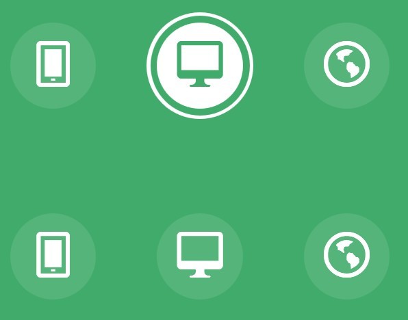
In this post I will share with you some Animated Icon Hover Over Effects created by MARY LOU. With this tutorial, you can add a variety of different hover over effects to the icon font, only using CSS3 transitions and animations.
How to use it:
1. Markup the html
<div class="hi-icon-wrap hi-icon-effect-1 hi-icon-effect-1a">
    <a href="#" class="hi-icon hi-icon-mobile">Mobile</a>
    <a href="#" class="hi-icon hi-icon-screen">Desktop</a>
    <a href="#" class="hi-icon hi-icon-earth">Partners</a>
    <a href="#" class="hi-icon hi-icon-support">Support</a>
    <a href="#" class="hi-icon hi-icon-locked">Security</a>
</div>
2. The CSS
@font-face {
font-family: 'ecoicon';
src: url('../fonts/ecoicons/ecoicon.eot');
src: url('../fonts/ecoicons/ecoicon.eot?#iefix') format('embedded-opentype'),  url('../fonts/ecoicons/ecoicon.woff') format('woff'),  url('../fonts/ecoicons/ecoicon.ttf') format('truetype'),  url('../fonts/ecoicons/ecoicon.svg#ecoicon') format('svg');
font-weight: normal;
font-style: normal;
}
.hi-icon-effect-6 .hi-icon {
box-shadow: 0 0 0 4px rgba(255,255,255,1);
transition: background 0.2s, color 0.2s;
}
.no-touch .hi-icon-effect-6 .hi-icon:hover {
background: rgba(255,255,255,1);
color: #64bb5d;
}
.no-touch .hi-icon-effect-6 .hi-icon:hover:before {
animation: spinAround 2s linear infinite;
}
 @keyframes spinAround {
 from {
 transform: rotate(0deg)
}
to {
transform: rotate(360deg);
}
}
3. Done
This awesome jQuery plugin is developed by codrops. For more Advanced Usages, please check the demo page or visit the official website.
