Gorgeous And Feature Rich Dropdown Select Box Plugin - SelectBoxIt
| File Size: | 452 KB |
|---|---|
| Views Total: | 8344 |
| Last Update: | |
| Publish Date: | |
| Official Website: | Go to website |
| License: | MIT |
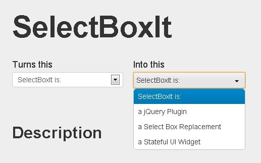
SelectBoxIt is a replacement of ugly and hard to use HTML select boxes that allows you to create gorgeous and feature rich dropdown select Boxes. This plugin can be styled with Twitter Bootstrap, jQueryUI, and jQuery Mobile themes without rewriting any of your existing form validation logic or event handling.
SelectBoxIt supports Desktop, Tablet, and Mobile browsers.
How to use it:
1. Include necessary CSS files in your head section
<link type="text/css" rel="stylesheet" href="http://twitter.github.com/bootstrap/assets/css/bootstrap.css" />
<link type="text/css" rel="stylesheet" href="css/jquery-ui-1.8.23.custom.css" />
<link type="text/css" rel="stylesheet" href="../src/stylesheets/SelectBoxIt/jquery.selectBoxIt-bootstrapbutton.css" />
2. Markup
<form>
<select id="test">
<option value="" disabled>Select a Month</option>
<option value="January">January</option>
<option value="February">February</option>
<option value="March" disabled>March</option>
<option value="April">April</option>
<option value="May" disabled>May</option>
<option value="June">June</option>
<option value="July">July</option>
<option value="August">August</option>
<option value="September">September</option>
<option value="October">October</option>
<option value="November">November</option>
<option value="December">December</option>
</select>
</form>
3. Include jQuery library , jQuery UI and selectBoxIt.js
<script src="http://code.jquery.com/jquery-1.8.2.min.js"></script>
<script src="http://ajax.googleapis.com/ajax/libs/jqueryui/1.9.1/jquery-ui.min.js"></script>
<script src="../src/javascripts/jquery.selectBoxIt.js"></script>
4. Call the plugin
<script>
$(function() {
    window.selectBox = $("#test").selectBoxIt().data("selectBoxIt");

    $('#test1').selectBoxIt({theme: "jqueryui"}).data("selectBoxIt");

});
</script>
5. All default plugin options.
// **showEffect**: Accepts String: "none", "fadeIn", "show", "slideDown", or any of the jQueryUI show effects (i.e. "bounce")
"showEffect": "none",

// **showEffectOptions**: Accepts an object literal.  All of the available properties are based on the jqueryUI effect options
"showEffectOptions": {},

// **showEffectSpeed**: Accepts Number (milliseconds) or String: "slow", "medium", or "fast"
"showEffectSpeed": "medium",

// **hideEffect**: Accepts String: "none", "fadeOut", "hide", "slideUp", or any of the jQueryUI hide effects (i.e. "explode")
"hideEffect": "none",

// **hideEffectOptions**: Accepts an object literal.  All of the available properties are based on the jqueryUI effect options
"hideEffectOptions": {},

// **hideEffectSpeed**: Accepts Number (milliseconds) or String: "slow", "medium", or "fast"
"hideEffectSpeed": "medium",

// **showFirstOption**: Shows the first dropdown list option within the dropdown list options list
"showFirstOption": true,

// **defaultText**: Overrides the text used by the dropdown list selected option to allow a user to specify custom text.  Accepts a String.
"defaultText": "",

// **defaultIcon**: Overrides the icon used by the dropdown list selected option to allow a user to specify a custom icon.  Accepts a String (CSS class name(s)).
"defaultIcon": "",

// **downArrowIcon**: Overrides the default down arrow used by the dropdown list to allow a user to specify a custom image.  Accepts a String (CSS class name(s)).
"downArrowIcon": "",

// **theme**: Provides theming support for Twitter Bootstrap and jQueryUI
"theme": "default",

// **keydownOpen**: Opens the dropdown if the up or down key is pressed when the dropdown is focused
"keydownOpen": true,

// **isMobile**: Function to determine if a user's browser is a mobile browser
"isMobile": function() {

  // Adapted from http://www.detectmobilebrowsers.com
  var ua = navigator.userAgent || navigator.vendor || window.opera;

  // Checks for iOs, Android, Blackberry, Opera Mini, and Windows mobile devices
  return (/iPhone|iPod|iPad|Silk|Android|BlackBerry|Opera Mini|IEMobile/).test(ua);

},

// **native**: Triggers the native select box when a user interacts with the drop down
"native": false,

// **aggressiveChange**: Will select a drop down item (and trigger a change event) when a user navigates to the item via the keyboard (up and down arrow or search), before a user selects an option with a click or the enter key
"aggressiveChange": false,

// **selectWhenHidden: Will allow a user to select an option using the keyboard when the drop down list is hidden and focused
"selectWhenHidden": true,

// **viewport**: Allows for a custom domnode used for the viewport. Accepts a selector.  Default is $(window).
"viewport": $(window),

// **similarSearch**: Optimizes the search for lists with many similar values (i.e. State lists) by making it easier to navigate through
"similarSearch": false,

// **copyAttributes**: HTML attributes that will be copied over to the new drop down
"copyAttributes": [

  "title",

  "rel"

],

// **dontCopyAttributes: HTML attributes to explicitly blacklist from being copied to the new dropdown
"dontCopyAttributes": [

  "data-reactid"

],

// **copyClasses**: HTML classes that will be copied over to the new drop down.  The value indicates where the classes should be copied.  The default value is 'button', but you can also use 'container' (recommended) or 'none'.
"copyClasses": "button",

// **nativeMousedown**: Mimics native firefox drop down behavior by opening the drop down on mousedown and selecting the currently hovered drop down option on mouseup
"nativeMousedown": false,

// **customShowHideEvent**: Prevents the drop down from opening on click or mousedown, which allows a user to open/close the drop down with a custom event handler.
"customShowHideEvent": false,

// **autoWidth**: Makes sure the width of the drop down is wide enough to fit all of the drop down options
"autoWidth": true,

// **html**: Determines whether or not option text is rendered as html or as text
"html": true,

// **populate**: Convenience option that accepts JSON data, an array, a single object, or valid HTML string to add options to the drop down list
"populate": "",

// **dynamicPositioning**: Determines whether or not the drop down list should fit inside it's viewport
"dynamicPositioning": true,

// **hideCurrent**: Determines whether or not the currently selected drop down option is hidden in the list
"hideCurrent": false,

// **numSearchCharacters**: Option for how many characters a user must search to be treated as a full string search
"numSearchCharacters": "auto"
Change log:
v3.8.2 (2017-12-07)
- Add a value attribute to the original select box if there is not one already there.
v3.8.1 (2013-12-04)
- Add a value attribute to the original select box if there is not one already there.
- Demo page update.
This awesome jQuery plugin is developed by gfranko. For more Advanced Usages, please check the demo page or visit the official website.