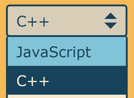
HTML List Based Multiple Select Plugin with jQuery - Rekaf
| File Size: | 111 KB |
|---|---|
| Views Total: | 2387 |
| Last Update: | |
| Publish Date: | |
| Official Website: | Go to website |
| License: | MIT |
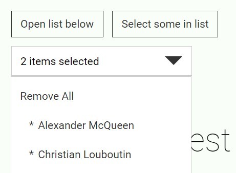
Rekaf is lightweight, flexible jQuery plugin which transforms a list of checkboxes / radio buttons / plain text into a styleable select dropdown widget with support for multiple select.
Basic usage:
1. Include the jQuery Rekaf plugin after jQuery JavaScript library, before the closing body tag.
<script src="//code.jquery.com/jquery-1.11.3.min.js"></script>
<script src="js/rekaf.js"></script>
2. Add the primary CSS styles into your CSS file.
.multi-select {
  width: 23.07692%;
  display: inline-block;
  vertical-align: top;
  margin-right: 20px
}

.fake-select {
  height: 33px;
  line-height: 33px;
  background-color: #fff;
  border: 1px solid #ccc
}

.fake-select:after {
  content: "";
  border: 10px solid transparent;
  border-top-color: #333;
  position: absolute;
  z-index: 10;
  right: 10px;
  top: 50%;
  margin-top: -5px
}

.fake-select>.title {
  padding: 0 10px;
  position: relative;
  z-index: 11
}

.fake-select ul {
  background-color: #fff;
  width: 100%;
  border: 1px solid #ccc;
  padding: 5px 0;
  left: -1px;
  top: 33px
}

.fake-select li { padding: 0 10px }

.fake-select li.selected a {
  padding-left: 20px;
  position: relative
}

.fake-select li.selected a:before {
  content: "*";
  position: absolute;
  left: 10px
}

.fake-select a:hover { color: #000 }

.fake-select input[type=radio] { margin-right: 10px }

.fake-select {
  position: relative;
  cursor: pointer;
  text-align: left;
  -webkit-box-sizing: border-box;
  -moz-box-sizing: border-box;
  box-sizing: border-box
}

.fake-select>.title {
  display: block;
  text-overflow: ellipsis;
  overflow: hidden;
  white-space: nowrap;
  -webkit-user-select: none;
  -moz-user-select: none;
  -ms-user-select: none;
  user-select: none
}

.fake-select a, .fake-select label { display: block }

.fake-select .disabled {
  opacity: .3;
  cursor: default
}

.multi-select>.title { white-space: normal }

.fake-select-list {
  position: absolute;
  display: none;
  left: 0;
  list-style: none;
  margin: 0;
  padding: 0;
  background-color: #fff;
  width: 100%
}

.no-js .fake-select:hover .fake-select-list { display: block }
3. Initialize the plugin.
$('SELECTOR').rekaf();
4. Create an html list based select box with anchors.
<div class="fake-select single-select toggle-select">
  <span class="title" data-orig-text="Designer">Choose Designer</span>
  <ul class="fake-select-list">
    <li><a href="#">Choose Designer</a></li>
    <li><a href="#">Alexander McQueen</a></li>
    <li><a href="#">Christian Louboutin</a></li>
    <li><a href="#">Jimmy Choo</a></li>
    <li><a href="#">Manolo Blahnik</a></li>
  </ul>
</div>
5. Create an html list based select box with radio buttons.
<div class="fake-select single-select input-select"> <span class="title" data-orig-text="Designer">Choose Designer</span>
  <ul class="fake-select-list">
    <li>
      <label for="choose-designer">
        <input id="choose-designer" value="0" type="radio" name="designer">
        Choose Designer</label>
    </li>
    <li>
      <label for="alexander-mcqueen">
        <input id="alexander-mcqueen" disabled="disabled" value="alexander-mcqueen" type="radio" name="designer">
        Alexander McQueen</label>
    </li>
    <li>
      <label for="christian-louboutin">
        <input id="christian-louboutin" checked="checked" value="christian-louboutin" type="radio" name="designer">
        Christian Louboutin</label>
    </li>
    <li>
      <label for="jimmy-choo">
        <input id="jimmy-choo" value="jimmy-choo" type="radio" name="designer">
        Jimmy Choo</label>
    </li>
    <li class="selected">
      <label for="manolo-blahnik">
        <input id="manolo-blahnik" value="manolo-blahnik" type="radio" name="designer">
        Manolo Blahnik</label>
    </li>
  </ul>
</div>
6. Customization options.
// CSS z-index property
zIndex: 1500,

// enable multiple select
mulitselect: false,

// using a screen to detect when to close the select.
useScreen: true,

// enable touch listerners
touch: false,

// click to remove selected items
clickRemoveSelected: false,

// CSS class for disabled items
disabledClass: 'disabled',

// CSS class for selected items
selectedClass: 'selected',

// limit the number of titles displayed in the " ... items selected"
multiselectTitleLimit: 4,

// text to display how manu items you selected
multiselectTitleLimitText: ' items selected',

// Delimits text when more than one option is selected in a multiselect dropdown.
delimiter: ', ',

// prevent link events
preventLinks: true,

preventInlineStyles: false,
debug: false
7. Public methods.
// open the select dropdown
$('SELECTOR').rekaf('open');

// update the dropdown values
$('SELECTOR').rekaf('update');

// reset the select dropdown
$('SELECTOR').rekaf('reset');
8. Events.
// triggered when a value is selected
$('SELECTOR').on(rekaf.selected, function(){
  // Do something
})

// triggered when a value is unselected
$('SELECTOR').on(rekaf.unselected, function(){
  // Do something
})

// triggered when a select dropdown is opened
$('SELECTOR').on(rekaf.opened, function(){
  // Do something
})
Change log:
2016-01-07
- Enabled pre select for anchor lists
2015-12-16
- Added a new property to stop position relative being added as an inline style.
2015-10-20
- Improvements to noscreen interaction now closes other lists if open.
2015-10-05
- Fixed opened trigger
This awesome jQuery plugin is developed by youngskilled. For more Advanced Usages, please check the demo page or visit the official website.