Radio Button Based Dropdown Select with jQuery and CSS3 - Dropp
| File Size: | 2.6 KB |
|---|---|
| Views Total: | 25932 |
| Last Update: | |
| Publish Date: | |
| Official Website: | Go to website |
| License: | MIT |
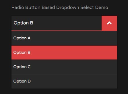
Dropp is a jQuery script that converts a group of radio buttons into a beautiful select like dropdown list using CSS/CSS3 and input label tricks.
How to use it:
1. Create a group of radio buttons with labels for the dropdown select.
<div class="dropp">
  <div class="dropp-header">
    <span class="dropp-header__title js-value">Choose an option</span>
    <a href="#" class="dropp-header__btn js-dropp-action">
      <i class="icon"></i>
    </a>
  </div>
  <div class="dropp-body">
    <label for="optA">Option A
      <input type="radio" id="optA" name="dropp" value="Option A">
    </label>
    <label for="optB">Option B
      <input type="radio" id="optB" name="dropp" value="Option B">
    </label>
    <label for="optC">Option C
      <input type="radio" id="optC" name="dropp" value="Option C">
    </label>
    <label for="optD">Option D
      <input type="radio" id="optD" name="dropp" value="Option D">
    </label>
  </div>
</div>
2. The CSS for the dropdown header.
.icon {
  display: block;
  position: relative;
  width: 1.5em;
  height: 1.5em;
  margin: 0 auto;
}

.icon:before,
.icon:after {
  content: "";
  position: absolute;
}

.dropp {
  width: 100%;
  box-shadow: 0 1px 3px #0a0a0a;
}

.dropp-header {
  background: #242424;
  color: #fff;
  border-bottom: 2px solid #dd4040;
  -webkit-box-align: stretch;
  -moz-box-align: stretch;
  box-align: stretch;
  -webkit-align-items: stretch;
  -moz-align-items: stretch;
  -ms-align-items: stretch;
  -o-align-items: stretch;
  align-items: stretch;
  -ms-flex-align: stretch;
  display: -webkit-box;
  display: -moz-box;
  display: box;
  display: -webkit-flex;
  display: -moz-flex;
  display: -ms-flexbox;
  display: flex;
  -webkit-box-orient: horizontal;
  -moz-box-orient: horizontal;
  box-orient: horizontal;
  -webkit-box-direction: normal;
  -moz-box-direction: normal;
  box-direction: normal;
  -webkit-flex-direction: row;
  -moz-flex-direction: row;
  flex-direction: row;
  -ms-flex-direction: row;
  -webkit-box-pack: start;
  -moz-box-pack: start;
  box-pack: start;
  -webkit-justify-content: flex-start;
  -moz-justify-content: flex-start;
  -ms-justify-content: flex-start;
  -o-justify-content: flex-start;
  justify-content: flex-start;
  -ms-flex-pack: start;
}

.dropp-header__title {
  display: block;
  padding: 0.8em 0.5em;
  -webkit-box-flex: 8;
  -moz-box-flex: 8;
  box-flex: 8;
  -webkit-flex: 8;
  -moz-flex: 8;
  -ms-flex: 8;
  flex: 8;
  display: inline-block;
  max-width: 100%;
  overflow: hidden;
  text-overflow: ellipsis;
  white-space: nowrap;
  word-wrap: normal;
}

.dropp-header__btn {
  display: block;
  background: #1c1c1c;
  color: #fff;
  padding: 0.8em 0.5em;
  -webkit-box-flex: 1;
  -moz-box-flex: 1;
  box-flex: 1;
  -webkit-flex: 1;
  -moz-flex: 1;
  -ms-flex: 1;
  flex: 1;
  -webkit-transition: all 0.3s ease-in-out;
  -moz-transition: all 0.3s ease-in-out;
  transition: all 0.3s ease-in-out;
}

.dropp-header__btn .icon {
  -webkit-transform: rotate(-90deg);
  -moz-transform: rotate(-90deg);
  -ms-transform: rotate(-90deg);
  -o-transform: rotate(-90deg);
  transform: rotate(-90deg);
}

.dropp-header__btn .icon:before,
.dropp-header__btn .icon:after {
  top: 30%;
  left: 25%;
  width: 50%;
  height: 15%;
  background: #dd4040;
  -webkit-transform: rotate(-45deg);
  -moz-transform: rotate(-45deg);
  -ms-transform: rotate(-45deg);
  -o-transform: rotate(-45deg);
  transform: rotate(-45deg);
}

.dropp-header__btn .icon:after {
  top: 55%;
  -webkit-transform: rotate(45deg);
  -moz-transform: rotate(45deg);
  -ms-transform: rotate(45deg);
  -o-transform: rotate(45deg);
  transform: rotate(45deg);
}

.dropp-header__btn.js-open { background: #dd4040; }

.dropp-header__btn.js-open .icon {
  -webkit-transform: rotate(90deg);
  -moz-transform: rotate(90deg);
  -ms-transform: rotate(90deg);
  -o-transform: rotate(90deg);
  transform: rotate(90deg);
}

.dropp-header__btn.js-open .icon:before,
.dropp-header__btn.js-open .icon:after { background: #fff; }

.dropp-header__btn:focus { outline: none; }
3. The CSS for the dropdown body.
.dropp-body {
  overflow: hidden;
  width: 100%;
  max-height: 0;
  background: #292929;
  color: #fff;
  -webkit-transition: all 0.3s ease-in-out;
  -moz-transition: all 0.3s ease-in-out;
  transition: all 0.3s ease-in-out;
}

.dropp-body.js-open { max-height: 20em; }

.dropp-body label {
  display: block;
  font-size: 0.875em;
  color: #fff;
  text-decoration: none;
  padding: 1em 0.5em;
  font-weight: 400;
  box-shadow: 0 -1px 0 #171717, inset 0 1px 0 #313131;
  cursor: pointer;
}

.dropp-body label:first-child { box-shadow: none; }

.dropp-body label:hover,
.dropp-body label.js-open { background: #dd4040; }

.dropp-body label > input { display: none; }
4. Load the latest version of jQuery library at the end of the document.
<script src="//code.jquery.com/jquery-2.1.3.min.js"></script>
5. The jQuery script to enable the dropdown select.
$(document).ready(function() {

  // Default dropdown action to show/hide dropdown content
  $('.js-dropp-action').click(function(e) {
    e.preventDefault();
    $(this).toggleClass('js-open');
    $(this).parent().next('.dropp-body').toggleClass('js-open');
  });

  // Using as fake input select dropdown
  $('label').click(function() {
    $(this).addClass('js-open').siblings().removeClass('js-open');
    $('.dropp-body,.js-dropp-action').removeClass('js-open');
  });
  // get the value of checked input radio and display as dropp title
  $('input[name="dropp"]').change(function() {
    var value = $("input[name='dropp']:checked").val();
    $('.js-value').text(value);
  });

});
This awesome jQuery plugin is developed by syndicatefx. For more Advanced Usages, please check the demo page or visit the official website.