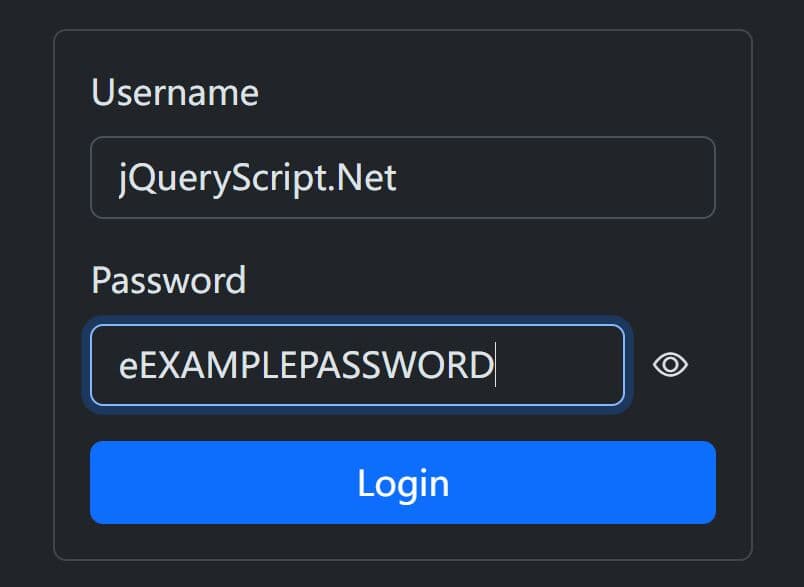
Toggle Password Visibility With jQuery - hideShowPassword
| File Size: | 20.1 KB |
|---|---|
| Views Total: | 32902 |
| Last Update: | |
| Publish Date: | |
| Official Website: | Go to website |
| License: | MIT |
jQuery hideShowPassword is a cross-browser and touch-friendly jQuery plugin that allows your user to toggle password field text visibility on click.
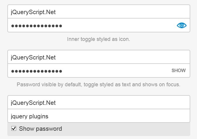
It currently provides 3 ways to toggle your password field visibility:
- Inner toggle styled as icon
- Password visible by default, toggle styled as text and shows on focus
- Checkbox toggles password visibility.
See also:
- jQuery Plugin For Previewing Password Field Values - Prevue
- Simple jQuery Plugin To Show Hidden Password - preventPassTypo
- jQuery Plugin For Windows 8 Password Reveal Feature - Sauron
Basic Usage:
1. Create a password input field
<input class="login-field login-field-password" id="demo" type="password" placeholder="Password">
2. The CSS (Inner toggle styled as icon)
/*
   * Add this if you want to disable IE10's implementation
   * of the winking eye in favor of your own.
   * Alternatively, you could set the 'innerToggle' option to
   * false for that browser only.
   */

::-ms-reveal {
 display:none !important;
}
/*
   * This toggle style shows a winking "eye-con" (nyuk, nyuk).
   * Open eye means "show," closed eye means "hide."
   */
.hideShowPassword-toggle {
background-image: url(img/wink.svg);
background-position: 0 center;
background-repeat: no-repeat;
cursor: pointer;
height: 100%;
overflow: hidden;
text-indent: -9999em;
width: 44px;
}
.hideShowPassword-toggle-hide {
background-position: -44px center;
}
3. Include jQuery library and jQuery hideShowPassword plugin on the web page
<script src="http://ajax.googleapis.com/ajax/libs/jquery/1.10.1/jquery.min.js"></script>
<script src="hideShowPassword.min.js"></script>
4. Call the function on the input.
$('#demo').hideShowPassword({
  innerToggle: true
});
5. All possible options with default values.
// Visibility of the password text. Can be true, false, 'toggle'
// or 'infer'. If 'toggle', it will be the opposite of whatever
// it currently is. If 'infer', it will be based on the input
// type (false if 'password', otherwise true).
show: 'infer',

// Set to true to create an inner toggle for this input. Can
// also be sent to an event name to delay visibility of toggle
// until that event is triggered on the input element.
innerToggle: false,

// If false, the plugin will be disabled entirely. Set to
// the outcome of a test to insure input attributes can be
// set after input has been inserted into the DOM.
enable: canSetInputAttribute,

// Event to trigger whenever the element is toggled.
// For example, if 'focus' it will focus the cursor in the
// input element after toggling.
triggerOnToggle: false,

// Class to add to input element when the plugin is enabled.
className: 'hideShowPassword-field',

// Event to trigger when the plugin is initialized and enabled.
initEvent: 'hideShowPasswordInit',

// Event to trigger whenever the visibility changes.
changeEvent: 'passwordVisibilityChange',

// Properties to add to the input element.
props: {
  autocapitalize: 'off',
  autocomplete: 'off',
  autocorrect: 'off',
  spellcheck: 'false'
},

// Options specific to the inner toggle.
toggle: {
  // The element to create.
  element: '<button type="button">',
  // Class name of element.
  className: 'hideShowPassword-toggle',
  // Whether or not to support touch-specific enhancements.
  // Defaults to the value of Modernizr.touchevents if available,
  // otherwise false.
  touchSupport: (typeof Modernizr === 'undefined') ? false : Modernizr.touchevents,
  // Non-touch event to bind to.
  attachToEvent: 'click.hideShowPassword',
  // Event to bind to when touchSupport is true.
  attachToTouchEvent: 'touchstart.hideShowPassword mousedown.hideShowPassword',
  // Key event to bind to if attachToKeyCodes is an array
  // of at least one keycode.
  attachToKeyEvent: 'keyup',
  // Key codes to bind the toggle event to for accessibility.
  // If false, this feature is disabled entirely.
  // If true, the array of key codes will be determined based
  // on the value of the element option.
  attachToKeyCodes: true,
  // Styles to add to the toggle element. Does not include
  // positioning styles.
  styles: { position: 'absolute' },
  // Styles to add only when touchSupport is true.
  touchStyles: { pointerEvents: 'none' },
  // Where to position the inner toggle relative to the
  // input element. Can be 'right', 'left' or 'infer'. If
  // 'infer', it will be based on the text-direction of the
  // input element.
  position: 'infer',
  // Where to position the inner toggle on the y-axis
  // relative to the input element. Can be 'top', 'bottom'
  // or 'middle'.
  verticalAlign: 'middle',
  // Amount by which to "offset" the toggle from the edge
  // of the input element.
  offset: 0,
  // Attributes to add to the toggle element.
  attr: {
    role: 'button',
    'aria-label': 'Show Password',
    title: 'Show Password',
    tabIndex: 0
  }
},

// Options specific to the wrapper element, created
// when the innerToggle is initialized to help with
// positioning of that element.
wrapper: {
  // The element to create.
  element: '<div>',
  // Class name of element.
  className: 'hideShowPassword-wrapper',
  // If true, the width of the wrapper will be set
  // unless it is already the same width as the inner
  // element. If false, the width will never be set. Any
  // other value will be used as the width.
  enforceWidth: true,
  // Styles to add to the wrapper element. Does not
  // include inherited styles or width if enforceWidth
  // is not false.
  styles: { position: 'relative' },
  // Styles to "inherit" from the input element, allowing
  // the wrapper to avoid disrupting page styles.
  inheritStyles: [
    'display',
    'verticalAlign',
    'marginTop',
    'marginRight',
    'marginBottom',
    'marginLeft'
  ],
  // Styles for the input element when wrapped.
  innerElementStyles: {
    marginTop: 0,
    marginRight: 0,
    marginBottom: 0,
    marginLeft: 0
  }
},

// Options specific to the 'shown' or 'hidden'
// states of the input element.
states: {
  shown: {
    className: 'hideShowPassword-shown',
    changeEvent: 'passwordShown',
    props: { type: 'text' },
    toggle: {
      className: 'hideShowPassword-toggle-hide',
      content: 'Hide',
      attr: {
        'aria-pressed': 'true',
        title: 'Hide Password'
      }
    }
  },
  hidden: {
    className: 'hideShowPassword-hidden',
    changeEvent: 'passwordHidden',
    props: { type: 'password' },
    toggle: {
      className: 'hideShowPassword-toggle-show',
      content: 'Show',
      attr: {
        'aria-pressed': 'false',
        title: 'Show Password'
      }
    }
  }
}
Changelog:
2019-12-28
- JS updated
2017-09-11
- Refactor by defaulting to FALSE and do boolean check to avoid empty event performance
This awesome jQuery plugin is developed by cloudfour. For more Advanced Usages, please check the demo page or visit the official website.