jQuery Plugin For Animated Custom Checkboxes & Radio Buttons - checkBo
| File Size: | 12.6 KB |
|---|---|
| Views Total: | 5945 |
| Last Update: | |
| Publish Date: | |
| Official Website: | Go to website |
| License: | MIT |
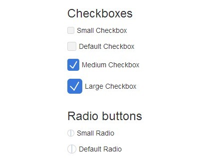
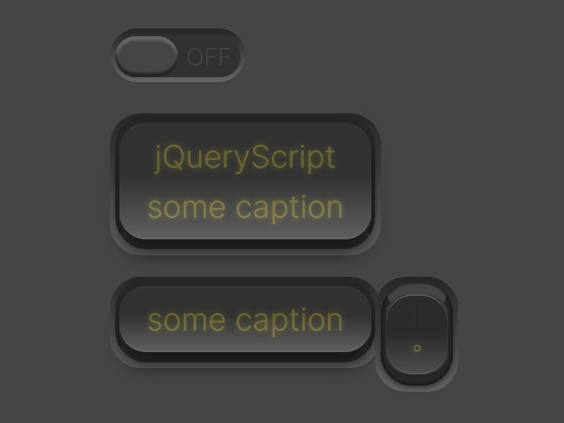
checkBo is a jQuery plugin to create cross-browser & cross-platform checkboxes, radio buttons, and toggle switches with animated check state powered by CSS3.
Advanced features:
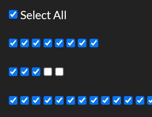
- Allows you to check all checkboxes by one click.
- Allows to toggle any element based on the check state.
- 4 CSS class based size options: Default, Small, Medium, Large.
Basic Usage:
1. Include jQuery library together with checkBo.css and checkBo.js into the document.
<link href="/path/to/checkBo.css" rel="stylesheet">
<script src="/path/to/cdn/jquery.min.js"></script>
<script src="/path/to/checkBo.js"></script>
2. Create custom checkboxes, radio buttons, and toggle switches as follows:
<label class="cb-checkbox">
  <input type="checkbox" />
  Checkbox
</label>

<label class="cb-radio">
  <input type="radio" />
  Radio Button
</label>

<div class="cb-switcher-group">
  <span class="cb-state">OFF</span>
  <div class="cb-switcher">
    <label class="inner-switcher"><input type="checkbox"/></label>
  </div>
  <span class="cb-state">ON</span>
</div>

<div class="cb-switcher">
  <label class="inner-switcher">
    <input type="checkbox" data-state-on="ON" data-state-off="OFF"/>
  </label>
  <span class="cb-state">ON</span>
</div>
3. You can custom the size by adding a CSS helper into your label element:
- cb-sm: small
- cb-md: middle
- cb-lg: large
<label class="cb-checkbox cb-lg">
  <input type="checkbox">
  Checkbox
</label>
3. Call the plugin on the parent element and done.
$(document).ready(function(){
  $('form').checkBo();
});
4. Make a checkbox to check/uncheck all related checkboxes.
<label class="cb-checkbox" id="check-all">
  <input type="checkbox" name="check-all" />
  Check All
</label>

<div class="checkbox-row">
  <label class="cb-checkbox">
    <input type="checkbox" name="a" />
    ABCD
  </label>
</div>

<div class="checkbox-row">
  <label class="cb-checkbox">
    <input type="checkbox" name="b" />
    EFGH
  </label>
</div>

<div class="checkbox-row">
  <label class="cb-checkbox">
    <input type="checkbox" name="c" />
    IJKL
  </label>
</div>
$('form').checkBo({
  checkAllButton:"#check-all",
  checkAllTarget:".checkbox-row",
  checkAllTextDefault:"Check All",
  checkAllTextToggle:"Un-check All"
});
5. Toggle the visibility of specific elements based on the check state.
<!-- Show Elements -->
<label class="cb-radio" data-show="#SELECTOR">
  <input type="radio" name="example" />
  Show
</label>
<div class="is-hidden" id="SELECTOR">
  Element To Toggle
</div>

<label class="cb-checkbox" data-show=".SELECTOR">
  <input type="checkbox" name="example" />
  Show
</label>
<div class="is-hidden SELECTOR">
  Element To Toggle
</div>

<!-- Hide Elements -->
<label class="cb-radio" data-hide="#SELECTOR">
  <input type="radio" name="example" />
  Hide
</label>
<div id="SELECTOR">
  Element To Toggle
</div>

<label class="cb-checkbox" data-hide=".SELECTOR">
  <input type="checkbox" name="example" />
  Hide
</label>
<div class="SELECTOR">
  Element To Toggle
</div>

<!-- Toggle (Checkbox) -->
<label class="cb-checkbox" data-toggle="#SELECTOR1" data-hide=".SELECTOR2" data-show="#SELECTOR3">
  <input type="checkbox" name="example" />
  Toggle
</label>

<div id="SELECTOR1">
  Element To Toggle
</div>
<div class="SELECTOR2">
  Element To Toggle
</div>
<div class="is-hidden" id="SELECTOR3">
  Element To Toggle
</div>

<label class="cb-checkbox" data-toggle="#X">
  <input type="checkbox" name="example" />
  Toggle
</label>
<div class="is-hidden" id="X"></div>

<label class="cb-checkbox" data-toggle="#XX">
  <input type="checkbox" name="example" />
  Toggle
</label>
<div id="XX">
  Element To Toggle
</div>

<!-- Toggle (Radio Button) -->
<label class="cb-radio" data-show=".ONE" data-hide=".TWO,.THREE">
  <input type="radio" name="radio-group" checked="checked"/>
  Toggle
</label>
<label class="cb-radio" data-show=".TWO,.ONE"  data-hide=".THREE">
  <input type="radio" name="radio-group"/>
  Toggle
</label>
<label class="cb-radio" data-show=".THREE" data-hide=".ONE">
  <input type="radio" name="radio-group"/>
  Toggle
</label>

<div class="ONE">
  Element To Toggle
  <div class="TWO is-hidden">
    Element To Toggle
  </div>
</div>
<div class="THREE is-hidden">
  Element To Toggle
</div>

<!-- Toggle (Switch) -->
<div class="cb-switcher" data-toggle=".switch-toggle">
 <label class="inner-switcher">
  <input type="checkbox" checked data-state-on="Yes" data-state-off="No"/>
 </label>
 <span class="cb-state">Yes</span>
</div>

<div class="switch-toggle">
  Element To Toggle
</div>
6. Change the check state manually.
$("form").prop('checked', true).change();
// OR
$('form').prop('checked', true).trigger('change');
Changelog:
v0.1.4 (2020-02-13)
- Added Switcher support
- Doc & Demo update accordingly.
v0.1.3 (2014-10-06)
- Improvements: Kill the bubbling on the click event ( link inside label ), Radio group toggle ( show hide ).
v0.1.2 (2014-10-06)
- fix radio buttons animation in Safari
- demo page update
v0.1.1 (2014-10-05)
- update
This awesome jQuery plugin is developed by elmahdim. For more Advanced Usages, please check the demo page or visit the official website.