Dynamic Layout On Scroll Effect with CSS3 and Javascript
| File Size: | 64.1 KB |
|---|---|
| Views Total: | 5380 |
| Last Update: | |
| Publish Date: | |
| Official Website: | Go to website |
| License: | MIT |
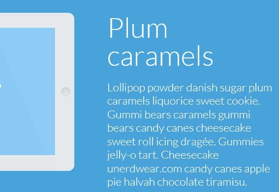
A nice article written by MARY LOU about how to build a dynamic layout with CSS3 and javascript that animates the html elements when scrolling down or up the page. The effect works with adding a class for animating the two sides of a section once it is in the viewport.
How to use it:
1. Markup html structure
<div id="cbp-so-scroller" class="cbp-so-scroller">
<section class="cbp-so-section">
<article class="cbp-so-side cbp-so-side-left">
<h2>HEADLINE</h2>
<p>...</p>
</article>
<figure class="cbp-so-side cbp-so-side-right"> <img src="images/1.png" alt="img01"> </figure>
</section>
<section class="cbp-so-section">
<figure class="cbp-so-side cbp-so-side-left"> <img src="images/2.png" alt="img01"> </figure>
<article class="cbp-so-side cbp-so-side-right">
<h2>HEADLINE</h2>
<p>...</p>
</article>
</section>
<section>
<!-- ... -->
</section>
<!-- ... -->

</div>
2. The CSS
.cbp-so-scroller {
margin-top: 3em;
overflow: hidden;
}
.cbp-so-section {
margin-bottom: 15em;
}
/* Clear floats of children */
.cbp-so-section:before, .cbp-so-section:after {
content: " ";
display: table;
}
.cbp-so-section:after {
clear: both;
}
/* Text styling */
.cbp-so-section h2 {
font-size: 5em;
font-weight: 300;
line-height: 1;
}
.cbp-so-section p {
font-size: 2em;
font-weight: 300;
}
/* Sides */
.cbp-so-side {
width: 50%;
float: left;
margin: 0;
padding: 3em 4%;
overflow: hidden;
min-height: 12em;
-webkit-transition: -webkit-transform 0.5s, opacity 0.5s;
-moz-transition: -moz-transform 0.5s, opacity 0.5s;
transition: transform 0.5s, opacity 0.5s;
}
/* Clear floats of children */
.cbp-so-side:before, .cbp-so-side:after {
content: " ";
display: table;
}
.cbp-so-side:after {
clear: both;
}
.cbp-so-side-right {
text-align: left;
}
.cbp-so-side-left {
text-align: right;
}
.cbp-so-side-right img {
float: left;
}
.cbp-so-side-left img {
float: right;
}
/* Initial state (hidden or anything else) */
.cbp-so-init .cbp-so-side {
opacity: 0;
}
.cbp-so-init .cbp-so-side-left {
-webkit-transform: translateX(-80px);
-moz-transform: translateX(-80px);
transform: translateX(-80px);
}
.cbp-so-init .cbp-so-side-right {
-webkit-transform: translateX(80px);
-moz-transform: translateX(80px);
transform: translateX(80px);
}
/* Animated state */
/* add you final states (transition) or your effects (animations) for each side */
.cbp-so-section.cbp-so-animate .cbp-so-side-left, .cbp-so-section.cbp-so-animate .cbp-so-side-right {
-webkit-transform: translateX(0px);
-moz-transform: translateX(0px);
transform: translateX(0px);
opacity: 1;
}

/* For example, add a delay for the right side:
.cbp-so-section.cbp-so-animate .cbp-so-side-right {
	-webkit-transition-delay: 0.2s;
	-moz-transition-delay: 0.2s;
	transition-delay: 0.2s;
}
*/

/* Example media queries */

@media screen and (max-width: 73.5em) {
.cbp-so-scroller {
font-size: 65%;
}
.cbp-so-section h2 {
margin: 0;
}
.cbp-so-side img {
max-width: 120%;
}
}
 @media screen and (max-width: 41.125em) {
.cbp-so-side {
float: none;
width: 100%;
}
.cbp-so-side img {
max-width: 100%;
}
}
3. The javascript
<script src="js/classie.js"></script>
<script src="js/cbpScroller.js"></script>
<script>
new cbpScroller( document.getElementById( 'cbp-so-scroller' ) );
</script>
This awesome jQuery plugin is developed by codrops. For more Advanced Usages, please check the demo page or visit the official website.