Dynamic & Responsive jQuery Grid Layout Plugin - JResponsive
| File Size: | 11.4KB |
|---|---|
| Views Total: | 3309 |
| Last Update: | |
| Publish Date: | |
| Official Website: | Go to website |
| License: | MIT |
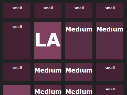
JResponsive is a smart and responsive jQuery plugin that dynamically rearranges the grid elements of your page with smooth animations to fit the window size.
How to use it:
1. Include jQuery library and jQuery JResponsive plugin in the head section
<script type="text/javascript" src="http://ajax.googleapis.com/ajax/libs/jquery/1.9.1/jquery.min.js"></script>
<script type="text/javascript" src="jresponsive.js"></script>
2. Create a container for the dynamic grid layout
<div id="example"> </div>
3. The javascript
<script>
var content = [];
content[0] = '<div class="element">...</div>';
content[1] = '<div class="element">...</div>';
content[2] = '<div class="element">...</div>';
content[3] = '<div class="element">...</div>';

...

$(function(){
$('#example').jresponsive({
min_size: 50,
max_size: 200,
hspace: 50,
vspace: 10,
height:200,
class_name: 'item',
content_array: content,
transformation: 'animation',
});
console.log($('#example').width());
});
</script>
4. Options
$('#example').jresponsive({
min_size: 50, // minimun width of each of the element
max_size: 200, // maximum width of each of the element
hspace: 50, // Horizontal gap between elements
vspace: 10, // Vertical gap between elements
height:200, // height of each element inside the container
class_name: 'item',
content_array: content,
transformation: 'animation', // animation or fade. Define custom transformation through transfromation property.
});
This awesome jQuery plugin is developed by dtuyenle. For more Advanced Usages, please check the demo page or visit the official website.