Responsive Equal Height Grid Layout Plugin For jQuery - Wrecker
| File Size: | 11.2 KB |
|---|---|
| Views Total: | 1920 |
| Last Update: | |
| Publish Date: | |
| Official Website: | Go to website |
| License: | MIT |

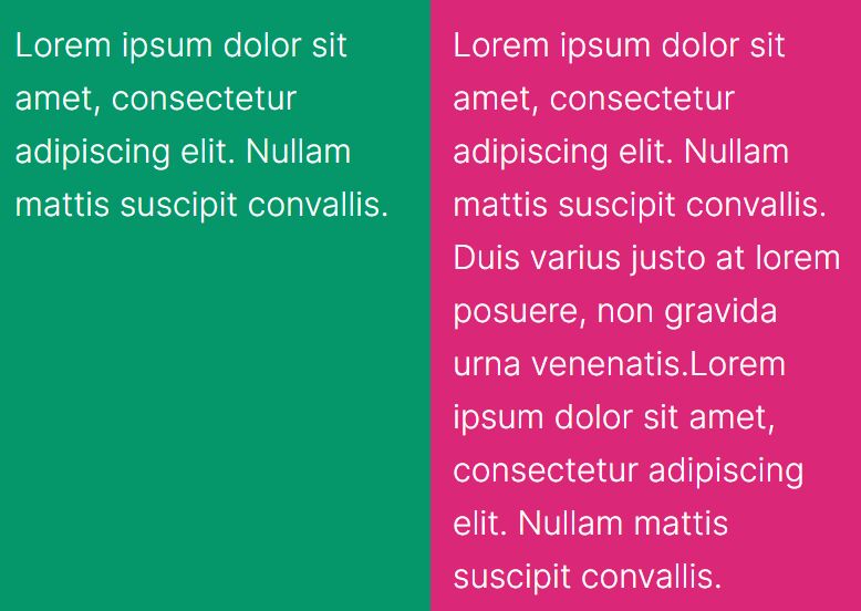
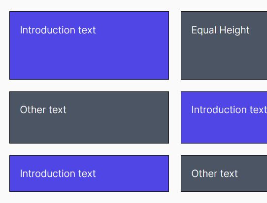
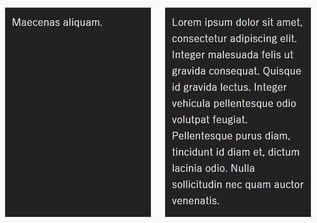
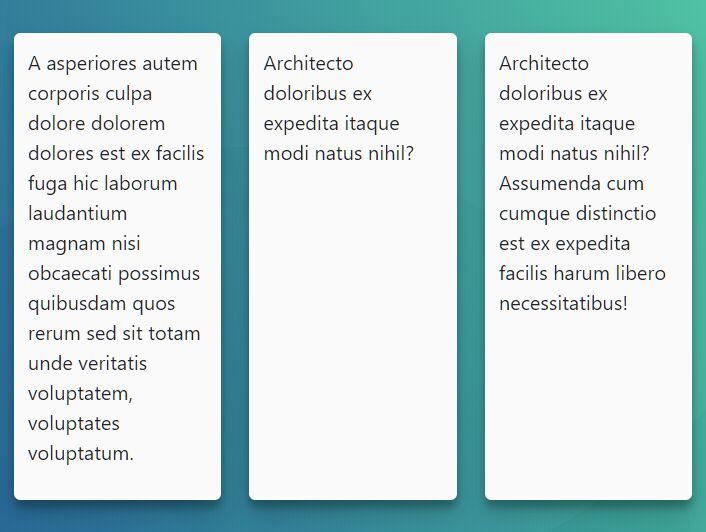
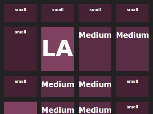
Wrecker is a lightweight, responsive jQuery equal height plugin for your grid layout where the cells of each row are equal in height based on their contents.
How to use it:
1. Include the jQuery Wrecker plugin's script jquery.wrecker.min.js after jQuery library and we're ready to go.
<script src="//code.jquery.com/jquery.min.js"></script>
<script src="jquery.wrecker.min.js"></script>
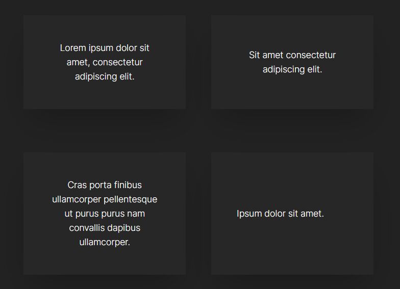
2. Suppose you have a grid layout like this:
<div id="container">
  <div class="item">
    <img src="1.jpg">
    <p>Lorem ipsum dolor sit amet, consectetur adipiscing elit. Nullam eget placerat mi. </p>
  </div>
  <div class="item">
    <img src="2.jpg">
    <p>Lorem ipsum dolor sit amet, consectetur adipiscing elit. </p>
  </div>
  <div class="item">
    <img src="3.jpg">
    <p>Sed eget leo eget dui aliquam interdum id id elit. Aenean fermentum, eros quis imperdiet mollis, metus ante volutpat leo, vitae gravida ante leo rhoncus eros. Vestibulum ante ipsum primis in faucibus orci luctus et ultrices posuere cubilia Curae; Suspendisse ullamcorper ultrices elementum.</p>
  </div>
  ...
</div>
3. Call the function on the top container and specify the grid items which should be equal height.
$("#container").wrecker({
  itemSelector : ".item",
  maxColumns : 4
});
4. Config the plugin to specify the maximum number of columns for different screen sizes.
$("#container").wrecker({
  itemSelector : ".item",
  maxColumns : 4,
  responsiveColumns : [
    // windowMaxWidth : columns
    // windowMaxWidth order and values should match those in your responsive CSS
    {1024 : 3},
    {800  : 2},
    {640  : 1}
  ]
});
This awesome jQuery plugin is developed by stevenvachon. For more Advanced Usages, please check the demo page or visit the official website.