Simple Responsive Grid Layout Plugin - jQuery Drystone.js
| File Size: | 6.02 KB |
|---|---|
| Views Total: | 6330 |
| Last Update: | |
| Publish Date: | |
| Official Website: | Go to website |
| License: | MIT |

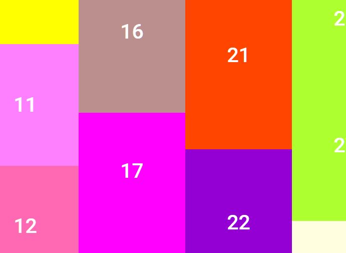
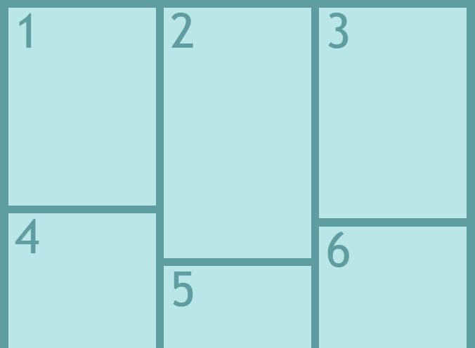
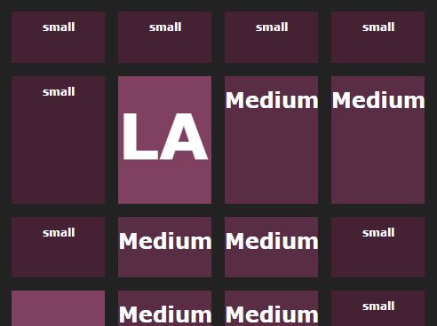
Drystone.js is a tiny, simple-to-use jQuery plugin to create a fully responsive grid layout where you can set the amount of columns at different breakpoints.
How to use it:
1. Insert your grid items to the layout:
<div class="grid">
  <div class="grid-item"></div>
  <div class="grid-item"></div>
  <div class="grid-item"></div>
  <div class="grid-item"></div>
  <div class="grid-item"></div>
  <div class="grid-item"></div>
  <div class="grid-item"></div>
  <div class="grid-item"></div>
  <div class="grid-item"></div>
  ...
</div>
2. Insert jQuery JavaScript library and the jQuery Drystone.js script into the document.
<script src="https://code.jquery.com/jquery-3.2.1.min.js"
        integrity="sha256-hwg4gsxgFZhOsEEamdOYGBf13FyQuiTwlAQgxVSNgt4="
        crossorigin="anonymous"></script>
<script src="src/drystone.js"></script>
3. Just call the function on the top container and the plugin will do the rest.
$('.grid').drystone();
4. Change the space in pixels between grid items.
$('.grid').drystone({
  gutter: 10
});
5. Specify the selector for the grid items in your grid layout.
$('.grid').drystone({
  item: '.grid-item'
});
6. Specify the amount of columns users want at each breakpoint.
$('.grid').drystone({
  xs: [576, 1],
  sm: [768, 2],
  md: [992, 2],
  lg: [1200, 3],
  xl: 3,
});
7. Execute a callback function as the grid layout is rendered.
$('.grid').drystone({
  onComplete: function() {}
});
This awesome jQuery plugin is developed by travismorenz. For more Advanced Usages, please check the demo page or visit the official website.