jQuery Dynamic Responsive Layout Library - Hopscotch
| File Size: | 2.5 KB |
|---|---|
| Views Total: | 1218 |
| Last Update: | |
| Publish Date: | |
| Official Website: | Go to website |
| License: | MIT |
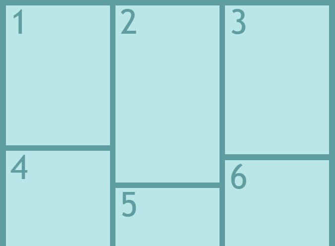
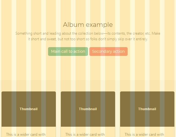
Hopscotch is a new jQuery plugin designed to aid responsive design. Whilst media queries are commonly used to switch layouts at certain container widths, sometimes this isn't flexible enough. Hopscotch lets you reorder layout units, and make complex changes that would be a nightmare with CSS. It also lets you define layout rules on not only the viewport but any container as its width changes.
Basic Usage:
1. Include the jQuery library and jQuery hopscrotch plugin in the document.
<script src="js/jquery-min.js" type="text/javascript"></script>
<script src="js/jquery.hopscotch.js" type="text/javascript"></script>
2. Include the required jQuery BA resize plugin to handle resize events.
<script src="js/jquery.ba-resize.min.js" type="text/javascript"></script>
3. Markup html structure.
<div id="body-container">
  <div data-grid-location="1;1;1,1">
  </div>
  <div data-grid-location="2;2,1;1,2">
  </div>
  <div data-grid-location="3;2,2;1,3">
  </div>
  <div data-grid-location="4;3,1;2,1">
  </div>
  <div data-grid-location="5;3,2;2,2">
  </div>
</div>
4. Call the plugin and you're done.
<script>
  $('#body-container').hopscotchResize([500, 800]);
</script>
About author:
Author: James Ellis-Jones
Home page: http://www.easyresponsive.com/hopscotch.htm
This awesome jQuery plugin is developed by easyresponsive. For more Advanced Usages, please check the demo page or visit the official website.