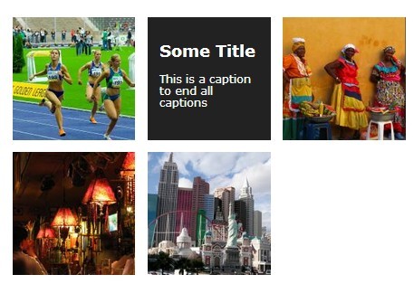
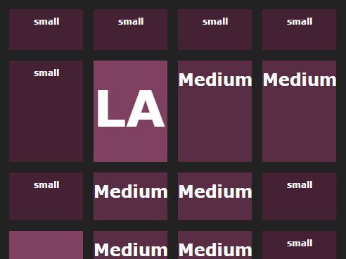
jQuery Horizontal Portfolio Layout With CSS3 Animations
| File Size: | 4.18MB |
|---|---|
| Views Total: | 5739 |
| Last Update: | |
| Publish Date: | |
| Official Website: | Go to website |
| License: | MIT |
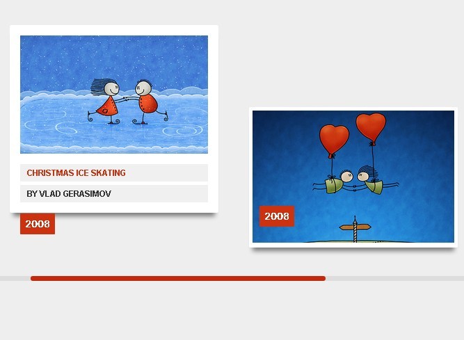
In this tutorial we're going to create a stylish Horizontal Portfolio Layout using jQuery and CSS3. The idea is that the portfolio items will fall down as soon as they enter the visible area of the viewport. It also comes with hover effects of the portfolio items using CSS3 animations and transitions, and some jQuery to replicate the image pan effect on hover.
How to use it:
1. Markup html structure
<ul class="portfolio-items">

<li class="item">
<figure>
<div class="view"> <img src="images/1.jpg" /> </div>
<figcaption>
<p><span><a href="#">Description 1</a></span></p>
<p><span>Description 2</span></p>
</figcaption>
</figure>
<div class="date">DATE</div>
</li>

<li class="item">
<figure>
<div class="view"> <img src="images/2.jpg" /> </div>
<figcaption>
<p><span><a href="#">Description 1</a></span></p>
<p><span>Description 2</span></p>
</figcaption>
</figure>
<div class="date">DATE</div>
</li>

...

</ul>
2. The CSS
.portfolio-items {
  height: 400px;
  overflow-x: scroll;
  overflow-y: hidden;
  white-space: nowrap;
  margin-bottom: 30px;
  position: relative
}

.portfolio-items > li {
  display: inline-block;
  vertical-align: top
}

.item {
  width: 300px;
  height: 202px;
  margin: 150px 20px 0;
  padding: 5px;
  border-radius: 2px;
  background-color: white;
  font-size: 14px;
  opacity: 0;
  position: relative;
  top: -300px;
  box-shadow: 0px 10px 10px -5px rgba(0,0,0,0.5);
  -webkit-transform: rotate(-135deg);
  -ms-transform: rotate(-135deg);
  -o-transform: rotate(-135deg);
  transform: rotate(-135deg);
  -webkit-transition: all .3s ease, opacity 2s ease,  top 1s ease;
  -o-transition: all .3s ease, opacity 2s ease,  top 1s ease;
  transition: all .3s ease, opacity 2s ease,  top 1s ease
}

.item:nth-child(even) {
  margin-top: 100px
}

.item:hover {
  height: 270px;
  padding: 15px;
  -webkit-transform: translateY(-68px);
  -ms-transform: translateY(-68px);
  -o-transform: translateY(-68px);
  transform: translateY(-68px)
}

.item:hover .date {
  -webkit-transform: translate3d(0, 61px, 0);
  -ms-transform: translate3d(0, 61px, 0);
  -o-transform: translate3d(0, 61px, 0);
  transform: translate3d(0, 61px, 0)
}

.item:hover figcaption {
  -webkit-animation: show .25s ease-in .120s forwards;
  -o-animation: show .25s ease-in .120s forwards;
  animation: show .25s ease-in .120s forwards
}

.item:hover p:nth-of-type(1) span {
  -webkit-animation: slideOut .25s ease-out .15s forwards;
  -o-animation: slideOut .25s ease-out .15s forwards;
  animation: slideOut .25s ease-out .15s forwards
}

.item:hover p:nth-of-type(2) span {
  -webkit-animation: slideOut .2s  ease-out .3s forwards;
  -o-animation: slideOut .2s  ease-out .3s forwards;
  animation: slideOut .2s  ease-out .3s forwards
}

.item:hover .view {
  height: 170px
}

.item:hover .view img {
  top: -20px;
  left: -20px
}

.falldown {
  top: 0;
  opacity: 1;
  -webkit-transform: rotate(0);
  -ms-transform: rotate(0);
  -o-transform: rotate(0);
  transform: rotate(0)
}

figure {
  width: 100%;
  height: 100%
}

.view {
  overflow: hidden;
  width: 100%;
  height: 190px;
  position: relative
}

.view img {
  width: 300px;
  height: 190px;
  -webkit-transition: width .3s ease;
  -o-transition: width .3s ease;
  transition: width .3s ease;
  position: absolute
}

figcaption {
  height: 60px;
  width: 100%;
  padding: 0;
  position: absolute;
  bottom: 0;
  overflow: hidden;
  opacity: 0
}

figcaption p {
  line-height: 25px !important;
  font: bold 12px/18px "Arial", sans-serif;
  text-transform: uppercase;
  padding: 0 10px;
  margin: 5px 0;
  width: 100%;
  background-color: #f0f0f0;
  color: #333
}

figcaption span {
  left: -100%;
  opacity: 0
}

figcaption a {
  color: #CC320F
}

.date {
  z-index: 1;
  width: 50px;
  height: 30px;
  line-height: 30px;
  color: #fff;
  font-weight: bold;
  text-align: center;
  border-radius: 1px;
  background-color: #CC320F;
  position: absolute;
  bottom: 30px;
  left: 15px;
  -webkit-transition: -webkit-transform 0.5s cubic-bezier(0.12, 1.6, 0.91, 0.92);
  -o-transition: -o-transform 0.5s cubic-bezier(0.12, 1.6, 0.91, 0.92);
  transition: -webkit-transform 0.5s cubic-bezier(0.12, 1.6, 0.91, 0.92);
  transition: -ms-transform 0.5s cubic-bezier(0.12, 1.6, 0.91, 0.92);
  transition: -o-transform 0.5s cubic-bezier(0.12, 1.6, 0.91, 0.92);
  transition: transform 0.5s cubic-bezier(0.12, 1.6, 0.91, 0.92)
}
3. Include jQuery library on the page
<script src="http://ajax.googleapis.com/ajax/libs/jquery/1.9.1/jquery.min.js"></script>
4. Include jQuery mousewheel plugin for mouse wheel support
<script src="js/jquery.mousewheel.js"></script>
5. The javascript
//checks if element it is called on is visible (only checks horizontally
(function($) {
  var $window = $(window);

  $.fn.isVisible = function(){
    var $this = $(this),
      Left = $this.offset().left,
      visibleWidth = $window .width();

    return Left < visibleWidth;
  }
})(jQuery);

(function($){
  var list = $('.portfolio-items'),
      showVisibleItems = function(){
      list.children('.item:not(.falldown)').each(function(el, i){
          var $this = $(this);
          if($this.isVisible()){
            $this.addClass('falldown');
          }
        });
      };

  //initially show all visible items before any scroll starts
  showVisibleItems();

  //then on scroll check for visible items and show them
  list.scroll(function(){
    showVisibleItems();
  });

  //image hover pan effect
  list.on('mousemove','img', function(ev){
      var $this = $(this),
          posX = ev.pageX,
          posY = ev.pageY,
          data = $this.data('cache');
    //cache necessary variables
        if(!data){
          data = {};
          data.marginTop = - parseInt($this.css('top')),
          data.marginLeft = - parseInt($this.css('left')),
          data.parent = $this.parent('.view'),
          $this.data('cache', data);
        }

    var originX = data.parent.offset().left,
        originY =  data.parent.offset().top;

       //move image
       $this.css({
          'left': -( posX - originX ) / data.marginLeft,
          'top' : -( posY - originY ) / data.marginTop
       });
  });


  list.on('mouseleave','.item', function(e){
    $(this).find('img').css({
      'left': '0',
      'top' : '0'
    });
  });

  //add mouse wheel support with the jquery.mousewheel plugin
  list.mousewheel(function(event, delta) {

      this.scrollLeft -= (delta * 60);

      event.preventDefault();

   });

})(jQuery);
This awesome jQuery plugin is developed by SaraSoueidan. For more Advanced Usages, please check the demo page or visit the official website.