jQuery Plugin To Move Elements Based On Media Queries - Responsive DOM
| File Size: | 27.3 KB |
|---|---|
| Views Total: | 2072 |
| Last Update: | |
| Publish Date: | |
| Official Website: | Go to website |
| License: | MIT |
Responsive DOM is a jQuery plugin for responsive web design that moves html elements in the DOM at a certain viewport size based on CSS3 media queries. For example, with this plugin you can move your sidebar to the bottom of the webpage if there's no enough space on small screens.
Basic usage:
1. Put jQuery library and the jQuery responsive DOM plugin at the bottom of your responsive webpage.
<script src="jquery.min.js"></script>
<script src="js/jquery.responsive-dom.min.js"></script>
2. Define an element you want to move at a certain breakpoint.
var $sidebar = $('.sidebar');
3. Call the function and specify the target element you want to append the sidebar to, and the breakpoint to active the plugin.
$sidebar.responsiveDom({
appendTo: '.bottom',
mediaQuery: 'screen and (min-width: 728px)',
callback: function(mediaMatched) {
// This callback is called when the DOM is updated
if (mediaMatched) {
$sidebar.text('I was moved to the bottom!');
} else {
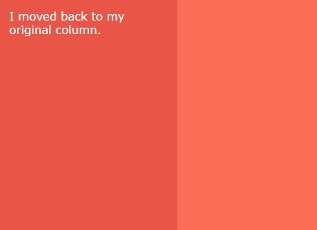
$sidebar.text('I moved back to my original place.');
}
}
});
4. All possible options with default values.
$sidebar.responsiveDom({

  // The element will be appended here
  appendTo: null,

  // (or prepended here)...
  prependTo: null,

  // ...when this media query is true.
  mediaQuery: '(min-width: 0)',

  // If provided, the callback will run after DOM updates.
  callback: null

});
Change log:
2018-03-14
- Make minor formatting updates
This awesome jQuery plugin is developed by thomashigginbotham. For more Advanced Usages, please check the demo page or visit the official website.