Cool Modal Animations with jQuery and CSS3
| File Size: | 5.95 KB |
|---|---|
| Views Total: | 4218 |
| Last Update: | |
| Publish Date: | |
| Official Website: | Go to website |
| License: | MIT |
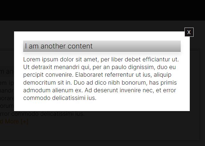
This is a collection of 7 awesome modal open / close animations built with JavaScript and several CSS3 properties. jQuery is used only to make the modal open / close on click by toggling a class name.
How to use it:
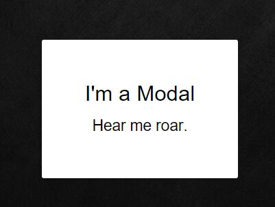
1. Create a modal window that is hidden before you click on the toggle button.
<div id="modal-container">
  <div class="modal-background">
    <div class="modal">
      Modal Content
      <svg class="modal-svg" xmlns="http://www.w3.org/2000/svg" width="100%" height="100%" preserveAspectRatio="none">
        <rect x="0" y="0" fill="none" width="226" height="162" rx="3" ry="3"></rect>
      </svg>
    </div>
  </div>
</div>
2. Create a set of trigger buttons to toggle the modal window with various animations.
<div id="one" class="button">Unfolding</div>
<div id="two" class="button">Revealing</div>
<div id="three" class="button">Uncovering</div>
<div id="four" class="button">Blow Up</div><br>
<div id="five" class="button">Meep Meep</div>
<div id="six" class="button">Sketch</div>
<div id="seven" class="button">Bond</div>
3. The jQuery script to toggle corresponding CSS classes when you click on trigger buttons.
$('.button').click(function(){
  var buttonId = $(this).attr('id');
  $('#modal-container').removeAttr('class').addClass(buttonId);
  $('body').addClass('modal-active');
})

$('#modal-container').click(function(){
  $(this).addClass('out');
  $('body').removeClass('modal-active');
});
4. The basic CSS styles for the modal window.
html.modal-active, body.modal-active {
  overflow: hidden;
}

#modal-container {
  position: fixed;
  display: table;
  height: 100%;
  width: 100%;
  top: 0;
  left: 0;
  transform: scale(0);
  z-index: 1;
}

#modal-container .modal-background {
  display: table-cell;
  background: rgba(0, 0, 0, 0.8);
  text-align: center;
  vertical-align: middle;
}

#modal-container .modal-background .modal {
  background: white;
  padding: 50px;
  display: inline-block;
  border-radius: 3px;
  font-weight: 300;
  position: relative;
}

#modal-container .modal-background .modal .modal-svg {
  position: absolute;
  top: 0;
  left: 0;
  height: 100%;
  width: 100%;
  border-radius: 3px;
}

#modal-container .modal-background .modal .modal-svg rect {
  stroke: #fff;
  stroke-width: 2px;
  stroke-dasharray: 778;
  stroke-dashoffset: 778;
}
5. The following CSS snippets contains 7 different open / close animations for your modal window.
#modal-container.one {
  transform: scaleY(0.01) scaleX(0);
  animation: unfoldIn 1s cubic-bezier(0.165, 0.84, 0.44, 1) forwards;
}

#modal-container.one .modal-background .modal {
  transform: scale(0);
  animation: zoomIn 0.5s 0.8s cubic-bezier(0.165, 0.84, 0.44, 1) forwards;
}

#modal-container.one.out {
  transform: scale(1);
  animation: unfoldOut 1s 0.3s cubic-bezier(0.165, 0.84, 0.44, 1) forwards;
}

#modal-container.one.out .modal-background .modal { animation: zoomOut 0.5s cubic-bezier(0.165, 0.84, 0.44, 1) forwards; }

#modal-container.two { transform: scale(1); }

#modal-container.two .modal-background {
  background: transparent;
  animation: fadeIn 0.5s cubic-bezier(0.165, 0.84, 0.44, 1) forwards;
}

#modal-container.two .modal-background .modal {
  opacity: 0;
  animation: scaleUp 0.5s cubic-bezier(0.165, 0.84, 0.44, 1) forwards;
}

#modal-container.two + .content { animation: scaleBack 0.5s cubic-bezier(0.165, 0.84, 0.44, 1) forwards; }

#modal-container.two.out { animation: quickScaleDown 0s .5s linear forwards; }

#modal-container.two.out .modal-background { animation: fadeOut 0.5s cubic-bezier(0.165, 0.84, 0.44, 1) forwards; }

#modal-container.two.out .modal-background .modal { animation: scaleDown 0.5s cubic-bezier(0.165, 0.84, 0.44, 1) forwards; }

#modal-container.two.out + .content { animation: scaleForward 0.5s cubic-bezier(0.165, 0.84, 0.44, 1) forwards; }

#modal-container.three {
  z-index: 0;
  transform: scale(1);
}

#modal-container.three .modal-background { background: rgba(0, 0, 0, 0.6); }

#modal-container.three .modal-background .modal { animation: moveUp 0.5s cubic-bezier(0.165, 0.84, 0.44, 1) forwards; }

#modal-container.three + .content {
  z-index: 1;
  animation: slideUpLarge 0.5s cubic-bezier(0.165, 0.84, 0.44, 1) forwards;
}

#modal-container.three.out .modal-background .modal { animation: moveDown 0.5s cubic-bezier(0.165, 0.84, 0.44, 1) forwards; }

#modal-container.three.out + .content { animation: slideDownLarge 0.5s cubic-bezier(0.165, 0.84, 0.44, 1) forwards; }

#modal-container.four {
  z-index: 0;
  transform: scale(1);
}

#modal-container.four .modal-background { background: rgba(0, 0, 0, 0.7); }

#modal-container.four .modal-background .modal { animation: blowUpModal 0.5s cubic-bezier(0.165, 0.84, 0.44, 1) forwards; }

#modal-container.four + .content {
  z-index: 1;
  animation: blowUpContent 0.5s cubic-bezier(0.165, 0.84, 0.44, 1) forwards;
}

#modal-container.four.out .modal-background .modal { animation: blowUpModalTwo 0.5s cubic-bezier(0.165, 0.84, 0.44, 1) forwards; }

#modal-container.four.out + .content { animation: blowUpContentTwo 0.5s cubic-bezier(0.165, 0.84, 0.44, 1) forwards; }

#modal-container.five { transform: scale(1); }

#modal-container.five .modal-background {
  background: transparent;
  animation: fadeIn 0.5s cubic-bezier(0.165, 0.84, 0.44, 1) forwards;
}

#modal-container.five .modal-background .modal {
  transform: translateX(-1500px);
  animation: roadRunnerIn 0.3s cubic-bezier(0.165, 0.84, 0.44, 1) forwards;
}

#modal-container.five.out { animation: quickScaleDown 0s .5s linear forwards; }

#modal-container.five.out .modal-background { animation: fadeOut 0.5s cubic-bezier(0.165, 0.84, 0.44, 1) forwards; }

#modal-container.five.out .modal-background .modal { animation: roadRunnerOut 0.5s cubic-bezier(0.165, 0.84, 0.44, 1) forwards; }

#modal-container.six { transform: scale(1); }

#modal-container.six .modal-background {
  background: transparent;
  animation: fadeIn 0.5s cubic-bezier(0.165, 0.84, 0.44, 1) forwards;
}

#modal-container.six .modal-background .modal {
  background-color: transparent;
  animation: modalFadeIn 0.5s 0.8s cubic-bezier(0.165, 0.84, 0.44, 1) forwards;
}

#modal-container.six .modal-background .modal h2, #modal-container.six .modal-background .modal p {
  opacity: 0;
  position: relative;
  animation: modalContentFadeIn 0.5s 1s cubic-bezier(0.165, 0.84, 0.44, 1) forwards;
}

#modal-container.six .modal-background .modal .modal-svg rect { animation: sketchIn 0.5s 0.3s cubic-bezier(0.165, 0.84, 0.44, 1) forwards; }

#modal-container.six.out { animation: quickScaleDown 0s .5s linear forwards; }

#modal-container.six.out .modal-background { animation: fadeOut 0.5s cubic-bezier(0.165, 0.84, 0.44, 1) forwards; }

#modal-container.six.out .modal-background .modal { animation: modalFadeOut 0.5s cubic-bezier(0.165, 0.84, 0.44, 1) forwards; }

#modal-container.six.out .modal-background .modal h2, #modal-container.six.out .modal-background .modal p { animation: modalContentFadeOut 0.5s cubic-bezier(0.165, 0.84, 0.44, 1) forwards; }

#modal-container.six.out .modal-background .modal .modal-svg rect { animation: sketchOut 0.5s cubic-bezier(0.165, 0.84, 0.44, 1) forwards; }

#modal-container.seven { transform: scale(1); }

#modal-container.seven .modal-background {
  background: transparent;
  animation: fadeIn 0.5s cubic-bezier(0.165, 0.84, 0.44, 1) forwards;
}

#modal-container.seven .modal-background .modal {
  height: 75px;
  width: 75px;
  border-radius: 75px;
  overflow: hidden;
  animation: bondJamesBond 1.5s cubic-bezier(0.165, 0.84, 0.44, 1) forwards;
}

#modal-container.seven .modal-background .modal h2, #modal-container.seven .modal-background .modal p {
  opacity: 0;
  position: relative;
  animation: modalContentFadeIn .5s 1.4s linear forwards;
}

#modal-container.seven.out { animation: slowFade .5s 1.5s linear forwards; }

#modal-container.seven.out .modal-background {
  background-color: rgba(0, 0, 0, 0.7);
  animation: fadeToRed 2s cubic-bezier(0.165, 0.84, 0.44, 1) forwards;
}

#modal-container.seven.out .modal-background .modal {
  border-radius: 3px;
  height: 162px;
  width: 227px;
  animation: killShot 1s cubic-bezier(0.165, 0.84, 0.44, 1) forwards;
}

#modal-container.seven.out .modal-background .modal h2, #modal-container.seven.out .modal-background .modal p { animation: modalContentFadeOut 0.5s 0.5 cubic-bezier(0.165, 0.84, 0.44, 1) forwards; }

@keyframes
unfoldIn {  0% {
 transform: scaleY(0.005) scaleX(0);
}
 50% {
 transform: scaleY(0.005) scaleX(1);
}
 100% {
 transform: scaleY(1) scaleX(1);
}
}
@keyframes
unfoldOut {  0% {
 transform: scaleY(1) scaleX(1);
}
 50% {
 transform: scaleY(0.005) scaleX(1);
}
 100% {
 transform: scaleY(0.005) scaleX(0);
}
}
@keyframes
zoomIn {  0% {
 transform: scale(0);
}
 100% {
 transform: scale(1);
}
}
@keyframes
zoomOut {  0% {
 transform: scale(1);
}
 100% {
 transform: scale(0);
}
}
@keyframes
fadeIn {  0% {
 background: transparent;
}
 100% {
 background: rgba(0, 0, 0, 0.7);
}
}
@keyframes
fadeOut {  0% {
 background: rgba(0, 0, 0, 0.7);
}
 100% {
 background: transparent;
}
}
@keyframes
scaleUp {  0% {
 transform: scale(0.8) translateY(1000px);
 opacity: 0;
}
 100% {
 transform: scale(1) translateY(0px);
 opacity: 1;
}
}
@keyframes
scaleDown {  0% {
 transform: scale(1) translateY(0px);
 opacity: 1;
}
 100% {
 transform: scale(0.8) translateY(1000px);
 opacity: 0;
}
}
@keyframes
scaleBack {  0% {
 transform: scale(1);
}
 100% {
 transform: scale(0.85);
}
}
@keyframes
scaleForward {  0% {
 transform: scale(0.85);
}
 100% {
 transform: scale(1);
}
}
@keyframes
quickScaleDown {  0% {
 transform: scale(1);
}
 99.9% {
 transform: scale(1);
}
 100% {
 transform: scale(0);
}
}
@keyframes
slideUpLarge {  0% {
 transform: translateY(0%);
}
 100% {
 transform: translateY(-100%);
}
}
@keyframes
slideDownLarge {  0% {
 transform: translateY(-100%);
}
 100% {
 transform: translateY(0%);
}
}
@keyframes
moveUp {  0% {
 transform: translateY(150px);
}
 100% {
 transform: translateY(0);
}
}
@keyframes
moveDown {  0% {
 transform: translateY(0px);
}
 100% {
 transform: translateY(150px);
}
}
@keyframes
blowUpContent {  0% {
 transform: scale(1);
 opacity: 1;
}
 99.9% {
 transform: scale(2);
 opacity: 0;
}
 100% {
 transform: scale(0);
}
}
@keyframes
blowUpContentTwo {  0% {
 transform: scale(2);
 opacity: 0;
}
 100% {
 transform: scale(1);
 opacity: 1;
}
}
@keyframes
blowUpModal {  0% {
 transform: scale(0);
}
 100% {
 transform: scale(1);
}
}
@keyframes
blowUpModalTwo {  0% {
 transform: scale(1);
 opacity: 1;
}
 100% {
 transform: scale(0);
 opacity: 0;
}
}
@keyframes
roadRunnerIn {  0% {
 transform: translateX(-1500px) skewX(30deg) scaleX(1.3);
}
 70% {
 transform: translateX(30px) skewX(0deg) scaleX(0.9);
}
 100% {
 transform: translateX(0px) skewX(0deg) scaleX(1);
}
}
@keyframes
roadRunnerOut {  0% {
 transform: translateX(0px) skewX(0deg) scaleX(1);
}
 30% {
 transform: translateX(-30px) skewX(-5deg) scaleX(0.9);
}
 100% {
 transform: translateX(1500px) skewX(30deg) scaleX(1.3);
}
}
@keyframes
sketchIn {  0% {
 stroke-dashoffset: 778;
}
 100% {
 stroke-dashoffset: 0;
}
}
@keyframes
sketchOut {  0% {
 stroke-dashoffset: 0;
}
 100% {
 stroke-dashoffset: 778;
}
}
@keyframes
modalFadeIn {  0% {
 background-color: transparent;
}
 100% {
 background-color: white;
}
}
@keyframes
modalFadeOut {  0% {
 background-color: white;
}
 100% {
 background-color: transparent;
}
}
@keyframes
modalContentFadeIn {  0% {
 opacity: 0;
 top: -20px;
}
 100% {
 opacity: 1;
 top: 0;
}
}
@keyframes
modalContentFadeOut {  0% {
 opacity: 1;
 top: 0px;
}
 100% {
 opacity: 0;
 top: -20px;
}
}
@keyframes
bondJamesBond {  0% {
 transform: translateX(1000px);
}
 80% {
 transform: translateX(0px);
 border-radius: 75px;
 height: 75px;
 width: 75px;
}
 90% {
 border-radius: 3px;
 height: 182px;
 width: 247px;
}
 100% {
 border-radius: 3px;
 height: 162px;
 width: 227px;
}
}
@keyframes
killShot {  0% {
 transform: translateY(0) rotate(0deg);
 opacity: 1;
}
 100% {
 transform: translateY(300px) rotate(45deg);
 opacity: 0;
}
}
@keyframes
fadeToRed {  0% {
 box-shadow: inset 0 0 0 rgba(201, 24, 24, 0.8);
}
 100% {
 box-shadow: inset 0 2000px 0 rgba(201, 24, 24, 0.8);
}
}
@keyframes
slowFade {  0% {
 opacity: 1;
}
 99.9% {
 opacity: 0;
 transform: scale(1);
}
 100% {
 transform: scale(0);
}
}
This awesome jQuery plugin is developed by designcouch. For more Advanced Usages, please check the demo page or visit the official website.