Pretty Modal Window Effects with CSS3 Transitions and Animations
| File Size: | 62.1 KB |
|---|---|
| Views Total: | 45859 |
| Last Update: | |
| Publish Date: | |
| Official Website: | Go to website |
| License: | MIT |
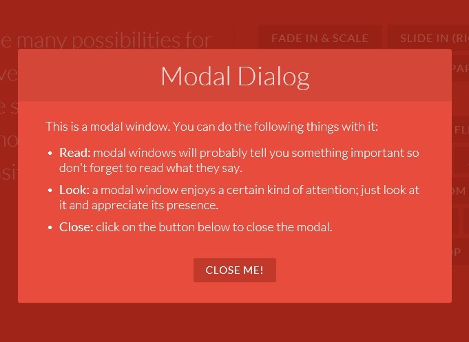
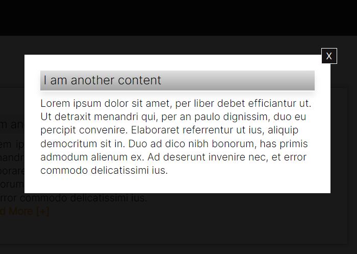
In this tutorial written by MARY LOU we're going to create Pretty Modal Window Effects with javascript and CSS3 Transitions & Animations. Modal window is a modern technology that will probably tell you something important so don't forget to read what they say.
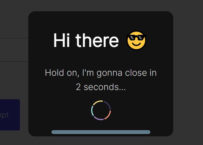
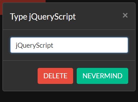
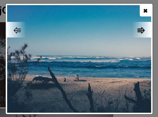
Effects included in this pack:
- Fade in & Scale
- Slide in
- Newspaper
- Fall
- Side fall
- Sticky up
- 3D Flip
- 3D Sign
- Super scaled
- 3D Rotation
- Blur
- Slip from top
- etc...
Basic Usage:
1. Create a modal window
<div class="md-modal md-effect-1" id="modal-1">
<div class="md-content">
<h3>Modal Dialog</h3>
<div>
<p>This is a modal window. You can do the following things with it:</p>
<ul>
<li><strong>Read:</strong> modal windows will probably tell you something important so don't forget to read what they say.</li>
<li><strong>Look:</strong> a modal window enjoys a certain kind of attention; just look at it and appreciate its presence.</li>
<li><strong>Close:</strong> click on the button below to close the modal.</li>
</ul>
<button class="md-close">Close me!</button>
</div>
</div>
</div>

<!-- the overlay element -->
<div class="md-overlay"></div>
2. The CSS
.md-modal {
position: fixed;
top: 50%;
left: 50%;
width: 50%;
max-width: 630px;
min-width: 320px;
height: auto;
z-index: 2000;
visibility: hidden;
-webkit-backface-visibility: hidden;
-moz-backface-visibility: hidden;
backface-visibility: hidden;
-webkit-transform: translateX(-50%) translateY(-50%);
-moz-transform: translateX(-50%) translateY(-50%);
-ms-transform: translateX(-50%) translateY(-50%);
transform: translateX(-50%) translateY(-50%);
}
.md-show {
visibility: visible;
}
.md-overlay {
position: fixed;
width: 100%;
height: 100%;
visibility: hidden;
top: 0;
left: 0;
z-index: 1000;
opacity: 0;
background: rgba(143,27,15,0.8);
-webkit-transition: all 0.3s;
-moz-transition: all 0.3s;
transition: all 0.3s;
}
.md-show ~ .md-overlay {
opacity: 1;
visibility: visible;
}
.md-effect-1 .md-content {
-webkit-transform: scale(0.7);
-moz-transform: scale(0.7);
-ms-transform: scale(0.7);
transform: scale(0.7);
opacity: 0;
-webkit-transition: all 0.3s;
-moz-transition: all 0.3s;
transition: all 0.3s;
}
.md-show.md-effect-1 .md-content {
-webkit-transform: scale(1);
-moz-transform: scale(1);
-ms-transform: scale(1);
transform: scale(1);
opacity: 1;
}
3. Create a button to trigger the modal window
<button class="md-trigger" data-modal="modal-1">Fade in & Scale</button>
4. Include required javascript files on the page
<script src="js/classie.js"></script>
<script src="js/modalEffects.js"></script>

<!-- for the blur effect -->
<script>
	// this is important for IEs
	var polyfilter_scriptpath = '/js/';
</script>
<script src="js/cssParser.js"></script>
<script src="js/css-filters-polyfill.js"></script>
This awesome jQuery plugin is developed by MARY LOU. For more Advanced Usages, please check the demo page or visit the official website.