Easy Pop Out Navigation Menu With jQuery And CSS3
| File Size: | 4.38 KB |
|---|---|
| Views Total: | 1632 |
| Last Update: | |
| Publish Date: | |
| Official Website: | Go to website |
| License: | MIT |
A simple space-saving navigation that allows you to toggle a fullscreen navigation menu while preventing the user from page scrolling. Heavily based on CSS and CSS3. jQuery is used only to toggle the CSS classes as you toggle the navigation on and off.
How to use it:
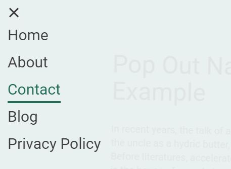
1. Create the pop out navigation with a toggle button on the webpage.
<nav>
  <ul>
    <li>Home</li>
    <li>About</li>
    <li>Contact</li>
    <li>Blog</li>
    <li>Privacy Policy</li>
  </ul>
  <button class="is-closed"></button>
</nav>
2. Style & position the navigation.
nav {
  position: fixed;
  padding: 24px;
  width: 100%;
  height: 0;
  -webkit-transform: translateZ(0);
  transform: translateZ(0);
  -webkit-transition: background-color .4s ease-out, height 0s .4s;
  transition: background-color .4s ease-out, height 0s .4s;
}

.is-open nav {
  height: 100%;
  background-color: rgba(255, 255, 255, 0.9);
  -webkit-transition: background-color 2s ease-out;
  transition: background-color 2s ease-out;
  z-index: 2;
}

ul {
  position: absolute;
  top: 24px;
  left: 24px;
  font-size: 30px;
  text-transform: capitalize;
  color: #3d3d3d;
  -webkit-transform-origin: 0 0;
  transform-origin: 0 0;
  -webkit-transform: scale(0.1);
  transform: scale(0.1);
  -webkit-transition: -webkit-transform .2s ease-out;
  transition: -webkit-transform .2s ease-out;
  transition: transform .2s ease-out;
  transition: transform .2s ease-out, -webkit-transform .2s ease-out;
  z-index: 2;
}

ul:after {
  content: "";
  display: table;
  clear: both;
}

ul li {
  display: none;
  clear: both;
  float: left;
  margin: 0 0 48px;
  padding: 0 60px;
  background-color: #3d3d3d;
  cursor: pointer;
  -webkit-user-select: none;
  -moz-user-select: none;
  -ms-user-select: none;
  user-select: none;
  -webkit-transition: background-color 0s .2s ease-out, margin .2s ease-out, padding .2s ease-out, opacity .2s ease-out;
  transition: background-color 0s .2s ease-out, margin .2s ease-out, padding .2s ease-out, opacity .2s ease-out;
}

ul li:after {
  content: "";
  position: absolute;
  bottom: 0;
  left: 0;
  height: 4px;
  width: 0;
  background-color: #216c57;
  -webkit-transition: width .2s ease-out;
  transition: width .2s ease-out;
}

ul li:nth-child(n+3) { display: block; }

ul li:nth-child(1) {
  -webkit-animation: bounce-out .2s ease-out;
  animation: bounce-out .2s ease-out;
}

ul li:nth-child(2) {
  -webkit-animation: bounce-out .2s ease-out;
  animation: bounce-out .2s ease-out;
}

ul li:nth-child(3) {
  -webkit-animation: bounce-out .2s ease-out;
  animation: bounce-out .2s ease-out;
}

ul li:nth-child(4) {
  -webkit-animation: bounce-out .2s ease-out;
  animation: bounce-out .2s ease-out;
}

ul li:nth-child(5) {
  -webkit-animation: bounce-out .2s ease-out;
  animation: bounce-out .2s ease-out;
}

ul li:hover { color: #216c57; }

ul li:hover:after { width: 100%; }

.is-open ul {
  -webkit-transform: translateY(30px) scale(1);
  transform: translateY(30px) scale(1);
}

.is-open ul li {
  display: block;
  padding: 12px 0;
  margin: 0;
  background-color: transparent;
  -webkit-transform: scale(0.6);
  transform: scale(0.6);
  -webkit-transition: background-color 0s ease-out, margin .2s ease-out, padding .2s ease-out, opacity .2s ease-out;
  transition: background-color 0s ease-out, margin .2s ease-out, padding .2s ease-out, opacity .2s ease-out;
}

.is-open ul li:nth-child(1) {
  -webkit-animation: bounce-in 1s 0.04s ease-out forwards;
  animation: bounce-in 1s 0.04s ease-out forwards;
}

.is-open ul li:nth-child(2) {
  -webkit-animation: bounce-in 1s 0.08s ease-out forwards;
  animation: bounce-in 1s 0.08s ease-out forwards;
}

.is-open ul li:nth-child(3) {
  -webkit-animation: bounce-in 1s 0.12s ease-out forwards;
  animation: bounce-in 1s 0.12s ease-out forwards;
}

.is-open ul li:nth-child(4) {
  -webkit-animation: bounce-in 1s 0.16s ease-out forwards;
  animation: bounce-in 1s 0.16s ease-out forwards;
}

.is-open ul li:nth-child(5) {
  -webkit-animation: bounce-in 1s 0.2s ease-out forwards;
  animation: bounce-in 1s 0.2s ease-out forwards;
}
3. Style the menu toggle button.
button {
  position: absolute;
  top: 24px;
  left: 24px;
  width: 24px;
  height: 24px;
  background-color: transparent;
  border: none;
  outline: none;
  cursor: pointer;
  opacity: 0;
  -webkit-transition: opacity .2s ease-out;
  transition: opacity .2s ease-out;
  z-index: 3;
}

button:before, button:after {
  content: "";
  position: absolute;
  top: 0;
  right: 0;
  bottom: 0;
  left: 0;
  margin: auto;
  width: 3px;
  height: 100%;
  background-color: #3d3d3d;
}

button:before {
  -webkit-transform: rotate(45deg);
  transform: rotate(45deg);
}

button:after {
  -webkit-transform: rotate(-45deg);
  transform: rotate(-45deg);
}

.is-open button {
  opacity: 1;
  -webkit-transform: rotate(360deg);
  transform: rotate(360deg);
  -webkit-transition: opacity .2s .1s ease-out, -webkit-transform .4s .1s ease-out;
  transition: opacity .2s .1s ease-out, -webkit-transform .4s .1s ease-out;
  transition: opacity .2s .1s ease-out, transform .4s .1s ease-out;
  transition: opacity .2s .1s ease-out, transform .4s .1s ease-out, -webkit-transform .4s .1s ease-out;
}
4. The CSS3 animations for the pop out navigation.
@-webkit-keyframes
bounce-in { 0% {
 -webkit-transform: scale(0.8);
 transform: scale(0.8);
}
 20% {
 -webkit-transform: scale(1.1);
 transform: scale(1.1);
}
 40% {
 -webkit-transform: scale(0.9);
 transform: scale(0.9);
}
 60% {
 -webkit-transform: scale(1.05);
 transform: scale(1.05);
}
 80% {
 -webkit-transform: scale(0.96);
 transform: scale(0.96);
}
 100% {
 -webkit-transform: scale(1);
 transform: scale(1);
}
}

@keyframes
bounce-in { 0% {
 -webkit-transform: scale(0.8);
 transform: scale(0.8);
}
 20% {
 -webkit-transform: scale(1.1);
 transform: scale(1.1);
}
 40% {
 -webkit-transform: scale(0.9);
 transform: scale(0.9);
}
 60% {
 -webkit-transform: scale(1.05);
 transform: scale(1.05);
}
 80% {
 -webkit-transform: scale(0.96);
 transform: scale(0.96);
}
 100% {
 -webkit-transform: scale(1);
 transform: scale(1);
}
}
5. Fade out the main content when the navigation is open.
main {
  margin: auto;
  padding: 100px 24px;
  width: 100%;
  max-width: 800px;
  -webkit-transition: -webkit-transform 0s ease-out;
  transition: -webkit-transform 0s ease-out;
  transition: transform 0s ease-out;
  transition: transform 0s ease-out, -webkit-transform 0s ease-out;
  z-index: 2;
}

.is-open main {
  opacity: 0;
  -webkit-transform: scale(0.9) rotate(4deg);
  transform: scale(0.9) rotate(4deg);
  -webkit-transition: opacity 20s linear, -webkit-transform 50s ease-out;
  transition: opacity 20s linear, -webkit-transform 50s ease-out;
  transition: opacity 20s linear, transform 50s ease-out;
  transition: opacity 20s linear, transform 50s ease-out, -webkit-transform 50s ease-out;
}
6. Prevent the user from scrolling when the navigation is open.
body.is-open { overflow: hidden; }
7. The JavaScript to toggle CSS classes based on the open/close states of the navigation. Add the following JS snippets after jQuery library and we're done.
$('button').on("click", function() {
  $(this).toggleClass('is-closed');
  if(!$(this).hasClass('is-closed')) {
    $('body').addClass('is-open');
  } else {
    $('body').removeClass('is-open');
  }
});
This awesome jQuery plugin is developed by hexagoncircle. For more Advanced Usages, please check the demo page or visit the official website.