Fully Responsive Navbar with jQuery and CSS3
| File Size: | 2.93 KB |
|---|---|
| Views Total: | 22015 |
| Last Update: | |
| Publish Date: | |
| Official Website: | Go to website |
| License: | MIT |
This is a jQuery based fully responsive navigation system that uses CSS3 media queries to detect the screen size and transforms the default horizontal navigation bar into a sliding toggle menu on small screens.
How to use it:
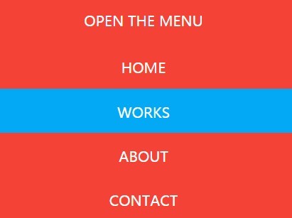
1. Create a normal navbar using nav and html unordered list.
<nav class="menu_open navbar_nav">
  <a href="#" id="menu-acces" class="menu_a">OPEN THE MENU</a>
  <ul class="menu_open navbar_ul">
    <li class="menu_li">
      <a class="menu_a" href="#">HOME</a>
    </li>
    <li class="menu_li">
      <a class="menu_a" href="#">WORKS</a>
    </li>
    <li class="menu_li">
      <a class="menu_a" href="#">ABOUT</a>
    </li>
    <li class="menu_li">
      <a class="menu_a" href="#">CONTACT</a>
    </li>
  </ul>
</nav>
2. The CSS to style the navbar.
.navbar_nav {
  height: 50px;
  background-color: #F44336;
  position: absolute;
  z-index: 3;
}

.navbar_nav,
.menu_a { width: 100%; }

.menu_li,
.menu_a { display: inline-block; }

.menu_li {
  width: 25%;
  float: left;
  opacity: 0.8;
  text-align: center;
  height: 50px;
  background-color: #F44336;
}

.menu_a { padding: 16px 0; }

.menu_li:hover,
.menu_a:hover {
  background-color: #03A9F4;
  opacity: 1;
}

#menu-acces {
  display: none;
  width: 100%;
  position: relative;
  text-align: center;
}

.menu_open:after {
  content: "";
  display: table;
}
3. The CSS for the responsive menu on small screens. In this sample, the breakpoint is set to 480px.
@media only screen and (max-width: 480px) {

#menu-acces { display: block; }

.navbar_ul { display: none; }

.menu_li {
  width: 100%;
  position: relative;
  opacity: 1;
}

.menu_open { height: auto; }

}
4. Load the needed jQuery library at the bottom of the webpage.
<script src="jquery.min.js"></script>
5. The jQuery script to toggle CSS classes based on screen size.
$(document).ready(function(){
  responsive_menu = $('.navbar_ul');
  $('#menu-acces').on('click', function(e) {
    e.preventDefault();
    responsive_menu.slideToggle();
  });
  $(window).resize(function(){
    var obtener_ancho = $(this).width();
    if(obtener_ancho > 480 && responsive_menu.is(':hidden')) {
      responsive_menu.removeAttr('style');
    }
  });
  $('nav li').on('click', function(e) {
    var obtener_ancho = $(window).width();
    if(obtener_ancho < 480 ) {
      responsive_menu.slideToggle();
    }
  });
});
This awesome jQuery plugin is developed by didesweb. For more Advanced Usages, please check the demo page or visit the official website.