Google-style Expanding Content Preview Effect With jQuery - Folding Content
| File Size: | 12.7 KB |
|---|---|
| Views Total: | 4366 |
| Last Update: | |
| Publish Date: | |
| Official Website: | Go to website |
| License: | MIT |
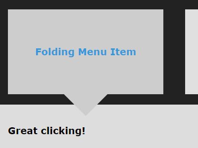
A really simple jQuery plugin used for creating a nice folding menu that allows you to open an expanding preview when clicking on a menu item as you've seen on Google Images Search.
See also:
- jQuery Plugin For Thumbnail Grid Expanding Preview - Gridder
- jQuery Plugin To Create An Expandable Thumbnail Grid - slidebox
- Simple jQuery Photo Gallery with Expanding Preview - sampGallery
- Google Image Search Style Photo Wall Gallery Plugin For jQuery - GI.TheWall.js
- Thumbnail Grid with Expanding Image Preview Using jQuery
How to use it:
1. Link to the jQuery Folding Content plugin's script at the bottom of your webpage. Make sure you first have the latest version of jQuery included.
<script src="//code.jquery.com/jquery-latest.min.js"></script>
<script src="folding-content.js"></script>
2. Create a folding menu from an unordered html list as shown below.
<ul class="folding-menu">
  <li class="menu-item">
    <a href="#">
      <h3>Folding Menu Item 1</h3>
    </a>
    <div class="folding-content">
      <h3>Folding Menu Content 1</h3>
    </div>
  </li>
  <li class="menu-item">
    <a href="#">
      <h3>Folding Menu Item 2</h3>
    </a>
    <div class="folding-content">
      <h3>Folding Menu Content 2</h3>
    </div>
  </li>
  <li class="menu-item">
    <a href="#">
      <h3>Folding Menu Item 3</h3>
    </a>
    <div class="folding-content">
      <h3>Folding Menu Content 3</h3>
    </div>
  </li>
</ul>
3. Call the function to initialize the folding menu.
$('.folding-menu').foldingContent({
  menuSelector: '.folding-menu',
  menuItemSelector: '.menu-item',
  contentSelector: '.folding-content',
  unfoldBeforeMarkup: '<li>',
  unfoldAfterMarkup: '</li>',
  closeMarkup: '<span class="your-icon-class">X</span>'
});
4. Style the folding menu whatever you like.
#menu-container a {
  text-decoration: none;
  color: #3498DB;
}

#menu-container {
  width: 100%;
  min-height: 100%;
  background: #222;
  border: 20px solid #fff;
}

.folding-menu {
  /* remove inline-block extra spacing */
  font-size: 0;
  padding: 0;
}

.folding-menu li { list-style-type: none; }

.menu-item {
  text-align: center;
  display: inline-block;
  padding: 50px;
  margin: 20px;
  background: #e0e0e0;
  transition: background 0.3s;
  font-size: 15px;
  vertical-align: top;
}

.menu-item:hover { background: #e6e6e6; }

.menu-item:after {
  content: '';
  border-top: 0 solid #e6e6e6;
}

.unfolded-content {
  font-size: 15px;
  background: #ddd;
  padding: 20px;
  box-sizing: border-box;
  position: relative;
}

.active-item {
  background: #ccc;
  position: relative;
}

.active-item:after {
  content: '';
  width: 0;
  height: 0;
  position: absolute;
  left: calc( 50% - 40px );
  bottom: -40px;
  border-top: 40px solid #ccc;
  border-right: 40px solid transparent;
  border-bottom: 00px solid transparent;
  border-left: 40px solid transparent;
  z-index: 10;
  transition: border-top-color 0.3s;
}

.active-item:hover:after { border-top: 40px solid #e6e6e6; }

.close-unfolded-content {
  position: absolute;
  top: 20px;
  right: 20px;
  height: 20px;
  width: 20px;
  text-align: center;
  background: #fff;
  transition: color 0.3s, background 0.3s;
}

.close-unfolded-content:hover {
  color: #fff;
  background: #444;
}

.folding-content, .unfolded-content { display: none; }

.unfolded-content { width: 100%; }

.unfolded-content .folding-content { display: block; }

.menu-item:hover, .close-unfolded-content:hover { cursor: pointer; }
Changelog:
2019-07-14
- Fixed for iOS.
2017-01-06
- Add minification and es5 compatibility
2016-02-22
- v2.0 - update
2016-01-24
- 1.2 - remove debug code and update readme
This awesome jQuery plugin is developed by palpants. For more Advanced Usages, please check the demo page or visit the official website.


