Lightweight Cross-platform jQuery Responsive Menu Plugin - Trunk.js
| File Size: | 39.7 KB |
|---|---|
| Views Total: | 6509 |
| Last Update: | |
| Publish Date: | |
| Official Website: | Go to website |
| License: | MIT |
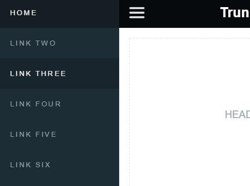
Trunk.js is a small, cross-platform, touch-enabled jQuery responsive menu plugin which automatically converts a regular horizontal navigation bar into to an mobile app-style off-canvas drawer menu depending on the viewport size.
How to use it:
1. Include the jQuery trunck.js plugin's JavaScript and Stylesheet files on the webpage. Make sure you first have jQuery JavaScript library installed.
<link rel="stylesheet" href="css/trunk.css">
<script src="//code.jquery.com/jquery-1.11.3.min.js"></script>
<script src="js/trunk.js"></script>
2. The html for the menu toggle button. Add "slideRight" class to items that move right when viewing Nav Drawer, and "slideRight" class to items that move right when viewing Nav Drawer.
<header class="slide">
  <ul id="navToggle" class="burger slide">
    <li></li><li></li><li></li>
  </ul>
</header>
3. The html for the drawer menu.
<nav class="slide">
  <ul>
    <li><a href="#" class="active">HOME</a></li>
    <li><a href="#">LINK TWO</a></li>
    <li><a href="#">LINK THREE</a></li>
    <li><a href="#">LINK FOUR</a></li>
    <li><a href="#">LINK FIVE</a></li>
    <li><a href="#">LINK SIX</a></li>
    <li><a href="#">LINK SEVEN</a></li>
  </ul>
</nav>
4. The html for the main content. Add "slideRight" class to items that move right when viewing Nav Drawer.
<div class="content slide">
  <ul class="responsive">
    <li class="header-section">
      <p class="placefiller">HEADER</p>
    </li>
    <li class="body-section">
      <p class="placefiller">BODY</p>
    </li>
    <li class="footer-section">
      <p class="placefiller">FOOTER</p>
    </li>
  </ul>
</div>
This awesome jQuery plugin is developed by roblukedesign. For more Advanced Usages, please check the demo page or visit the official website.


