Material Design Inspired Floating Navigation with jQuery and CSS3
| File Size: | 3.33 KB |
|---|---|
| Views Total: | 4000 |
| Last Update: | |
| Publish Date: | |
| Official Website: | Go to website |
| License: | MIT |
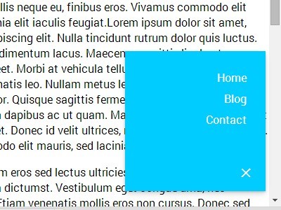
A jQuery/CSS3 navigation concept to create a Material Design inspired floating action button that morphs into a navigation panel when toggled.
How to use it:
1. Create a navigation menu with a toggle button.
<nav class="float-nav closed">
  <ul>
    <li><a href="#">Home</a></li>
    <li><a href="#">Blog</a></li>
    <li><a href="#">Contact</a></li>
  </ul>
  <a class="toggle" href="#">+</a>
</nav>
2. The CSS styles to make the floating navigation sticky at the bottom of the screen.
.float-nav {
  position: fixed;
  z-index: 1;
  bottom: 1.375em;
  right: 1.375em;
  overflow: hidden;
  width: 200px;
  height: 200px;
  padding: 1.375em;
  text-align: right;
  background: #0cf;
  border: 5px solid #0cf;
  box-shadow: 0 1px 2px rgba(0,0,0,0.2), 0 4px 10px rgba(0,0,0,0.15);
  -webkit-transition: all 300ms cubic-bezier(.6, -0.3, .3, 1.3);
  transition: all 300ms cubic-bezier(.6, -0.3, .3, 1.3);
}

.float-nav .toggle {
  position: absolute;
  bottom: 0;
  right: 0;
  width: 1.375em;
  height: 1.375em;
  font-size: 200%;
  line-height: 1.375em;
  font-weight: 300;
  text-align: center;
  -webkit-transform: rotate(45deg);
  -ms-transform: rotate(45deg);
  transform: rotate(45deg);
  -webkit-transform-origin: 50%;
  -ms-transform-origin: 50%;
  transform-origin: 50%;
  -webkit-transition: all 300ms;
  transition: all 300ms;
}
3. The CSS styles to rotate the toggle button using CSS3 transform.
.float-nav.closed .toggle {
  -webkit-transform: rotate(0);
  -ms-transform: rotate(0);
  transform: rotate(0);
}
4. The CSS/CSS3 to style the floating navigation with a morphing effect using CSS3 transitions.
.float-nav.closed {
  width: 0;
  height: 0;
  border: 5px solid #fff;
  border-radius: 50%;
}

.float-nav a {
  display: inline-block;
  color: #fff;
}

.float-nav > a { -webkit-tap-highlight-color: rgba(0,0,0,0); }


.float-nav ul {
  position: absolute;
  bottom: 4.125em;
  right: 1.375em;
  opacity: 1;
  list-style: none;
  -webkit-transition: all 300ms;
  transition: all 300ms;
}

.float-nav.closed ul { opacity: 0; }

.float-nav li {
  padding: 0.25em 0;
  margin-bottom: 0;
  -webkit-transition: all 600ms;
  transition: all 600ms;
}

.float-nav.closed li { margin-bottom: 1.375em; }
5. Load the needed jQuery JavaScript library at the end of the document.
<script src="//code.jquery.com/jquery-2.1.1.min.js"></script>
6. Active the floating navigation with a little bit JavaScript magic.
var floatNav = $('.float-nav'),
    mainContent = $('.main-content');

floatNav.on('click', function(e) {
  $(this).toggleClass('closed');
  e.stopPropagation();
  e.preventDefault();
});

mainContent.on('click', function() {
  if (!floatNav.hasClass('closed')) floatNav.addClass('closed');
});
This awesome jQuery plugin is developed by joshbade. For more Advanced Usages, please check the demo page or visit the official website.