Minimalist Responsive Push Menu with jQuery and CSS3
| File Size: | 5.76 KB |
|---|---|
| Views Total: | 4343 |
| Last Update: | |
| Publish Date: | |
| Official Website: | Go to website |
| License: | MIT |
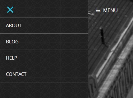
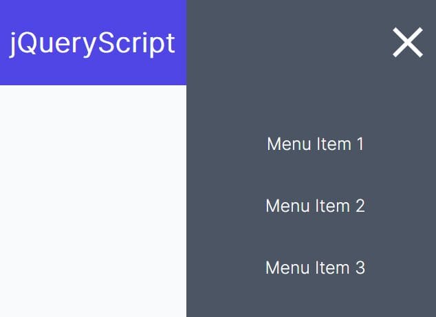
A jQuery & CSS3 based off-canvas navigation menu that pushes the main page to the right when toggled.
How to use it:
1. Create an off-canvas menu with a close menu as follows.
<div class="menu">

  <!-- Menu icon -->
  <div class="icon-close"> <img src="close.png"> </div>

  <!-- Menu -->
  <ul>
    <li><a href="#">Home</a></li>
    <li><a href="#">About</a></li>
    <li><a href="#">Blog</a></li>
    <li><a href="#">Contact</a></li>
  </ul>
</div>
2. Wrap your main content and the menu toggle button into a container.
<div class="main-content">
  <div class="icon-menu">
  Toggle Menu
  </div>
  ...
</div>
3. The basic CSS styles for the off-canvas menu.
body {
  left: 0;
  margin: 0;
  overflow: hidden;
  position: relative;
}

.menu {
  left: -285px;
  height: 100%;
  position: fixed;
  width: 285px;
}
4. Include the necessary jQuery library at the end of the document.
<script src="http://code.jquery.com/jquery-1.11.1.min.js"></script>
5. Enable the push menu.
var main = function() {
  $('.icon-menu').click( function() {
    $('.menu').animate( {
    left: '0px'
  }, 200);

  $('body').animate( {
    left: '285px'
    }, 200);
  });

  $('.icon-close').click( function() {
    $('.menu').animate( {
    left: '-285px'
  }, 200);

  $('body').animate({
    left: "0px"
    }, 200);
  });
};


$(document).ready(main);
This awesome jQuery plugin is developed by renhades. For more Advanced Usages, please check the demo page or visit the official website.