Mobile First Hamburger Menu Plugin For jQuery
| File Size: | 4.69 KB |
|---|---|
| Views Total: | 15665 |
| Last Update: | |
| Publish Date: | |
| Official Website: | Go to website |
| License: | MIT |
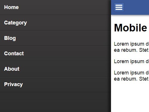
A jQuery & jQuery UI based navigation plugin helps you create an off-screen sidebar push menu with a hamburger toggle for your mobile website / web application.
How to use it:
1. Load the necessary jQuery and jQuery UI JavaScript libraries in your document.
<script src="jquery-2.1.4.min.js"></script>
<script src="jquery-ui.min.js"></script>
2. Load the jQuery Mobile Menu Hamburger plugin's JavaScript and CSS after jQuery library.
<script src="js/hamburger.js"></script>
<link rel="stylesheet" href="css/hamburger.css">
3. Create a hamburger button in the header.
<header>
  <div id="hamburger">
    <div></div>
    <div></div>
    <div></div>
  </div>
</header>
4. Create the mobile navigation that is hidden via CSS on page load.
<nav>
  <ul>
    <li><a href="#">Home</a></li>
    <li><a href="#">Category</a></li>
    <li><a href="#">Blog</a></li>
    <li><a href="#">Contact</a></li>
    <li><a href="#">About</a></li>
    <li><a href="#">Privacy</a></li>
  </ul>
</nav>
5. Create an empty DIV layer that will be layed over the content so that the content is unclickable while menu is shown.
<div id="contentLayer"></div>
6. Wrap your main content in the 'content' container.
<div id="content">
  ... main content of your website ...
</div>
This awesome jQuery plugin is developed by ymc-thzi. For more Advanced Usages, please check the demo page or visit the official website.