Mobile Push Menu with jQuery and CSS3 Transitions
| File Size: | 29.6 KB |
|---|---|
| Views Total: | 5135 |
| Last Update: | |
| Publish Date: | |
| Official Website: | Go to website |
| License: | MIT |
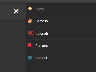
A simple implementation of responsive, mobile-friendly, off-canvas push menu using Html5, CSS3 and a little jQuery magic.
How to use it:
1. Create a regular nav menu from an unordered list.
<header>
  <nav class="nav">
    <ul class="nav-list">
      <li class="nav-item"><a href="#">Home</a></li>
      <li class="nav-item"><a href="#">Portfolio</a></li>
      <li class="nav-item"><a href="#">Settings</a></li>
      <li class="nav-item"><a href="#">Services</a></li>
      <li class="nav-item"><a href="#">Contact</a></li>
    </ul>
  </nav>
</header>
2. Insert a trigger button into the nav menu.
<button type="button" class="nav-trigger js-nav-trigger"><span></span><span></span><span></span></button>
3. Hide the trigger button & mobile push menu on the large screens.
.nav-trigger { display: none; }
.mobile-nav { display: none; }
4. Set the breakpoint using CSS3 media queries and style the mobile push menu whatever you want.
@media (max-width: 640px) {

header {
  right: 0;
  transition: right .5s;
}

.nav-trigger {
  display: block;
  position: absolute;
  right: 0;
  top: 8px;
  background: transparent;
  border: none;
}

.nav-trigger:focus { outline: none; }

.show-nav .nav-trigger { margin-top: 10px; }

.nav-trigger span {
  position: relative;
  display: block;
  width: 25px;
  height: 4px;
  margin: 4px 0;
  border-radius: 5px;
  background-color: #fff;
  transition: all .2s;
}

.show-nav .nav-trigger span:nth-child(1) { transform: rotate(405deg); }

.show-nav .nav-trigger span:nth-child(2) { opacity: 0; }

.show-nav .nav-trigger span:nth-child(3) {
  transform: rotate(-405deg);
  bottom: 16px;
}

.nav {
  position: absolute;
  right: 0;
  top: 0;
  margin-top: 0;
  width: 50px;
  height: 50px;
}

.nav-list { display: none; }

.mobile-nav .nav-list { display: block; }

.mobile-nav {
  display: block;
  background: #2a2a2a;
  position: absolute;
  left: 100%;
  bottom: 0;
  top: 0;
  width: 80%;
  transition: left .5s;
}

.show-nav .mobile-nav { left: 20%; }

.nav-item {
  width: 100%;
  border-bottom: 1px solid #333;
}

.nav-item a .fa {
  position: absolute;
  left: 10px;
  color: #fff;
  font-size: 18px;
}

.nav-item a {
  display: block;
  padding: 15px 20px 15px 40px;
  border: none;
}

.nav-list a { color: #fff !important; }

.show-nav header { right: 80%; }

}
5. The JQuery script to active the push menu on mobile devices (screen width < 640px).
jQuery(function($){


  $('body').append($('<div class="mobile-nav"></div>').html($('.nav--list').clone()));


  $('.js-nav-trigger').on('click',function(event){
    event.preventDefault();
    $('body').toggleClass('show-nav');
  });

});
This awesome jQuery plugin is developed by sethabbott. For more Advanced Usages, please check the demo page or visit the official website.