Mobile-friendly Multi-level Dropdown Menu Plugin - jQuery Stellarnav
| File Size: | 18.5 KB |
|---|---|
| Views Total: | 51196 |
| Last Update: | |
| Publish Date: | |
| Official Website: | Go to website |
| License: | MIT |
Stellarnav is an elegant, responsive, mobile-friendly dropdown menu plugin for jQuery that supports infinite levels of sub menus and auto switches to a small screen friendly toggle menu when the window width reaches a specified breakpoint.
More features:
- 3 themes: plain, light and dark.
- 4 position modes: top, static, left or right.
- Allows to make nav sticky on scroll.
- Auto fixes horizontal scrollbar issue on very long navs
How to use it:
1. The plugin requires Font Awesome iconic font to provide the menu toggle icons (Removed FontAwesome dependency since 11/15/2018).
<link rel="stylesheet" href="/path/to/font-awesome.min.css">
2. Load the jQuery Stellarnav plugin's files into your jQuery project as usual.
<link rel="stylesheet" href="stellarnav.min.css">
<script src='/path/to/jquery.min.js'></script>
<script src="stellarnav.js"></script>
3. Create a nested nav list for the responsive multi-level dropdown navigation.
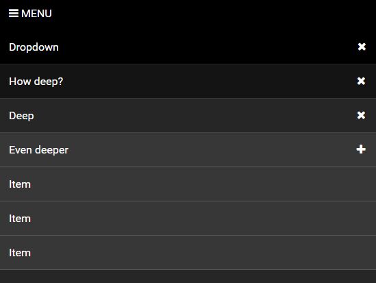
<div id="main-nav" class="stellarnav">
    <ul>
      <li><a href="">Dropdown</a>
          <ul>
            <li><a href="#">How deep?</a>
              <ul>
                <li><a href="#">Deep</a>
                  <ul>
                    <li><a href="#">Even deeper</a>
                      <ul>
                        <li><li><a href="#">Item</a></li></li>
                        <li><li><a href="#">Item</a></li></li>
                        <li><li><a href="#">Item</a></li></li>
                      </ul>
                    </li>
                    <li><a href="#">Item</a></li>
                    <li><a href="#">Item</a></li>
                    <li><a href="#">Item</a></li>
                  </ul>
                </li>
                <li><a href="#">Item</a></li>
                <li><a href="#">Item</a></li>
                <li><a href="#">Item</a></li>
                <li><a href="#">Item</a></li>
              </ul>
            </li>
            <li><a href="#">Item</a></li>
            <li><a href="#">Item</a></li>
            <li><a href="#">Here's a very long item. It can be as long as you want</a></li>
            <li><a href="#">Item</a></li>
          </ul>
        </li>
        <li><a href="">Item 2</a></li>
        <li><a href="">Item 3</a></li>
        <li><a href="">Item 4</a></li>
        <li><a href="">Item 5</a></li>
        <li><a href="">Item 6</a></li>
        <li class="drop-left"><a href="">Drop Left</a>
          <ul>
            <li><a href="#">How deep?</a>
              <ul>
                <li><a href="#">Deep</a>
                  <ul>
                    <li><a href="#">Even deeper</a>
                      <ul>
                        <li><li><a href="#">Item</a></li></li>
                        <li><li><a href="#">Item</a></li></li>
                        <li><li><a href="#">Item</a></li></li>
                      </ul>
                    </li>
                    <li><a href="#">Item</a></li>
                    <li><a href="#">Item</a></li>
                    <li><a href="#">Item</a></li>
                  </ul>
                </li>
                <li><a href="#">Item</a></li>
                <li><a href="#">Item</a></li>
                <li><a href="#">Item</a></li>
                <li><a href="#">Item</a></li>
              </ul>
            </li>
            <li><a href="#">Item</a></li>
            <li><a href="#">Item</a></li>
            <li><a href="#">Item</a></li>
            <li><a href="#">Item</a></li>
          </ul>
        </li>
    </ul>
</div>
4. Invoke the plugin with default settings and we're done.
jQuery('#main-nav').stellarNav();
5. Default plugin settings to config the responsive multi-level dropdown navigation.
jQuery('#main-nav').stellarNav({

  // adds default color to nav. (light, dark)
  theme     : 'plain',

  // number in pixels to determine when the nav should turn mobile friendly
  breakpoint: 768,

  // label for the mobile nav
  menuLabel: 'Menu',

  // adds a click-to-call phone link to the top of menu - i.e.: "18009084500"
  phoneBtn: false,

  // adds a location link to the top of menu - i.e.: "/location/", "http://site.com/contact-us/"
  locationBtn: false,

  // makes nav sticky on scroll
  sticky     : false,

  // how fast the dropdown should open in milliseconds
  openingSpeed: 250,

  // controls how long the dropdowns stay open for in milliseconds
  closingDelay: 250,

  // 'static', 'top', 'left', 'right'
  position: 'static',

  // shows dropdown arrows next to the items that have sub menus
  showArrows: true,

  // adds a close button to the end of nav
  closeBtn     : false,

  // fixes horizontal scrollbar issue on very long navs
  scrollbarFix: false,

  // enables mobile mode
  mobileMode: false

});
Changelog:
2019-01-30
- Added labels to location, phone and close buttons
2018-11-15
- Removed FontAwesome dependency, added new options, imrpoved performance, and general fixes.
2018-03-17
- v2.3: Added new features
2017-10-25
- Fixed nav closing on mobile bug
2017-10-06
- Added 'left' and 'right' position options
2017-07-13
- Fixed the issue of nav opening in mobile mode when opening links on new tabs
2017-04-14
- moved phone and location buttons to menu bar
2017-01-26
- Fixed issue with desktop and mobile css classes
2017-01-12
- Adjusted the .drop-left css class
2016-12-22
- update.
This awesome jQuery plugin is developed by vinnymoreira. For more Advanced Usages, please check the demo page or visit the official website.


