Responsive and Cross-platform jQuery Navigation Menu Plugin - Smart Menus
| File Size: | 245 KB |
|---|---|
| Views Total: | 53232 |
| Last Update: | |
| Publish Date: | |
| Official Website: | Go to website |
| License: | MIT |
Smart Menus is a jQuery Navigation Menu plugin for creating responsive and cross-platform multi-level dropdown menus for your site navigation. It comes with a lot of options for customizing your menus and supports all devices such as desktop, tablet, mobile, etc. Please resize the demo page to see how it works on mobile devices.
Features:
- Responsive and mobile-friendly
- Cross browser. Supports all major browsers.
- Vertical or horizontal menus
- Supports mega menu contents
- Supports events and methods
- Supports drop down animations
See Also:
- 10 Best Responsive Dropdown Menus In JavaScript & CSS
- 10 Best Responsive Menu Systems In jQuery/JavaScript/CSS
Addons available:
- smartmenus-bootstrap: For Bootstrap 3
- smartmenus-bootstrap-4: For Bootstrap 4
- smartmenus-keyboard: Keyboard addon
Table Of Contents:
- Installation
- Options
- Data attributes
- Methods
- Events
How to use it:
1. Include jQuery library and the jQuery Smart Menus plugin on the web page.
<!-- Core -->
<script src="/path/to/cdn/jquery.min.js"></script>
<script src="/path/to/dist/jquery.smartmenus.min.js"></script>

<!-- Addons -->
<script src="/path/to/dist/addons/bootstrap-4/jquery.smartmenus.bootstrap-4.min.js"></script>
<script src="/path/to/dist/addons/bootstrap/jquery.smartmenus.bootstrap.min.js"></script>
<script src="/path/to/dist/addons/keyboard/jquery.smartmenus.keyboard.min.js"></script>
2. Include the jQuery Smart Menus' core on the page.
<link href="/path/to/dist/css/sm-core-css.css" rel="stylesheet" />
3. Include a theme CSS of your choice on the page.
<!-- Blue Theme -->
<link href="/path/to/dist/css/sm-blue/sm-blue.css" rel="stylesheet" />

<!-- Clean Theme -->
<link href="/path/to/dist/css/sm-clean/sm-clean.css" rel="stylesheet" />

<!-- Mint Theme -->
<link href="/path/to/dist/css/sm-mint/sm-mint.css" rel="stylesheet" />

<!-- Simple Theme -->
<link href="/path/to/dist/css/sm-simple/sm-simple.css" rel="stylesheet" />
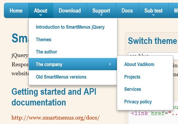
4. The required HTML structure for the smart menu.
<ul id="main-menu" class="sm sm-blue">
  <li><a href="#">Home</a></li>
  <li><a href="#">About</a>
  <ul>
    <li><a href="#">Introduction to SmartMenus jQuery</a></li>
    <li><a href="#">Themes</a></li>
    <li><a href="#">The author</a></li>
    <li><a href="#">The company</a>
  </ul>
  <ul>
    <li><a href="#">About Vadikom</a></li>
    <li><a href="#">Projects</a></li>
    <li><a href="#">Services</a></li>
    <li><a href="#">Privacy policy</a></li>
  </ul>
  </li>
  <li><a href="#">Old SmartMenus versions</a></li>
  ...
</ul>
5. Call the plugin on the top container. Done.
$(function() {
  $('#main-menu').smartmenus({
    // options here
  });
});
6. All default options to customize the smart menu.
isPopup:false: is this a popup menu (can be shown via the popupShow/popupHide methods) or a permanent menu barmainMenuSubOffsetX:0: pixels offset from default positionmainMenuSubOffsetY:0: pixels offset from default positionsubMenusSubOffsetX:0: pixels offset from default positionsubMenusSubOffsetY:0: pixels offset from default positionsubMenusMinWidth:'10em': min-width for the sub menus (any CSS unit) - if set, the fixed width set in CSS will be ignoredsubMenusMaxWidth:'20em': max-width for the sub menus (any CSS unit) - if set, the fixed width set in CSS will be ignoredsubIndicators: true: create sub menu indicators - creates a SPAN and inserts it in the AsubIndicatorsPos: 'prepend': position of the SPAN relative to the menu item content ('prepend', 'append')subIndicatorsText:'+': [optionally] add text in the SPAN (e.g. '+') (you may want to check the CSS for the sub indicators too)scrollStep: 30: pixels step when scrolling long sub menus that do not fit in the viewport heightscrollAccelerate:true: accelerate scrolling or use a fixed stepshowTimeout:250: timeout before showing the sub menushideTimeout:500: timeout before hiding the sub menusshowDuration:0: duration for show animation - set to 0 for no animation - matters only if showFunction:nullshowFunction:null: custom function to use when showing a sub menu (the default is the jQuery 'show'). Don't forget to call complete() at the end of whatever you do e.g.: function($ul, complete) { $ul.fadeIn(250, complete); }hideDuration:0: duration for hide animation - set to 0 for no animation - matters only if hideFunction:nullhideFunction:function($ul, complete) { $ul.fadeOut(200, complete); }: custom function to use when hiding a sub menu (the default is the jQuery 'hide'). Ddon't forget to call complete() at the end of whatever you doe.g.: function($ul, complete) { $ul.fadeOut(250, complete); }collapsibleShowDuration:0: duration for show animation for collapsible sub menus - matters only if collapsibleShowFunction:nullcollapsibleShowFunction:function($ul, complete) { $ul.slideDown(200, complete); }: custom function to use when showing a collapsible sub menu (i.e. when mobile styles are used to make the sub menus collapsible)collapsibleHideDuration:0: duration for hide animation for collapsible sub menus - matters only if collapsibleHideFunction:nullcollapsibleHideFunction:function($ul, complete) { $ul.slideUp(200, complete); }: custom function to use when hiding a collapsible sub menu (i.e. when mobile styles are used to make the sub menus collapsible)showOnClick:false: show the first-level sub menus onclick instead of onmouseover (matters only for mouse input)hideOnClick:true: hide the sub menus on click/tap anywhere on the pagenoMouseOver: false: disable sub menus activation onmouseover (i.e. behave like in touch mode - use just mouse clicks) (matters only for mouse input)keepInViewport:true: reposition the sub menus if needed to make sure they always appear inside the viewportkeepHighlighted:true: keep all ancestor items of the current sub menu highlighted (adds the 'highlighted' class to the A's)markCurrentItem:false: automatically add the 'current' class to the A element of the item linking to the current URLmarkCurrentTree:true: add the 'current' class also to the A elements of all ancestor items of the current itemrightToLeftSubMenus:false: right to left display of the sub menus (check the CSS for the sub indicators' position)bottomToTopSubMenus:false: bottom to top display of the sub menuscollapsibleBehavior: 'default': parent items behavior in collapsible (mobile) view ('default', 'toggle', 'link', 'accordion', 'accordion-toggle', 'accordion-link'). 'default' - first tap on parent item expands sub, second tap loads its link. 'toggle' - the whole parent item acts just as a toggle button for its sub menu (expands/collapses on each tap). 'link' - the parent item acts as a regular item (first tap loads its link), the sub menu can be expanded only via the +/- button. 'accordion' - like 'default' but on expand also resets any visible sub menus from deeper levels or other branches. 'accordion-toggle' - like 'toggle' but on expand also resets any visible sub menus from deeper levels or other branches. 'accordion-link' - like 'link' but on expand also resets any visible sub menus from deeper levels or other branchesbootstrapHighlightClasses:'text-dark bg-light': Custom option(s) for the Bootstrap 4 addon
7. HTML data attributes.
<!-- Horizontal Sub Menus -->
<li data-sm-horizontal-sub="true">
  <a href="#">Item</a>
  <ul>
    <li><a href="#">Sub item 1</a></li>
    <li><a href="#">Sub item 2</a></li>
    ...
  </ul>
</li>

<!-- Pass options via data attributes -->
<ul id="main-menu" class="sm sm-blue"
    data-sm-options='{}'>
    ...
</ul>

<!-- Reverse the horizontal alignment of a specific sub menu -->
<li data-sm-reverse="true">
  <a href="#">Item</a>
  <ul>
    <li><a href="#">Sub item 1</a></li>
    <li><a href="#">Sub item 2</a></li>
    ...
  </ul>
</li>

<!-- Tells the script to skip this navbar and not apply any SmartMenus features to it so it will behave like a regular Bootstrap navbar. -->
<ul class="nav navbar-nav" data-sm-skip="true">
  ...
</ul>

<!-- Tells the script to not apply SmartMenus' specific behavior to this navbar in collapsible mode (mobile view). -->
<ul class="nav navbar-nav" data-sm-skip-collapsible-behavior="true">
  ...
</ul>
8. API methods.
// destroy all menus
$.SmartMenus.destroy();

// hide all sub menus
$.SmartMenus.hideAll();

// destroy a menu
$('#main-menu').smartmenus('destroy');

// disable the menu
$('#main-menu').smartmenus('disable');

// disable the menu but don't display an overlay over the main menu
$('#main-menu').smartmenus('disable', true);

// enable the menu
$('#main-menu').smartmenus('enable');

// activate the item
$('#main-menu').smartmenus('itemActivate', $('a#myItem'));

// activate the item and focus it
$('#main-menu').smartmenus('itemActivate', $('a#myItem'));
$('a#myItem')[0].focus();

// hide all sub menus
$('#main-menu').smartmenus('menuHideAll');

// hide a popup menu
$('#popup-menu').smartmenus('popupHide');

// hide a popup menu immediately without a delay
$('#popup-menu').smartmenus('popupHide', true);

// show the popup at left:100px;top:100px;
$('#popup-menu').smartmenus('popupShow', '100px', '100px');

// show the popup right below some target element
var $targetElm = $('#targetElm'),
    targetOffset = $targetElm.offset();
$('#popup-menu').smartmenus('popupShow', targetOffset.left, targetOffset.top + $targetElm.outerHeight());

// refresh the menu after the DOM operations
$('#main-menu').smartmenus('refresh');

// set focus on an item
$('a#myItem')[0].focus();

// blur an item
$('a#myItem')[0].blur();
9. Events.
$('#main-menu').on('activate.smapi', function(e, item) {
  // do something
});

$('#main-menu').on('beforefirstshow.smapi', function(e, menu) {
  // do something
})

$('#main-menu').on('beforehide.smapi', function(e, menu) {
  // do something
});

$('#main-menu').on('beforeshow.smapi', function(e, menu) {
  // do something
});

$('#main-menu').on('blur.smapi', function(e, item) {
  // check namespace if you need to differentiate from a regular DOM event fired inside the menu tree
  if (e.namespace == 'smapi') {
    // your handler code
  }
});

$('#main-menu').on('click.smapi', function(e, item) {
  // check namespace if you need to differentiate from a regular DOM event fired inside the menu tree
  if (e.namespace == 'smapi') {
    // your handler code
  }
});

$('#main-menu').on('focus.smapi', function(e, item) {
  // check namespace if you need to differentiate from a regular DOM event fired inside the menu tree
  if (e.namespace == 'smapi') {
    // your handler code
  }
});

$('#main-menu').on('hide.smapi', function(e, menu) {
  // do something
});

$('#main-menu').on('hideAll.smapi', function(e) {
  // do something
});

$('#main-menu').on('mouseenter.smapi', function(e, item) {
  // check namespace if you need to differentiate from a regular DOM event fired inside the menu tree
  if (e.namespace == 'smapi') {
    // your handler code
  }
});

$('#main-menu').on('mouseleave.smapi', function(e, item) {
  // check namespace if you need to differentiate from a regular DOM event fired inside the menu tree
  if (e.namespace == 'smapi') {
    // your handler code
  }
});

$('#main-menu').on('select.smapi', function(e, item) {
  // do something
});

$('#main-menu').on('show.smapi', function(e, menu) {
  // do something
});
Changelog:
2022-11-04
- Combine addons
- Update doc.
v4.5.0 (2020-07-23)
- fix: Mouse input not detected correctly on Windows when pointer speed is set to any of the fastest 2 options and additionally "Enhance pointer precision" is unchecked
v4.5.0 (2020-07-23)
- fix: Mouse input not detected correctly on Windows when pointer speed is set to any of the fastest 2 options and additionally "Enhance pointer precision" is unchecked
- fix: Avoid Content Security Policy issue when valid JSON is used as "data-sm-options" value #88
- fix: "showOnClick: true" should not affect collapsible mode behavior in any way
- fix: Remove SHJS syntax highlighter source code from the repo
- fix: Problem with markCurrentTree in megamenu #86
- fix: Uncaught TypeError when clicking on items (that do not have a sub menu in certain cases) in collapsible mode
2017-12-08
- fix: Uncaught TypeError when clicking on items (that do not have a sub menu in certain cases) in collapsible mode
v1.1.0 (2017-09-18)
- Added addons.
v1.0.1 (2016-11-02)
- Added support for the data-sm-options attribute on the root <ul> element
v1.0.0(2016-01-27)
- added AMD/CommonJS compatibility for the plugin and the addons
v0.9.7(2015-06-01)
- go mobile first - notable changes in the script, core CSS and themes
v0.9.7(2014-08-25)
- allow scrolling long sub menus via touch for fixed positioned menu bars
v0.9.6(2014-03-27)
- new theme "sm-mint"
v0.9.6beta (2014-03-21)
- fix: mainMenuSubOffsetY was not honored when bottomToTopSubMenus: true (mainMenuSubOffsetX was used instead)
v0.9.6 (2014-02-22)
- fix: Bootstrap addon now works in jQuery.noConflict() mode
v0.9.5 (2014-01-19)
- Added Bootstrap Addon.
v0.9.4 (2013-12-01)
- Added Keyboard Addon which you can optionally include on your pages in addition to the SmartMenus jQuery plugin.
This awesome jQuery plugin is developed by vadikom. For more Advanced Usages, please check the demo page or visit the official website.


