Responsive Header Navigation Plugin For jQuery - Menu.js
| File Size: | 7.44 KB |
|---|---|
| Views Total: | 6717 |
| Last Update: | |
| Publish Date: | |
| Official Website: | Go to website |
| License: | MIT |
Yet another jQuery plugin for responsive, multi-level site navigation that automatically transforms the default nav list into a fullscreen, user-friendly hamburger menu in mobile view.
How to use it:
1. Create a normal multi-level dropdown menu from nested html lists:
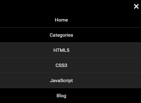
<div class="ve-menu">
  <ul class="ve-menu-pc">
    <li><a href="#">Home</a></li>
    <li><a href="#">Categories</a>
      <ul>
        <li><a href="#">HTML5</a></li>
        <li><a href="#">CSS3</a></li>
        <li><a href="#">JavaScript</a></li>
      </ul>
    </li>
    <li><a href="#">Blog</a></li>
    <li><a href="#">Contact</a></li>
    <li><a href="#">About</a></li>
  </ul>
</div>
2. Load the required JavaScript and CSS files into your document.
<link rel="stylesheet" href="menu.css">
<script src="//code.jquery.com/jquery.min.js"></script>
<script src="menu.js"></script>
3. Optionally, you can load the FastClick library to remove click delays on browsers with touch UIs.
<script src="fastclick.min.js"></script>
4. Initialize the responsive menu with default settings.
$('.ve-menu').menu();
5. Config the responsive menu by passing the following parameters as a JS object to the menu() method.
$('.ve-menu').menu({
  firstFontSize: '16px',
  secondFontSize: '16px',
  height: 40,
  itemWidth: 20,
  itemMargin: 1,
  theme: 'blue', // or dark
  menuIconColor: '#000',
  menuMaskColor: '#000',
  mFirstBgColor: '#000',
  mFirstFontColor: '#fff',
  mSecondBgColor: '#222',
  mSecondFontColor: '#fff',
  closeIconColor: '#fff',
  animate: false,
  speed: 200
});
Change log:
2017-05-20
- bugfix
This awesome jQuery plugin is developed by DreamOn324. For more Advanced Usages, please check the demo page or visit the official website.


