Responsive Mobile Menu Plugin For jQuery - Simple Mobile Menu
| File Size: | 12.7 KB |
|---|---|
| Views Total: | 14754 |
| Last Update: | |
| Publish Date: | |
| Official Website: | Go to website |
| License: | MIT |
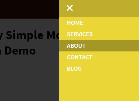
A responsive, mobile-first jQuery menu plugin which converts the normal header navigation into a toggleable sliding menu on mobile devices. Also known as 'off-canvas menu' or 'revealing menu'.
How to use it:
1. Load the OPTIONAL ionicons for menu toggle icons.
<link rel="stylesheet" href="path/to/ionicons.min.css">
2. Create a header navigation for your project.
<header class="cf">
  <div class="logo">logo</div>
  <div class="navigation">
    <nav>
      <a href="javascript:void(0)" class="smobitrigger ion-navicon-round"><span>Menu</span></a>
      <ul class="mobimenu">
        <li><a href="">Home</a></li>
        <li><a href="">Services</a></li>
        <li><a href="">About</a></li>
        <li><a href="">Contact</a></li>
        <li><a href="">Blog</a></li>
      </ul>
    </nav>
  </div>
</header>
3. The default CSS styles for the header navigation.
.smobitrigger, .mnuclose { display: none; }

header { background: #441B0A; }

.logo { float: left; }

.navigation { float: right; }

.navigation nav ul {
  padding: 0px;
  margin: 0px;
  list-style: none;
}

.navigation nav ul li { display: inline-block; }

.navigation nav ul li a {
  color: #fff;
  font-weight: 600;
  display: inline-block;
  text-transform: uppercase;
  text-decoration: none;
  padding: 15px 20px;
  transition: 0.5s;
  -webkit-transition: 0.5s;
  -moz-transition: 0.5s;
  -ms-transition: 0.5s;
  -o-transition: 0.5s;
}

.navigation nav ul li a:hover {
  background: rgb(234, 214, 54);
  color: #441B0A;
}
4. The required styles for the menu that works on mobile devices (screen size < 768px).
@media all and (max-width : 768px) {

.smobitrigger, .mnuclose { display: inline-block; }

.smobitrigger {
  color: #fff;
  font-size: 30px;
  line-height: 12px;
  padding: 10px;
}

.mnuclose {
  font-size: 20px;
  padding: 10px 20px;
  width: 100%;
  background: rgba(0, 0, 0, 0.18);
}

.smobitrigger span, .mnuclose span {
  font: 0/0 a;
  text-shadow: none;
  color: transparent;
}

.navigation nav ul {
  padding-bottom: 40px;
  overflow-y: auto;
}

.navigation nav ul li, .navigation nav ul li a { width: 100%; }

.navigation nav ul li a {
  padding-top: 5px;
  padding-bottom: 5px;
}

.navigation nav ul li a:hover { background: rgba(0, 0, 0, 0.29); }

.mobimenu {
  list-style: none;
  padding: 20px;
  margin: 0px;
  width: 210px;
  position: fixed;
  height: 100%;
  top: 0px;
  right: -250px;
}

.mnuopn { right: 0px !important; }

.ovrActv {
  position: fixed;
  background: rgba(0, 0, 0, 0.79);
  width: 100%;
  height: 100%;
  z-index: 9998;
  transition: 0.5s;
  -webkit-transition: 0.5s;
  -moz-transition: 0.5s;
  -ms-transition: 0.5s;
  -o-transition: 0.5s;
}
}
5. Include jQuery library and the jQuery Simple Mobile Menu plugin at the bottom of the webpage.
<script src="//code.jquery.com/jquery-1.11.3.min.js"></script>
<script src="js/simpleMobileMenu.js"></script>
6. Enable the mobile menu with default settings.
$('.smobitrigger').smplmnu();
7. Available plugin options.
// background color
background: "#EAD636",

// animation speed
speed: "0.5s",

// text color
textColor: "#fff"
This awesome jQuery plugin is developed by Subhojit1992. For more Advanced Usages, please check the demo page or visit the official website.


