Responsive Mobile Off-canvas Menu with jQuery and CSS3
| File Size: | 3.35 KB |
|---|---|
| Views Total: | 3753 |
| Last Update: | |
| Publish Date: | |
| Official Website: | Go to website |
| License: | MIT |
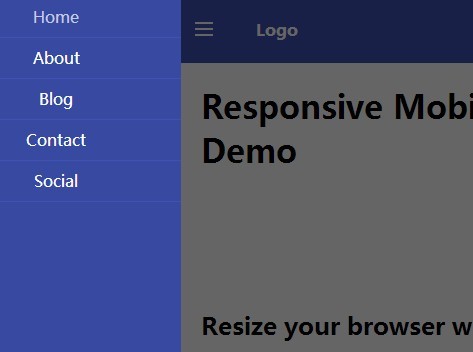
A jQuery & CSS3 based responsive menu system that automatically turns the horizontal navigation menu into a mobile App-style off-canvas menu on small screens. Also known as mobile menu, toggle menu, and push menu.
How to use it:
1. Create a hamburg icon to toggle the off-canvas menu.
<a href="#" class="header__icon" id="header__icon"></a>
2. Create a regular navigation menu using Html list.
<nav class="menu">
  <a href="#">Home</a>
  <a href="#">About</a>
  <a href="#">Blog</a>
  <a href="#">Contact</a>
  <a href="#">Social</a>
</nav>
3. Wrap your main content into a container with CSS class of 'site-content'.
<div class="site-content">
  <div class="container">
       ...
  </div>
</div>
4. The full markup structure should be like this:
<div class="site-pusher">

  <header class="header">

    <a href="#" class="header__icon" id="header__icon"></a>

    <nav class="menu">
    <a href="#">Home</a>
    <a href="#">About</a>
    <a href="#">Blog</a>
    <a href="#">Contact</a>
    <a href="#">Social</a>
    </nav>

  </header>

  <div class="site-content">
    <div class="container">
    ...
  </div>

</div>
5. The CSS styles for the horizontal navigation.
.header {
  position: fixed;
  left: 0;
  right: 0;
  height: 66px;
  line-height: 66px;
  color: #fff;
  background-color: #3f51b5;
}

.menu {
  float: left;
}
.menu a {
  padding: 0 10px;
}

.menu a:hover {
  color: #c5cae9;
}
6. The CSS/CSS3 styles for the off-canvas menu on mobile devices. You can custom the breakpoint in CSS3 media queries.
@media only screen and (max-width: 768px) {

.site-pusher,
 .site-container { height: 100%; }

.site-container { overflow: hidden; }

.site-pusher {
  -webkit-transition-duration: 0.3s;
  transition-duration: 0.3s;
  -ms-transform: translateX(0px);
  -webkit-transform: translateX(0px);
  transform: translateX(0px);
}

.site-content {
  position: absolute;
  top: 66px;
  right: 0;
  left: 0;
  bottom: 0;
  padding-top: 0;
  overflow-y: scroll;
  -webkit-overflow-scrolling: touch;
}

.header { position: static; }

.header__icon {
  position: relative;
  display: block;
  float: left;
  width: 50px;
  height: 66px;
  cursor: pointer;
}

.header__icon:after {
  content: '';
  position: absolute;
  display: block;
  width: 1rem;
  height: 0;
  top: 16px;
  left: 15px;
  box-shadow: 0 10px 0 1px #fff, 0 16px 0 1px #fff, 0 22px 0 1px #fff;
}

.menu {
  position: absolute;
  left: 0;
  top: 0;
  bottom: 0;
  background-color: #3849a2;
  width: 250px;
  -ms-transform: translateX(-250px);
  -webkit-transform: translateX(-250px);
  transform: translateX(-250px);
}

.menu a {
  display: block;
  height: 40px;
  text-align: center;
  line-height: 40px;
  border-bottom: 1px solid #3f51b5;
}

.with--sidebar .site-pusher {
  -ms-transform: translateX(250px);
  -webkit-transform: translateX(250px);
  transform: translateX(250px);
}

.with--sidebar .site-cache {
  position: absolute;
  top: 0;
  left: 0;
  right: 0;
  bottom: 0;
  background-color: rgba(0, 0, 0, 0.6);
}
}
7. Include the jQuery library at the end of the document.
<script src="//code.jquery.com/jquery-1.11.1.min.js"></script>
8. Active the off-canvas menu.
$(document).ready(function(){

  (function($) {

    $('#header__icon').click(function(e){
      e.preventDefault();
      $('body').toggleClass('with--sidebar');
    });

    $('#site-cache').click(function(e){
      $('body').removeClass('with--sidebar');
    });

  })(jQuery);

});
This awesome jQuery plugin is developed by hanlinC. For more Advanced Usages, please check the demo page or visit the official website.