Responsive Multilevel Dropdown Menu with jQuery and CSS3
| File Size: | 3.69 KB |
|---|---|
| Views Total: | 18861 |
| Last Update: | |
| Publish Date: | |
| Official Website: | Go to website |
| License: | MIT |
A jQuery and CSS powered responsive multi-level dropdown menu that utilizes media queries to detect the screen size and collapses the dropdown menu into an off-canvas push menu on mobile viewport sizes ( less than 767px).
How to use it:
1. Create a hamburger toggle for the off-canvas menu (Requires Font Awesome loaded in the header).
<a id="toggle" href="#"><i class="fa fa-bars"></i></a>
2. Create an overlay that covers the whole page when the off-canvas menu is toggled.
<div id="overlay"></div>
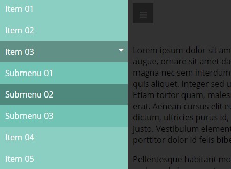
3. Create a multilevel navigation using nested html lists.
<nav id="menu">
  <ul>
    <li><a href="#">Item 01</a></li>
    <li><a href="#">Item 02</a></li>
    <li><a href="#">Item 03</a></li>
    <li><a href="#">Item 04</a>
      <ul>
        <li><a href="#">Submenu 01</a></li>
        <li><a href="#">Submenu 02</a></li>
        <li><a href="#">Submenu 03</a></li>
      </ul>
    </li>
    <li><a href="#">Item 05</a></li>
  </ul>
</nav>
4. Wrap your main content into the container '#content'.
<main id="content">
  ...
</main>
5. The core CSS styles for the horizontal dropdown menu.
main#content { padding: 10px; }

#menu {
  text-align: center;
  transition: all ease-out 0.3s;
}

#menu a { color: white; }

#menu ul {
  margin: 0;
  padding: 0;
  background-color: rgba(0, 102, 153, 0.5);
}

#menu ul li {
  display: inline-block;
  position: relative;
}

#menu ul li > a {
  display: inline-block;
  padding: 10px;
}

#menu ul li > a > i {
  margin-left: 15px;
  transition: all ease-out 0.3s;
  -webkit-transition: all ease-out 0.1s;
}

#menu ul li ul {
  display: none;
  position: absolute;
  top: 38px;
  width: 200px;
  text-align: left;
}

#menu ul li ul li { display: block; }

#menu ul li ul li a { display: block; }

#menu ul li:hover > a { background-color: rgba(0, 0, 0, 0.2); }

#menu ul li:hover > a > i { transform: rotateZ(90deg); }

#menu ul li:hover ul { display: block; }
6. The core CSS styles for the off-canvas push menu on mobile devices. Use the CSS3 media queries to specify the breakpoint that triggers the off-canvas menu.
div#overlay { display: none; }

a#toggle {
  position: fixed;
  top: 10px;
  left: 10px;
  width: 40px;
  height: 40px;
  background-color: rgba(0, 0, 0, 0.4);
  text-align: center;
  color: white;
  display: none;
  transition: all ease-out 0.3s;
}

a#toggle i {
  position: relative;
  top: 50%;
  transform: translateY(-50%);
}

@media screen and (max-width: 767px) {

a#toggle { display: block; }

main#content {
  margin-top: 65px;
  transition: all ease-out 0.3s;
}

#menu {
  position: fixed;
  width: 250px;
  height: 100%;
  top: 0;
  left: 0;
  overflow: hidden;
  overflow-y: auto;
  background-color: rgba(0, 102, 153, 0.5);
  transform: translateX(-250px);
}

#menu ul {
  text-align: left;
  background-color: transparent;
}

#menu ul li { display: block; }

#menu ul li a { display: block; }

#menu ul li a > i { float: right; }

#menu ul li ul {
  display: none;
  position: static;
  width: 100%;
  background-color: rgba(0, 102, 153, 0.2);
}

#menu ul li:hover > ul { display: none; }

#menu ul li:hover > a > i { transform: rotateZ(0); }

#menu ul li.open > a { background-color: rgba(0, 0, 0, 0.3); }

#menu ul li.open > a > i { transform: rotateZ(90deg); }

#menu ul li.open > ul { display: block; }

div#overlay {
  display: block;
  visibility: hidden;
  position: fixed;
  left: 0;
  top: 0;
  width: 100%;
  height: 100%;
  background-color: rgba(0, 0, 0, 0.8);
  transition: all ease-out 0.3s;
  z-index: 1;
  opacity: 0;
}

html.open-menu { overflow: hidden; }

html.open-menu div#overlay {
  visibility: visible;
  opacity: 1;
  width: calc(-150%);
  left: 250px;
}

html.open-menu a#toggle,
 html.open-menu main#content { transform: translateX(250px); }

html.open-menu nav#menu {
  z-index: 3;
  transform: translateX(0);
}

}
7. Load the latest version of jQuery library in your web page.
<script src="//code.jquery.com/jquery-2.1.4.min.js"></script>
8. The core JavaScript to toggle CSS classed based on screen sizes.
(function($){
  var ico = $('<i class="fa fa-caret-right"></i>');
  $('nav#menu li:has(ul) > a').append(ico);

  $('nav#menu li:has(ul)').on('click',function(){
    $(this).toggleClass('open');
  });

  $('a#toggle').on('click',function(e){
    $('html').toggleClass('open-menu');
    return false;
  });


  $('div#overlay').on('click',function(){
    $('html').removeClass('open-menu');
  })

})(jQuery)
This awesome jQuery plugin is developed by andrecavallari. For more Advanced Usages, please check the demo page or visit the official website.


