Responsive Revealing Navigation Menu Plugin For jQuery - mobTabMenu
| File Size: | 19.1 KB |
|---|---|
| Views Total: | 3975 |
| Last Update: | |
| Publish Date: | |
| Official Website: | Go to website |
| License: | MIT |
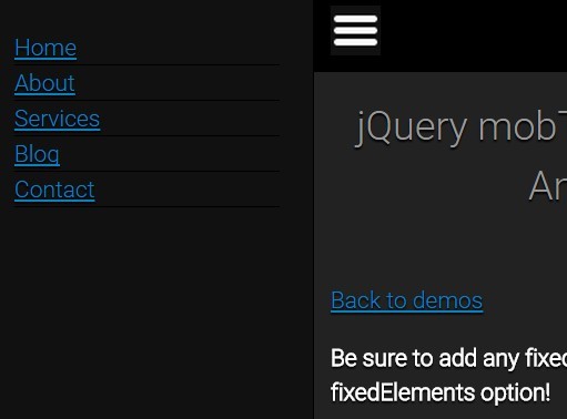
mobTabMenu is a jQuery responsive revealing menu plugin designed for both mobile and desktop websites to make your site navigation more user friendly.
More Examples:
Features:
- Can be positioned anywhere on your webpage: top, left or right.
- Reveals an off-canvas menu when you clicked on the toggle icon.
- Also can be implement as a 'push menu' that will push your site content to the other side when the menu is toggled.
- Custom slide-out animations.
- A plenty of options & callbacks to fit your special design needs.
Basic usage:
1. Load the jQuery mobTabMenu plugin and other dependencies in the document.
<script src="jquery.min.js"></script>
<script src="jQuery.easing.js"></script>
<script src="js/jQuery.mobTabMenu.js"></script>
<link rel="stylesheet" href="css/mobTabMenu.css">
2. Create a navigation menu that's hidden on page load.
<nav id="mobile-menu">
  <a href="#">Home</a>
  <a href="#">Services</a>
  <a href="#">About</a>
  <a href="#">Blog</a>
  <a href="#">Contact</a>
</nav>
3. Create a toggle button for the navigation menu.
$('nav#mobile-menu').mobTabMenu({

  position: 'right'

});
4. Call the plugin and setup the position option.
<div id="mobile-bar">
  <a href="#" class="mob-tab-menu-toggle"></a>
</div>
5. Configuration options available.
$('nav#mobile-menu').mobTabMenu({

// Elements that need animating separately (fixed positioned elements)
fixedElements: null,

// Same as above but the animated property is inverted
// e.g. if the position property is set to 'top', 'bottom' will be animated
invertedFixedElements: null,

// If set to an int, the menu will hide when the browser width exceeds this value
hideMenuOnResize: false,

// Elements that trigger the open/close of the menu (usually anchor tags)
toggleElements: '.mob-tab-menu-toggle',

// Links that trigger the open of the menu
openElements: '.mob-tab-menu-open',

 // Links that trigger the close of the menu
closeElements: '.mob-tab-menu-close',

// Toggle event
toggleEvent: 'click',

// Class added to trigger elements when menu is open
activeClass: 'mob-tab-menu-active',

// Animation speed, 0 for toggle
speed:  0,

// The position of the menu
// 'default' | 'left' | 'top' | 'right'
position: 'left',

// Whether to animate the page content along with the menu
animateBody: false,

// Easing effects. Required jQuery easing plugin.
easing: '',

// Prevent FOUC (Flash Of Unwanted Content); requires you add style="display: none;" to your menu
preventFOUC: true,

// callbacks
onInit: function() {},  on initialised
onOpened: function() {},  // on menu opened
onClosed: function() {},  // on menu closed
onToggled: function() {},  // on menu opened/closed
onBeforeOpen: function() {},  // on before menu opened
onBeforeClose: function() {},  // on before menu closed
onBeforeToggle: function() {},  // on before menu opened/closed

});
Change log:
2015-07-05
- add preventFOUC option
2015-05-22
- Prevents FOUC, more efficent variable use
This awesome jQuery plugin is developed by texelate. For more Advanced Usages, please check the demo page or visit the official website.


