Responsive Site Navigation with jQuery and Checkbox Hack
| File Size: | 2.13 KB |
|---|---|
| Views Total: | 7024 |
| Last Update: | |
| Publish Date: | |
| Official Website: | Go to website |
| License: | MIT |
A fully responsive, mobile-friendly navigation menu built using HTML5, CSS3, the Checkbox Hack" tricks and a little jQuery magic. jQuery is used to detect the screen size and then add a smooth sliding animation to the responsive menu when toggled.
How to use it:
1. Create a site navigation from a nav list using checkbox + input label tricks.
<input type="checkbox" id="toggle">
<nav id="site-nav" class="site-nav">
<div class="container">
<label class="navBars" for="toggle">
<i class="fa fa-bars"></i>
</label>
<ul id="menu" class="menu">
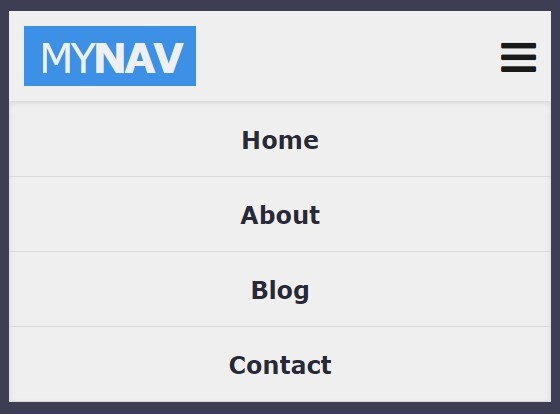
<li><a href="#">Home</a></li>
<li><a href="#">About</a></li>
<li><a href="#">Blog</a></li>
<li><a href="#">Contact</a></li>
</ul>
</div>
</nav>
2. Style the desktop site navigation in your CSS.
.container {
  max-width: 960px;
  margin: 0 auto;
  padding: 10px;
}

.site-nav {
  background: #efefef;
  color: #1a1b18;
  max-height: 70px;
  position: relative;
}

.site-nav a { text-decoration: none; }

.site-nav .menu {
  background: #efefef;
  box-shadow: inset 0 1px 5px rgba(0, 0, 0, 0.1);
  border-top: 1px solid #d9d9d9;
  display: none;
  list-style: none;
  margin: 0;
  padding: 0;
  text-align: center;
  position: absolute;
  top: 60px;
  right: 0;
  left: 0;
}

.site-nav .menu a {
  color: #292938;
  border-bottom: 1px solid #d9d9d9;
  font-weight: bold;
  display: block;
  padding: 15px;
}

.site-nav .menu a:hover {
  background: #292938;
  color: #efefef;
}

.site-nav .navBars {
  display: inline-block;
  font-size: 1.7em;
  line-height: 1.5em;
  float: right;
  -moz-user-select: none;
  -ms-user-select: none;
  user-select: none;
  -webkit-user-select: none;
}

#toggle {
  visibility: hidden;
  opacity: 0;
  position: absolute;
  top: -99999px;
}

#toggle:checked ~ nav .menu { display: block; }
3. Style the mobile site navigation (screen size < 600px) in CSS media queries.
@media screen and (min-width: 600px) {

.site-nav .navBars { display: none; }

.site-nav .container {
  padding-top: 0;
  padding-bottom: 0;
}

.site-nav .logo { margin: 10px 0; }

.site-nav .menu {
  display: block;
  box-shadow: none;
  border: none;
  float: right;
  position: static;
}

.site-nav .menu li { display: inline-block; }

.site-nav .menu a {
  border: none;
  padding: 20px 10px;
}
}
4. Load the Font Awesome 4 in the header for menu toggle icon.
<link rel="stylesheet" href="font-awesome.min.css">
5. Load the necessary jQuery library at the end of the document.
<script src="//code.jquery.com/jquery-2.1.4.min.js"></script>
6. The core JavaScript.
"use strict";
var myNav = {
  init: function () {
    this.cacheDOM();
    this.browserWidth();
    this.bindEvents();
  },
  cacheDOM: function () {
    this.navBars = $(".navBars");
    this.toggle = $("#toggle");
    this.navMenu = $("#menu");
  },
  browserWidth: function () {
    $(window).resize(this.bindEvents.bind(this));
  },
  bindEvents: function () {
    var width = window.innerWidth;

    if (width < 600) {
      this.navBars.click(this.animate.bind(this));
      this.navMenu.hide();
      this.toggle[0].checked = false;
    } else {
      this.resetNav();
    }
  },
  animate: function (e) {
    var checkbox = this.toggle[0];

    if (!checkbox.checked) {
      this.navMenu.slideDown();
    } else {
      this.navMenu.slideUp();
    }

  },
  resetNav: function () {
    this.navMenu.show();
  }
};
7. Initialize the side navigation and done.
myNav.init();
This awesome jQuery plugin is developed by ChynoDeluxe. For more Advanced Usages, please check the demo page or visit the official website.