Responsive Sliding Hamburger Menu Plugin For jQuery - elmenu
| File Size: | 39.6 KB |
|---|---|
| Views Total: | 5625 |
| Last Update: | |
| Publish Date: | |
| Official Website: | Go to website |
| License: | MIT |
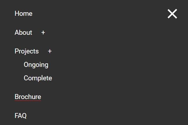
Just another jQuery based responsive nav solution that converts the normal horizontal dropdown navigation into a mobile-friendly sliding hamburger menu (aka off-canvas menu) on small screens. Supports nested, multi-level sub menus and has the ability to take all menus in the header and clones them into the mobile nav. Fully customizable via SCSS.
How to use it:
1. First you need to put jQuery library and the jQuery elmenu plugin's script at the bottom of your html document.
<script src="//code.jquery.com/jquery-latest.min.js"></script>
<script src="js/elmenu.js"></script>
2. Put the compiled CSS file in the head section of the document.
<link rel="stylesheet" href="css/styles.min.css">
3. Create a multi-level site navigaton and insert it together with the main page content to a container named 'canvas'.
<div id="canvas">
<header id="elmain">
<div class="elmtoggle__holder">
<a href="#!" id="elmtoggle" class="cf"><img src="img/hamburger.svg" alt="Open Sub Menu" class="elmtoggle__icon"></a>
</div>
<div class="navholder--utility cf">
<nav>
<ul class="nav--utility elm__list">
<li class="elm__item"><a class="elm__link" href="#!">About</a></li>
<li class="elm__item"><a class="elm__link" href="#!">Contact</a></li>
<li class="elm__item"><a class="elm__link" href="#!">Blog</a></li>
</ul>
</nav>
<ul class="nav--social elm__list">
<li class="elm__item"><a class="elm__link" href="#!">Facebook</a></li>
<li class="elm__item"><a class="elm__link" href="#!">Twitter</a></li>
</ul>
</div>
<div class="navholder--main">
<nav>
<ul class="nav--main elm__list">
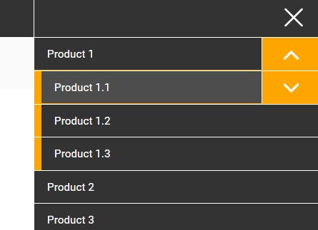
<li class="elm__item hassub"><a class="elm__link" href="#!">Product 1</a>
<ul class="elm__list--sub">
<li class="elm__item--sub hassubsub"><a class="elm__link--sub" href="#!">Product 1.1</a>
<ul class="elm__list--subsub">
<li class="elm__item--subsub"><a class="elm__link--subsub" href="#!">Product 1.1.1</a></li>
<li class="elm__item--subsub"><a class="elm__link--subsub" href="#!">Product 1.1.2</a></li>
<li class="elm__item--subsub"><a class="elm__link--subsub" href="#!">Product 1.1.3</a></li>
</ul>
</li>
<li class="elm__item--sub"><a class="elm__link--sub" href="#!">Product 1.2</a></li>
<li class="elm__item--sub"><a class="elm__link--sub" href="#!">Product 1.3</a></li>
</ul>
</li>
<li class="elm__item"><a class="elm__link" href="#!">Product 2</a></li>
<li class="elm__item"><a class="elm__link" href="#!">Product 3</a></li>
</ul>
</nav>
</div>
</header>
Main content goes here
</div>
4. Initialize the plugin and set the order you want the nav elements to show up in the mobile nav. Reminder: it's an array, so 0 is the first item. .
var menuOrder = ['2','0','1'];
$( '#elmain' ).elmenu( menuOrder );
Change log:
2017-03-16
- v1.1.0 Fixes a bug where multiple toggle icons where spinning on a single icon click, so individual elements needed to be targeted specifically
2017-02-01
- styles update
This awesome jQuery plugin is developed by elmnt. For more Advanced Usages, please check the demo page or visit the official website.