Vertical Accordion Menu Plugin For jQuery - Nav Accordion
| File Size: | 7.89 KB |
|---|---|
| Views Total: | 18579 |
| Last Update: | |
| Publish Date: | |
| Official Website: | Go to website |
| License: | MIT |
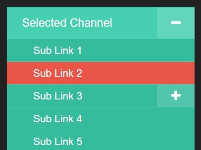
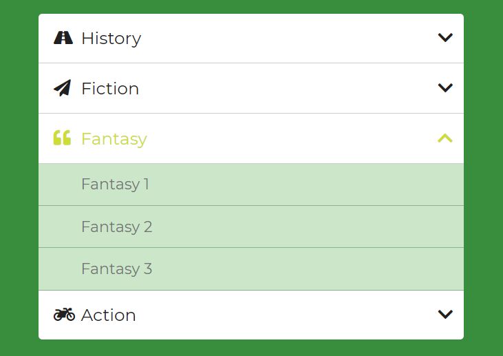
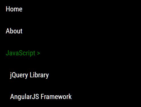
Nav Accordion is a lightweight, customizable jQuery plugin that lets you generate a vertical, multilevel, collapsible accordion menu from a nested unordered list for your site navigation.
How to use it:
1. Load the Font Awesome 4 icon font for expand / collapsible icons (OPTIAONAL).
<link rel="stylesheet" href="/path/to/font-awesome.min.css">
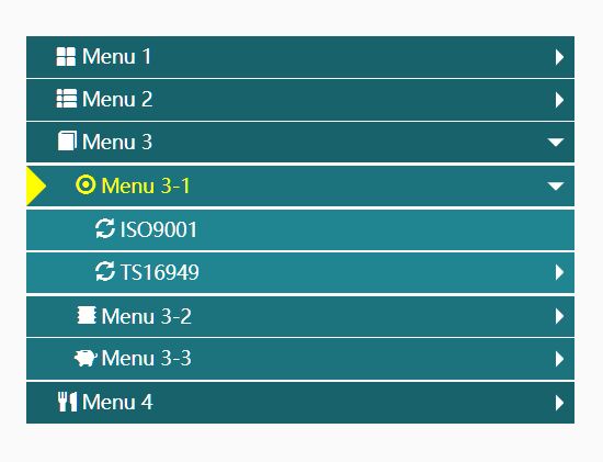
2. Create a multilevel accordion menu with a nested html list.
<nav class="mainNav">
  <ul>
    <li class="selected"><a href="#">Main menu 1</a>
      <ul>
        <li><a href="#">Sub Link 1-1</a></li>
        <li><a href="#">Sub Link 1-2</a></li>
        <li><a href="#">Sub Link 1-3</a>
          <ul>
            <li><a href="#">Sub Link 1-3-1</a></li>
            <li><a href="#">Sub Link 1-3-2</a></li>
            <li><a href="#">Sub Link 1-3-3</a></li>
          </ul>
        </li>
      </ul>
    </li>
    <li><a>Main menu 2</a>
      <ul>
        <li><a href="#">Sub Link 2-1</a></li>
        <li><a href="#">Sub Link 2-2</a></li>
        <li><a href="#">Sub Link 2-3</a></li>
      </ul>
    </li>
    <li><a href="#">Main menu 3</a></li>
  </ul>
</nav>
3. Style the accordion menu using your own CSS.
.mainNav {
  background: #46CFB0;
  width: 25%;
}

/* First Level */

.mainNav ul {
  margin: 0;
  padding: 0;
  list-style: none;
  border-bottom: 1px solid #1ABC9C
}

.mainNav ul li { border-top: 1px solid #1ABC9C; }

.mainNav ul li a {
  color: #FFFFFF;
  display: block;
  font-size: 1.1em;
  line-height: normal;
  padding: 12px 20px;
  text-decoration: none;
}

.mainNav ul li a:hover {
  background: #E95546;
  text-decoration: none;
}

/* Second Level */

.mainNav ul ul { border-bottom: none }

.mainNav ul ul li {
  border-top: 1px solid #46CFB0;
  background: #34BC9D;
}

.mainNav ul ul li a {
  color: #FFFFFF;
  display: block;
  font-size: 1em;
  line-height: normal;
  padding: 0.5em 1em 0.5em 2.5em;
}

.mainNav ul ul li a:hover { background: #E95546; }

/* Third Level */

.mainNav ul ul ul { border-top: 1px solid #46CFB0; }

.mainNav ul ul ul li { border: none; }

.mainNav ul ul ul li a {
  padding-left: 3.5em;
  padding-top: 0.25em;
  padding-bottom: 0.25em;
}

/* Accordion Button */

ul li.has-subnav .accordion-btn {
  color: #fff;
  background: rgba(255,255,255, 0.15);
  font-size: 16px;
}
4. Load jQuery library and the jQuery Nav Accordion plugin at the bottom of the webpage.
<script src="/path/to/jquery.min.js"></script>
<script src="/path/to/navAccordion.min.js"></script>
5. Initialize the plugin and specify the html content for the expand / collapse buttons.
jQuery('.mainNav').navAccordion({
  expandButtonText: '<i class="fa fa-plus"></i>',
  collapseButtonText: '<i class="fa fa-minus"></i>'
});
6. Plugin's defaults.
jQuery('.mainNav').navAccordion({

  // Text inside of expand button
  expandButtonText : "+",

  // Text inside of collapse button
  collapseButtonText: "-",

  // Expand the selected channel
  selectedExpand: "true",

  // Class that will be used to detect the currently selected channel
  // This will check the "parentElement" for this class (the parent <li> by default)
  selectedClass: "selected",

  // Apply accordion to all levels
  // Setting this to false will apply the accordion only to the first level
  multipleLevels: "true",

  // Width of accordion expand/collapse button as a percentage or pixels
  buttonWidth: "20%",

  // Position of button
  buttonPosition: "right",

  // Speed of slide animation
  // "fast", "slow", or number in milliseconds such as 500
  slideSpeed: "fast",

  // Parent element type, class or ID
  // You don't need to change this if you're using a ul > li > ul pattern
  parentElement: "li",

  // Child element type, class or ID
  // You don't need to change this if you're using a ul > li > ul pattern
  childElement: "ul",

  // Setting to true will make any link with sub-nav behave as if it were set to header only, making the link inaccessible
  // This option is useful if you are using the plugin for a non-navigation area
  headersOnly: false,

  // Setting to true to apply the accordion only to links that are set as "header only" (have no href)
  headersOnlyCheck: false,

  // Delay following the href of links until after the accordion the has expanded
  delayLink: false,

  // Time in milliseconds to delay before following href - will use "slideSpeed" by default if nothing else is set
  delayAmount: null

});
Change log:
2016-03-26
- Fix for applying/remove active class.
2015-12-12
- Add active class to parentElement on expanded and add callback function.
2015-12-07
- Add delayed link mode.
This awesome jQuery plugin is developed by corycaywood. For more Advanced Usages, please check the demo page or visit the official website.