Material Design Action Button Transition Effect with jQuery and CSS3
| File Size: | 1.83 KB |
|---|---|
| Views Total: | 3294 |
| Last Update: | |
| Publish Date: | |
| Official Website: | Go to website |
| License: | MIT |

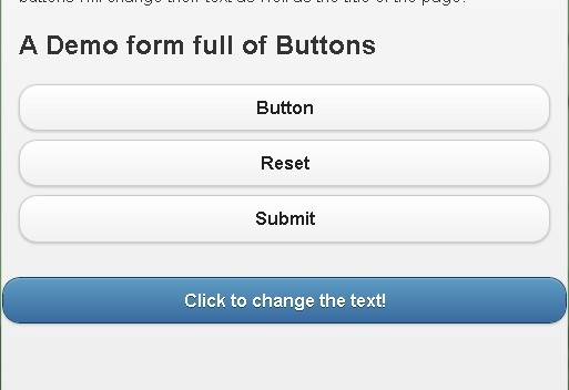
A Google Material Design styled action button transition effect built on top of jQuery, jQuery Mobile and CSS3 transitions & transforms.
See also:
- Hamburger Button Transition Effect with jQuery and CSS3
- Google Material Design Concept UI Button with jQuery and CSS3
How to use it:
1. Include the necessary jQuery library and jQuery Mobile at the bottom of your web page.
<script src="http://ajax.googleapis.com/ajax/libs/jquery/1.11.1/jquery.min.js"></script>
<script src="http://ajax.googleapis.com/ajax/libs/jquerymobile/1.4.2/jquery.mobile.min.js"></script>
2. Create the Html for the action button.
<div class="icon">
  <i></i>
  <span class="tap"></span>
</div>
3. The required CSS styles.
.icon {
  width: 40px;
  height: 40px;
  -webkit-border-radius: 100%;
  border-radius: 100%;
  position: absolute;
  top: 50%;
  left: 50%;
  cursor: pointer;
  margin: -20px;
}

.icon i {
  width: 2px;
  height: 14px;
  background: #786699;
  display: block;
  -webkit-transform: rotate(45deg);
  -moz-transform: rotate(45deg);
  -o-transform: rotate(45deg);
  -ms-transform: rotate(45deg);
  transform: rotate(45deg);
  left: 19px;
  position: absolute;
  top: 13px;
  opacity: 0;
  -ms-filter: "progid:DXImageTransform.Microsoft.Alpha(Opacity=0)";
  filter: alpha(opacity=0);
  -webkit-transition: all 0.8s ease;
  -moz-transition: all 0.8s ease;
  -o-transition: all 0.8s ease;
  -ms-transition: all 0.8s ease;
  transition: all 0.8s ease;
}

.icon i:after {
  content: '';
  display: block;
  width: 14px;
  height: 2px;
  background: #786699;
  position: absolute;
  left: -6px;
  top: 6px;
}

.icon:after {
  content: '';
  display: block;
  width: 10px;
  height: 10px;
  -webkit-border-radius: 100%;
  border-radius: 100%;
  position: absolute;
  left: 15px;
  top: 15px;
  -webkit-box-shadow: 14px 0px 0px #fff, -14px 0px 0px #fff;
  box-shadow: 14px 0px 0px #fff, -14px 0px 0px #fff;
  -webkit-transition: all 0.4s ease;
  -moz-transition: all 0.4s ease;
  -o-transition: all 0.4s ease;
  -ms-transition: all 0.4s ease;
  transition: all 0.4s ease;
  z-index: -1;
}

.icon:before {
  content: '';
  display: block;
  width: 40px;
  height: 40px;
  -webkit-border-radius: 100%;
  border-radius: 100%;
  -webkit-transform: scale(0.25);
  -moz-transform: scale(0.25);
  -o-transform: scale(0.25);
  -ms-transform: scale(0.25);
  transform: scale(0.25);
  background: #fff;
  position: absolute;
  -webkit-transition: all 0.6s ease;
  -moz-transition: all 0.6s ease;
  -o-transition: all 0.6s ease;
  -ms-transition: all 0.6s ease;
  transition: all 0.6s ease;
}

.icon.active:before {
  -webkit-transform: scale(1);
  -moz-transform: scale(1);
  -o-transform: scale(1);
  -ms-transform: scale(1);
  transform: scale(1);
}

.icon.active:after {
  -webkit-box-shadow: 0px 0px 0px #fff, 0px 0px 0px #fff;
  box-shadow: 0px 0px 0px #fff, 0px 0px 0px #fff;
  opacity: 0.4;
  -ms-filter: "progid:DXImageTransform.Microsoft.Alpha(Opacity=40)";
  filter: alpha(opacity=40);
}

.icon.active i {
  opacity: 1;
  -ms-filter: none;
  filter: none;
}

.tap {
  width: 80px;
  height: 80px;
  display: block;
  position: absolute;
  left: -20px;
  top: -20px;
  opacity: 1;
  -ms-filter: none;
  filter: none;
  -webkit-transform: scale(0);
  -moz-transform: scale(0);
  -o-transform: scale(0);
  -ms-transform: scale(0);
  transform: scale(0);
  -webkit-border-radius: 100%;
  border-radius: 100%;
  background-color: rgba(255,255,255,0.6);
}

.tap.active {
  -webkit-transition: all 400ms cubic-bezier(0, 0.7, 0.5, 1);
  -moz-transition: all 400ms cubic-bezier(0, 0.7, 0.5, 1);
  -o-transition: all 400ms cubic-bezier(0, 0.7, 0.5, 1);
  -ms-transition: all 400ms cubic-bezier(0, 0.7, 0.5, 1);
  transition: all 400ms cubic-bezier(0, 0.7, 0.5, 1);
  opacity: 0;
  -ms-filter: "progid:DXImageTransform.Microsoft.Alpha(Opacity=0)";
  filter: alpha(opacity=0);
  -webkit-transform: scale(1);
  -moz-transform: scale(1);
  -o-transform: scale(1);
  -ms-transform: scale(1);
  transform: scale(1);
}
4. The javascript to active the button transition effect on click or tap.
(function() {
  $(".icon").on('tap', function() {
    $(this).toggleClass('active');
    return $('.tap').addClass('active');
  });

  $(".icon").bind('transitionend webkitTransitionEnd oTransitionEnd MSTransitionEnd', function() {
    return $('.tap').removeClass('active');
  });

}).call(this);
This awesome jQuery plugin is developed by andreasstorm. For more Advanced Usages, please check the demo page or visit the official website.