Create A Responsive & Animated Vertical Timeline with jQuery and CSS3
| File Size: | 12.4 KB |
|---|---|
| Views Total: | 36756 |
| Last Update: | |
| Publish Date: | |
| Official Website: | Go to website |
| License: | MIT |
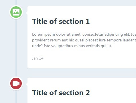
A cool, responsive, animated timeline built with jQuery and CSS3 that shows & animates event blocks when they're scrolled into the viewport.
How to use it:
1. Include the necessary modernizr.js in the head section of the page.
<script src="modernizr.js"></script>
2. Create the Html structure for a timeline as follows.
<section id="cd-timeline" class="cd-container">
  <div class="cd-timeline-block">
    <div class="cd-timeline-img cd-picture"> <img src="cd-icon-picture.svg" alt="Picture"> </div>
    <!-- cd-timeline-img -->

    <div class="cd-timeline-content">
      <h2>Title of section 1</h2>
      <p> Content 1 </p>
      <a href="#0" class="cd-read-more">Read more</a> <span class="cd-date">Jan 14</span> </div>
    <!-- cd-timeline-content -->
  </div>
  <!-- cd-timeline-block -->

  <div class="cd-timeline-block">
    <div class="cd-timeline-img cd-movie"> <img src="cd-icon-movie.svg" alt="Movie"> </div>
    <!-- cd-timeline-img -->

    <div class="cd-timeline-content">
      <h2>Title of section 2</h2>
      <p> Content 2 </p>
      <a href="#0" class="cd-read-more">Read more</a> <span class="cd-date">Jan 18</span> </div>
    <!-- cd-timeline-content -->
  </div>
  <!-- cd-timeline-block -->

  <div class="cd-timeline-block">
    <div class="cd-timeline-img cd-picture"> <img src="cd-icon-picture.svg" alt="Picture"> </div>
    <!-- cd-timeline-img -->

    <div class="cd-timeline-content">
      <h2>Title of section 3</h2>
      <p> Content 3 </p>
      <a href="#0" class="cd-read-more">Read more</a> <span class="cd-date">Jan 24</span> </div>
    <!-- cd-timeline-content -->
  </div>
  <!-- cd-timeline-block -->

  <div class="cd-timeline-block">
    <div class="cd-timeline-img cd-location"> <img src="cd-icon-location.svg" alt="Location"> </div>
    <!-- cd-timeline-img -->

    <div class="cd-timeline-content">
      <h2>Title of section 4</h2>
      <p> Content 4 </p>
      <a href="#0" class="cd-read-more">Read more</a> <span class="cd-date">Feb 14</span> </div>
    <!-- cd-timeline-content -->
  </div>
  <!-- cd-timeline-block -->

  <div class="cd-timeline-block">
    <div class="cd-timeline-img cd-location"> <img src="cd-icon-location.svg" alt="Location"> </div>
    <!-- cd-timeline-img -->

    <div class="cd-timeline-content">
      <h2>Title of section 5</h2>
      <p> Content 5 </p>
      <a href="#0" class="cd-read-more">Read more</a> <span class="cd-date">Feb 18</span> </div>
    <!-- cd-timeline-content -->
  </div>
  <!-- cd-timeline-block -->

  <div class="cd-timeline-block">
    <div class="cd-timeline-img cd-movie"> <img src="cd-icon-movie.svg" alt="Movie"> </div>
    <!-- cd-timeline-img -->

    <div class="cd-timeline-content">
      <h2>Final Section</h2>
      <p> Content 6 </p>
      <a href="#0" class="cd-read-more">Read more</a> <span class="cd-date">Feb 26</span> </div>
    <!-- cd-timeline-content -->
  </div>
  <!-- cd-timeline-block -->
</section>
3. The required CSS/CSS3 styles for the timeline.
#cd-timeline {
  position: relative;
  padding: 2em 0;
  margin-top: 2em;
  margin-bottom: 2em;
}

#cd-timeline::before {
  /* this is the vertical line */
  content: '';
  position: absolute;
  top: 0;
  left: 18px;
  height: 100%;
  width: 4px;
  background: #d7e4ed;
}
@media only screen and (min-width: 1170px) {

#cd-timeline {
  margin-top: 3em;
  margin-bottom: 3em;
}

#cd-timeline::before {
  left: 50%;
  margin-left: -2px;
}
}

.cd-timeline-block {
  position: relative;
  margin: 2em 0;
 *zoom: 1;
}

.cd-timeline-block:before,
.cd-timeline-block:after {
  content: " ";
  display: table;
}

.cd-timeline-block:after { clear: both; }

.cd-timeline-block:first-child { margin-top: 0; }

.cd-timeline-block:last-child { margin-bottom: 0; }
@media only screen and (min-width: 1170px) {

.cd-timeline-block { margin: 4em 0; }

.cd-timeline-block:first-child { margin-top: 0; }

.cd-timeline-block:last-child { margin-bottom: 0; }
}

.cd-timeline-img {
  position: absolute;
  top: 0;
  left: 0;
  width: 40px;
  height: 40px;
  border-radius: 50%;
  box-shadow: 0 0 0 4px white, inset 0 2px 0 rgba(0, 0, 0, 0.08), 0 3px 0 4px rgba(0, 0, 0, 0.05);
}

.cd-timeline-img img {
  display: block;
  width: 24px;
  height: 24px;
  position: relative;
  left: 50%;
  top: 50%;
  margin-left: -12px;
  margin-top: -12px;
}

.cd-timeline-img.cd-picture { background: #75ce66; }

.cd-timeline-img.cd-movie { background: #c03b44; }

.cd-timeline-img.cd-location { background: #f0ca45; }
@media only screen and (min-width: 1170px) {

.cd-timeline-img {
  width: 60px;
  height: 60px;
  left: 50%;
  margin-left: -30px;
  /* Force Hardware Acceleration in WebKit */
  -webkit-transform: translateZ(0);
  -webkit-backface-visibility: hidden;
}

.cssanimations .cd-timeline-img.is-hidden { visibility: hidden; }

.cssanimations .cd-timeline-img.bounce-in {
  visibility: visible;
  -webkit-animation: cd-bounce-1 0.6s;
  -moz-animation: cd-bounce-1 0.6s;
  animation: cd-bounce-1 0.6s;
}
}
 @-webkit-keyframes
cd-bounce-1 {  0% {
 opacity: 0;
 -webkit-transform: scale(0.5);
}
 60% {
 opacity: 1;
 -webkit-transform: scale(1.2);
}
 100% {
 -webkit-transform: scale(1);
}
}
@-moz-keyframes
cd-bounce-1 {  0% {
 opacity: 0;
 -moz-transform: scale(0.5);
}
 60% {
 opacity: 1;
 -moz-transform: scale(1.2);
}
 100% {
 -moz-transform: scale(1);
}
}
@-o-keyframes
cd-bounce-1 {  0% {
 opacity: 0;
 -o-transform: scale(0.5);
}
 60% {
 opacity: 1;
 -o-transform: scale(1.2);
}
 100% {
 -o-transform: scale(1);
}
}
@keyframes
cd-bounce-1 {  0% {
 opacity: 0;
 transform: scale(0.5);
}
 60% {
 opacity: 1;
 transform: scale(1.2);
}
 100% {
 transform: scale(1);
}
}

.cd-timeline-content {
  position: relative;
  margin-left: 60px;
  background: white;
  border-radius: 0.25em;
  padding: 1em;
  box-shadow: 0 3px 0 #d7e4ed;
 *zoom: 1;
}

.cd-timeline-content:before,
.cd-timeline-content:after {
  content: " ";
  display: table;
}

.cd-timeline-content:after { clear: both; }

.cd-timeline-content h2 { color: #303e49; }

.cd-timeline-content p,
.cd-timeline-content .cd-read-more,
.cd-timeline-content .cd-date {
  font-size: 13px;
  font-size: 0.8125rem;
}

.cd-timeline-content .cd-read-more,
.cd-timeline-content .cd-date { display: inline-block; }

.cd-timeline-content p {
  margin: 1em 0;
  line-height: 1.6;
}

.cd-timeline-content .cd-read-more {
  float: right;
  padding: .8em 1em;
  background: #acb7c0;
  color: white;
  border-radius: 0.25em;
}

.no-touch .cd-timeline-content .cd-read-more:hover { background-color: #bac4cb; }

.cd-timeline-content .cd-date {
  float: left;
  padding: .8em 0;
  opacity: .7;
}

.cd-timeline-content::before {
  content: '';
  position: absolute;
  top: 16px;
  right: 100%;
  height: 0;
  width: 0;
  border: 7px solid transparent;
  border-right: 7px solid white;
}
@media only screen and (min-width: 768px) {

.cd-timeline-content h2 {
  font-size: 20px;
  font-size: 1.25rem;
}

.cd-timeline-content p {
  font-size: 16px;
  font-size: 1rem;
}

.cd-timeline-content .cd-read-more,
.cd-timeline-content .cd-date {
  font-size: 14px;
  font-size: 0.875rem;
}
}
@media only screen and (min-width: 1170px) {

.cd-timeline-content {
  margin-left: 0;
  padding: 1.6em;
  width: 45%;
}

.cd-timeline-content::before {
  top: 24px;
  left: 100%;
  border-color: transparent;
  border-left-color: white;
}

.cd-timeline-content .cd-read-more { float: left; }

.cd-timeline-content .cd-date {
  position: absolute;
  width: 100%;
  left: 122%;
  top: 6px;
  font-size: 16px;
  font-size: 1rem;
}

.cd-timeline-block:nth-child(even) .cd-timeline-content { float: right; }

.cd-timeline-block:nth-child(even) .cd-timeline-content::before {
  top: 24px;
  left: auto;
  right: 100%;
  border-color: transparent;
  border-right-color: white;
}

.cd-timeline-block:nth-child(even) .cd-timeline-content .cd-read-more { float: right; }

.cd-timeline-block:nth-child(even) .cd-timeline-content .cd-date {
  left: auto;
  right: 122%;
  text-align: right;
}

.cssanimations .cd-timeline-content.is-hidden { visibility: hidden; }

.cssanimations .cd-timeline-content.bounce-in {
  visibility: visible;
  -webkit-animation: cd-bounce-2 0.6s;
  -moz-animation: cd-bounce-2 0.6s;
  animation: cd-bounce-2 0.6s;
}
}
 @media only screen and (min-width: 1170px) {

/* inverse bounce effect on even content blocks */

.cssanimations .cd-timeline-block:nth-child(even) .cd-timeline-content.bounce-in {
  -webkit-animation: cd-bounce-2-inverse 0.6s;
  -moz-animation: cd-bounce-2-inverse 0.6s;
  animation: cd-bounce-2-inverse 0.6s;
}
}
@-webkit-keyframes
cd-bounce-2 {  0% {
 opacity: 0;
 -webkit-transform: translateX(-100px);
}
 60% {
 opacity: 1;
 -webkit-transform: translateX(20px);
}
 100% {
 -webkit-transform: translateX(0);
}
}
@-moz-keyframes
cd-bounce-2 {  0% {
 opacity: 0;
 -moz-transform: translateX(-100px);
}
 60% {
 opacity: 1;
 -moz-transform: translateX(20px);
}
 100% {
 -moz-transform: translateX(0);
}
}
@-o-keyframes
cd-bounce-2 {  0% {
 opacity: 0;
 -o-transform: translateX(-100px);
}
 60% {
 opacity: 1;
 -o-transform: translateX(20px);
}
 100% {
 -o-transform: translateX(0);
}
}
@keyframes
cd-bounce-2 {  0% {
 opacity: 0;
 transform: translateX(-100px);
}
 60% {
 opacity: 1;
 transform: translateX(20px);
}
 100% {
 transform: translateX(0);
}
}
@-webkit-keyframes
cd-bounce-2-inverse {  0% {
 opacity: 0;
 -webkit-transform: translateX(100px);
}
 60% {
 opacity: 1;
 -webkit-transform: translateX(-20px);
}
 100% {
 -webkit-transform: translateX(0);
}
}
@-moz-keyframes
cd-bounce-2-inverse {  0% {
 opacity: 0;
 -moz-transform: translateX(100px);
}
 60% {
 opacity: 1;
 -moz-transform: translateX(-20px);
}
 100% {
 -moz-transform: translateX(0);
}
}
@-o-keyframes
cd-bounce-2-inverse {  0% {
 opacity: 0;
 -o-transform: translateX(100px);
}
 60% {
 opacity: 1;
 -o-transform: translateX(-20px);
}
 100% {
 -o-transform: translateX(0);
}
}
@keyframes
cd-bounce-2-inverse {  0% {
 opacity: 0;
 transform: translateX(100px);
}
 60% {
 opacity: 1;
 transform: translateX(-20px);
}
 100% {
 transform: translateX(0);
}
}
4. Include the latest version of jQuery library at the bottom of the page.
<script src="//ajax.googleapis.com/ajax/libs/jquery/2.1.1/jquery.min.js"></script>
5. The Javascript to enable the animated timeline.
<script>
jQuery(document).ready(function($){
var $timeline_block = $('.cd-timeline-block');

//hide timeline blocks which are outside the viewport
$timeline_block.each(function(){
if($(this).offset().top > $(window).scrollTop()+$(window).height()*0.75) {
$(this).find('.cd-timeline-img, .cd-timeline-content').addClass('is-hidden');
}
});

//on scolling, show/animate timeline blocks when enter the viewport
$(window).on('scroll', function(){
$timeline_block.each(function(){
if( $(this).offset().top <= $(window).scrollTop()+$(window).height()*0.75 && $(this).find('.cd-timeline-img').hasClass('is-hidden') ) {
$(this).find('.cd-timeline-img, .cd-timeline-content').removeClass('is-hidden').addClass('bounce-in');
}
});
});
});
</script>
This awesome jQuery plugin is developed by codyhouse. For more Advanced Usages, please check the demo page or visit the official website.