Customizable SEO-Friendly Tabs Plugin - jquery-tab
| File Size: | 186 KB |
|---|---|
| Views Total: | 3019 |
| Last Update: | |
| Publish Date: | |
| Official Website: | Go to website |
| License: | MIT |
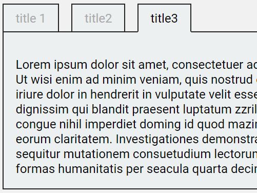
jquery-tab is a jQuery plugin used to create highly customizable tabs from semantic HTML markups that can be used to switch between different sections of content on the web page.
More features:
- Tons of configuration options.
- Easy to style via CSS.
- No link element needed.
- Search engine friendly for original content.
- Dynamic tab creation.
- Custom trigger events: click or hover.
- Keeps current selected index in URL hash, so that it can be restored after page refersh.
How to use it:
1. Load the main stylesheet and default skin CSS in the document.
<link rel="stylesheet" href="layout.css">
<link rel="stylesheet" href="skin-gray.css">
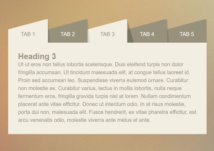
2. The basic HTML structure. The plugin will look for heading elements within the main container and converts them into tabs.
<div class="tab-demo">
  <h1>Tab 1</h1>
  <p>Content 1</p>
  ... more content here

  <h1>Tab 2</h1>
  <p>Content 2</p>
  ... more content here

  <h1>Tab 3</h1>
  <p>Content 3</p>
  ... more content here
</div>
3. Call the plugin on the container and done.
$('.tab-demo').tab();
4. Available options (with default values) to customize the tabs plugin.
$('.tab-demo').tab({
// or 'hover'
triggerEvents: 'click',
// delays trigger events
delayTriggerEvents: '',
delayTriggerCancelEvents: '',
delayTriggerLatency: 200,
// enable keyboard interaction
keyboardSwitch: true,
// A form (normally hidden) field to store active tab index
statusFieldSelector: '',
// A key-value pair template to store active tab index in URL hash
statusHashTemplate: '',
// Determine a separator between multiple hash items if there are more than 1 tab-container on the same page
statusHashSeparator: '&',
// Is fixed height
fixedHeight: false,
// or "vertical"
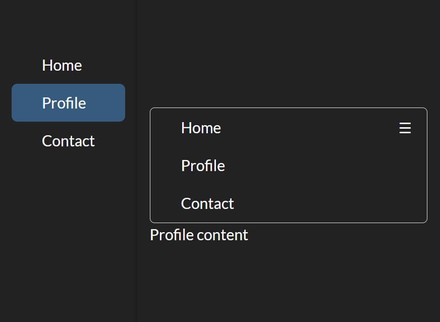
mode: "horizontal",
// start tab
activePosition: 0,
// still create tab container when there is no tab item found
createEmptyTab: false,
// heading elements
titleSelector: 'h1,h2,h3,h4,h5,h6',
// show label container before panel container
showHeaderLabelContainer: true,
// show label container after panel container
showFooterLabelContainer: false,
// Keep title always visible
keepTitleVisible: false,
// callbacks
onBeforeSwitch: undefined, // (from:{index, name}, to:{index, name}, tabState)
onAfterSwitch: undefined, // (from:{index, name}, to:{index, name}, tabState)
fnGetTitleContent: function ($title) {
return $title.contents();
},
fnGetTabItemName: function ($title) {
return $title.attr('data-tab-item-name');
},
fnIsTabItemDisabled: function ($title) {
var attrDisabled = $title.attr('data-tab-item-disabled');
return attrDisabled !== undefined && attrDisabled !== 'false';
},
fnIsTabItemHidden: function ($title) {
var attrHidden = $title.attr('data-tab-item-hidden');
return attrHidden !== undefined && attrHidden !== 'false';
},
// Default HTML/CSS
tabContainerTemplate: '<div></div>',
tabContainerClass: 'tab-container',
labelContainerTemplate: '<div></div>',
labelContainerClass: 'label-container',
labelItemTemplate: '<label></label>',
labelItemClass: 'label-item',
panelContainerTemplate: '<div></div>',
panelContainerClass: 'panel-container',
panelItemTemplate: '<div></div>',
panelItemClass: 'panel-item'
});
5. API methods.
var instance = $('.tab-demo').data('jquery-tab-controller');

// Get the number of tabs.
instance.getCount()

// Get current active tab Index.
instance.getCurrentIndex()

// Get tab item index by name.
instance.getIndexByName()

// Get tab item name by index.
instance.getName(index)

// Set tab item name.
instance.setName(name|index, newName)

// Check if enabled/disabled.
instance.isDisabled(name|index)
instance.isEnabled(name|index)

// Check if hidden/visible.
instance.isHidden(name|index)
instance.isVisible(name|index)

// Set tab state.
instance.setHidden(name|index, isHidden=true)
instance.setVisible(name|index, isVisible=true)
instance.setDisabled(name|index, isDisabled=true)
instance.setEnabled(name|index, isEnabled=true)

// Get the header/footer side label items by tab item name or index.
instance.getHeaderLabel(name|index)
instance.getFooterLabel(name|index)
instance.getHeaderFooterLabels(name|index)

// Get current active header/footer label items.
instance.getCurrentHeaderLabel()
instance.getCurrentFooterLabel()
instance.getCurrentHeaderFooterLabels()

// Get panel item by tab item name or index.
instance.getPanel(name|index)

// Get current active panel item.
instance.getCurrentPanel()

// When tab item's content is dynamically changed and becomes longer, use this method to update the height of the tab container. Only available in height fixed mode by setting option fixedHeight.
instance.updateFixedHeight()

// Switch active(selected) tab item by index.
instance.switchTo(index)

// Switch to previous/next tab item.
instance.switchPrevious({includeDisabled, includeHidden, exclude, loop})
instance.switchNext({includeDisabled, includeHidden, exclude?, loop})

// Switch to first/last tab item.
instance.switchFirst({includeDisabled?, includeHidden?, exclude?}?)
instance.switchLast({includeDisabled?, includeHidden?, exclude?}?)

// Parse and append another $region's structure to current tab.
instance.add($region)

// Append a new tab to existing tab container.
instance.addTabItem({title, content, name, disabled, hidden})

// Append/insert a new tab item to existing tab container.
instance.insertTabItem(before-name|before-index, {title, content, name?, disabled?, hidden?})

// Parse and insert another $container's structure to current tab at position index.
instance.insert($container, index)

// Remove a tab from index and return it's tab item.
instance.remove(index)

// Exchange tab items
instance.exchangeTabItem(from-name|from-index, to-name|to-index)

// Move tab items
instance.moveTabItemBefore(from-name|from-index, to-name-before|to-index-before)
instance.moveTabItemAfter(from-name|from-index, to-name-after|to-index-after)
instance.moveTabItemPrevious(from-name|from-index)
instance.moveTabItemNext(from-name|from-index)
instance.moveTabItemFirst(from-name|from-index)
instance.moveTabItemLast(from-name|from-index)
6. Create your own theme CSS as these:
.tab-container .page-container {
  border-color: #222;
  padding: 1em;
  background: #ECF0F1;
}

.tab-container .label-container .label-item {
  border-color: #222;
  background: #ECF0F1;
}

.tab-container .label-container .label-active {
  color: #000;
}

.tab-container .label-container.top .label-active {
  border-bottom-color: #ECF0F1;
}

.tab-container .label-container.bottom .label-active {
  border-top-color: #ECF0F1;
}

.tab-container .label-container .label-inactive {
  color:#aaa;
}
Changelog:
v4.0.0 (2019-11-14)
- feat: add option `fixedHeightProp`
v4.0.0 (2019-05-30)
- feat(default-options): use <span> for label item element
2019-02-24
- refactor
2019-01-14
- add moveTabItemPrevious and moveTabItemNext method
2019-01-06
- add switchFirst and switchLast
2019-01-03
- refactor(handle-keypress-event): process switchResult at one place
2018-12-19
- improve fade effect style
2018-12-09
- feat(switch): add option 'keyboardSwitch'
2018-11-26
- fix(switch): set focus back to last label item if switch cancelled
2018-11-25
- fix(switch): arrow key switch for legacy browser
v3.0.3 (2018-11-16)
- fix(types): $.fn.tab() type declaration not exported
v3.0.1 (2018-11-12)
- fix(init): only load position if has tab item
- fix(init): only load position if has tab item
2018-11-12
- feat: add more class names to container element
2018-10-21
- fix(switch): prevent duplicated call swithchTo() from hash change event
2018-10-12
- compatible with legacy browser
2017-09-17
- trigger switch event correctly
- make typescript works for external project
2017-09-11
- allow use special chars in options.statusHashTemplate
This awesome jQuery plugin is developed by mjpclab. For more Advanced Usages, please check the demo page or visit the official website.