Making IMG Elements Responsive Like Background Images - Sizee.js
| File Size: | 3.12 KB |
|---|---|
| Views Total: | 666 |
| Last Update: | |
| Publish Date: | |
| Official Website: | Go to website |
| License: | MIT |
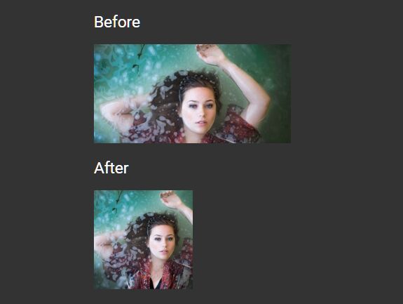
Sizee.js is a lightweight jQuery plugin which has the ability to make any pictures wrapped in the img tag adaptive on any screen sizes just like the responsive background images using the CSS background properties. The biggest difference with img { width: 100% } is that the plugin auto adjusts the width of your image and makes it always be centered whatever you resize the browser window. Works on modern browsers which have CSS3 transform support.
How to use it:
1. Load the core Style sheet Sizee.css in the header of the html page.
<link href="sizee.css" rel="stylesheet">
2. Load the main JavaScript file Sizee.js plugin after jQuery library and we're ready to go.
<script src="//code.jquery.com/jquery-3.1.1.slim.min.js"></script>
<script src="sizee.js"></script>
3. Add the CSS class 'sizee-img' to the target image and insert it into a DIV container called 'sizee-wrapper'. That's it.
<div class="sizee-wrapper">
  <img class="sizee-img" src="1.jpg">
</div>
This awesome jQuery plugin is developed by EddyFK. For more Advanced Usages, please check the demo page or visit the official website.