Material Design Inspired Tabs Modal with jQuery and CSS3
| File Size: | 1.54 MB |
|---|---|
| Views Total: | 5472 |
| Last Update: | |
| Publish Date: | |
| Official Website: | Go to website |
| License: | MIT |
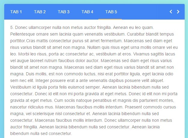
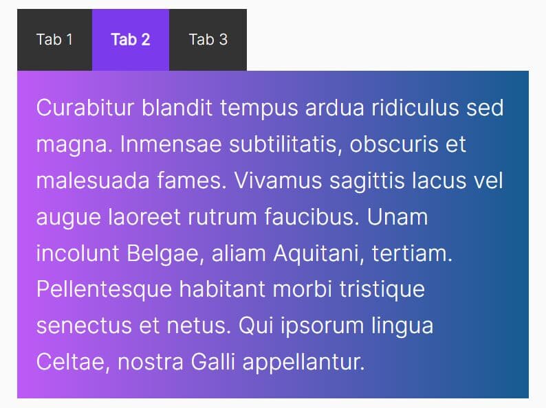
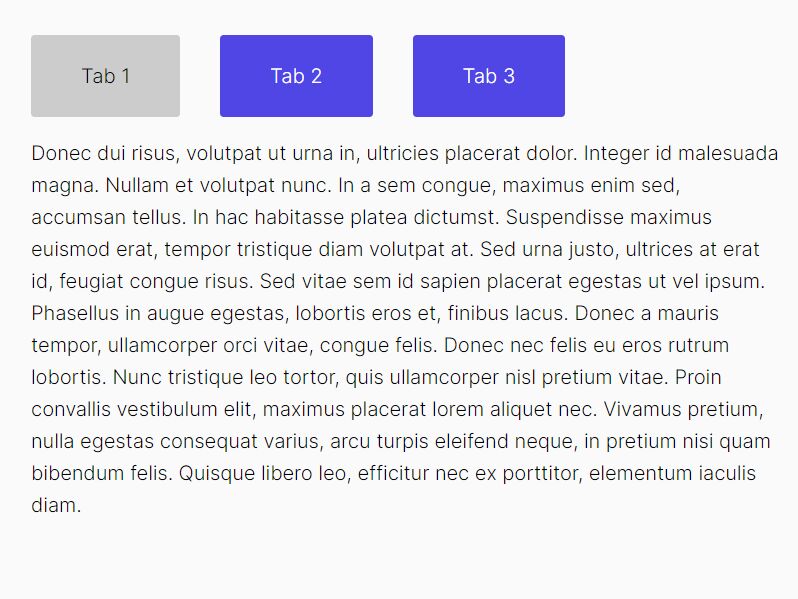
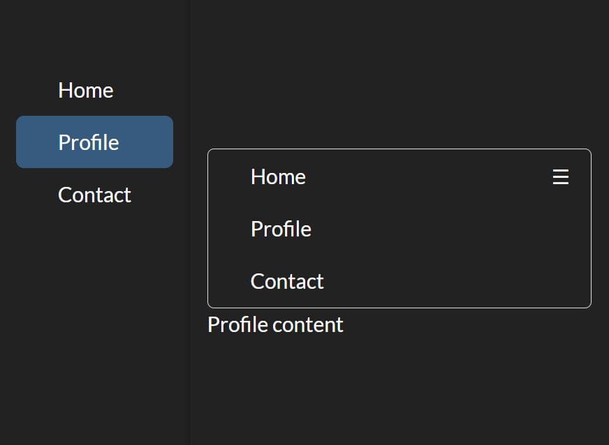
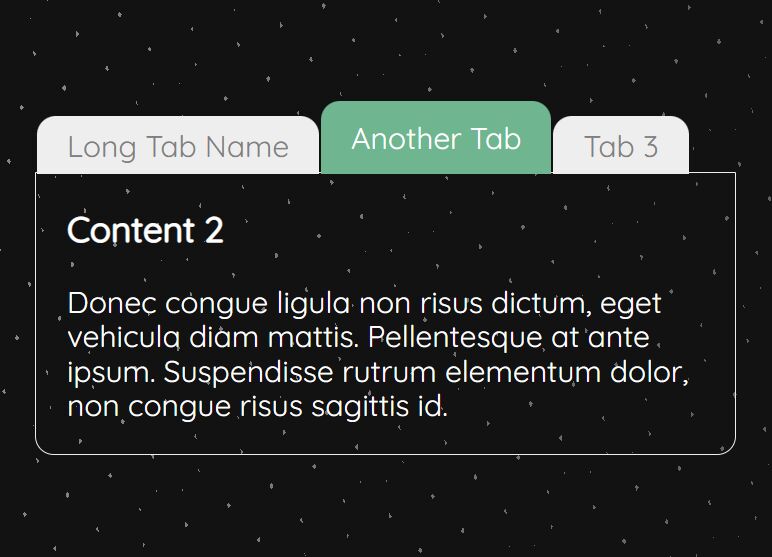
A modern, Material Design inspried jQuery tabs UI component which allows to switch between different sections of content with a smooth CSS3 based animation. The tabs interface will auto expand and shrink depending on the tabbed content. Also comes with a ripple click effect as you click on the tabbed navigation.
How to use it:
1. Load the official Material design icons in your html page.
<link rel="stylesheet" href="//fonts.googleapis.com/icon?family=Material+Icons">
2. Create a tabbed interface following the markup structure like this:
<div class="tabs">
<div class="tabs-header">
<div class="border"></div>
<ul>
<li class="active"><a href="#tab-1" tab-id="1" ripple="ripple" ripple-color="#FFF">Tab 1</a></li>
<li><a href="#tab-2" tab-id="2" ripple="ripple" ripple-color="#FFF">Tab 2</a></li>
<li><a href="#tab-3" tab-id="3" ripple="ripple" ripple-color="#FFF">Tab 3</a></li>
</ul>
<nav class="tabs-nav">
<i id="prev" ripple="ripple" ripple-color="#FFF" class="material-icons"></i>
<i id="next" ripple="ripple" ripple-color="#FFF" class="material-icons"></i>
</nav>
</div>
<div class="tabs-content">
<div tab-id="1" class="tab active">Tabbed Content 1</div>
<div tab-id="2" class="tab">Tabbed Content 2/div>
<div tab-id="3" class="tab">Tabbed Content 3</div>
</div>
</div>
3. The primary CSS/CSS3 styles for the tabbed interface.
.tabs {
  z-index: 15px;
  position: relative;
  background: #FFFFFF;
  width: 600px;
  border-radius: 4px;
  box-shadow: 0 0 30px rgba(0, 0, 0, 0.1);
  box-sizing: border-box;
  margin: 100px auto 10px;
  overflow: hidden;
}

.tabs-header {
  position: relative;
  background: #4285F4;
  overflow: hidden;
}

.tabs-header .border {
  position: absolute;
  bottom: 0;
  left: 0;
  background: #F4B142;
  width: auto;
  height: 2px;
  -webkit-transition: 0.3s ease;
  transition: 0.3s ease;
}

.tabs-header ul {
  display: -webkit-box;
  display: -webkit-flex;
  display: -ms-flexbox;
  display: flex;
  -webkit-box-orient: horizontal;
  -webkit-box-direction: normal;
  -webkit-flex-direction: row;
  -ms-flex-direction: row;
  flex-direction: row;
  -webkit-flex-wrap: wrap;
  -ms-flex-wrap: wrap;
  flex-wrap: wrap;
  width: calc(100% - 68px);
}

.tabs-header li {
  -webkit-transition: 0.3s ease;
  transition: 0.3s ease;
}

.tabs-header a {
  z-index: 1;
  display: block;
  box-sizing: border-box;
  padding: 15px 20px;
  color: #FFFFFF;
  font-weight: 500;
  text-decoration: none;
  text-transform: uppercase;
}

.tabs-nav {
  position: absolute;
  top: 0;
  right: 0;
  background: #4285F4;
  display: -webkit-box;
  display: -webkit-flex;
  display: -ms-flexbox;
  display: flex;
  -webkit-box-align: center;
  -webkit-align-items: center;
  -ms-flex-align: center;
  align-items: center;
  height: 100%;
  padding: 0 10px;
  color: #FFFFFF;
  -webkit-user-select: none;
  -moz-user-select: none;
  -ms-user-select: none;
  user-select: none;
}

.tabs-nav:before {
  content: '';
  z-index: 1;
  position: absolute;
  top: 0;
  left: 0;
  height: 100%;
  box-shadow: 0 0 20px 10px #4285F4;
}

.tabs-nav i {
  border-radius: 100%;
  cursor: pointer;
}

.tabs-content {
  position: relative;
  padding: 15px 20px;
  -webkit-transition: 0.3s ease;
  transition: 0.3s ease;
  overflow: hidden;
}

.tabs-content:after {
  content: '';
  position: absolute;
  bottom: -1px;
  left: 0;
  display: block;
  width: 100%;
  height: 1px;
  box-shadow: 0 0 20px 10px #FFFFFF;
}

.tabs-content .tab { display: none; }

.tabs-content .tab.active { display: block; }
4. Include the latest version of jQuery library from a CDN.
<script src="//code.jquery.com/jquery-2.1.4.min.js"></script>
5. The core JavaScript to active the tabbed interface.
// Intial Border Position
var activePos = $('.tabs-header .active').position();

// Change Position
function changePos() {

  // Update Position
  activePos = $('.tabs-header .active').position();

  // Change Position & Width
  $('.border').stop().css({
    left: activePos.left,
    width: $('.tabs-header .active').width()
  });
}

changePos();

// Intial Tab Height
var tabHeight = $('.tab.active').height();

// Animate Tab Height
function animateTabHeight() {

  // Update Tab Height
  tabHeight = $('.tab.active').height();

  // Animate Height
  $('.tabs-content').stop().css({
    height: tabHeight + 'px'
  });
}

animateTabHeight();

// Change Tab
function changeTab() {
  var getTabId = $('.tabs-header .active a').attr('tab-id');

  // Remove Active State
  $('.tab').stop().fadeOut(300, function () {
    // Remove Class
    $(this).removeClass('active');
  }).hide();

  $('.tab[tab-id=' + getTabId + ']').stop().fadeIn(300, function () {
    // Add Class
    $(this).addClass('active');

    // Animate Height
    animateTabHeight();
  });
}

// Tabs
$('.tabs-header a').on('click', function (e) {
  e.preventDefault();

  // Tab Id
  var tabId = $(this).attr('tab-id');

  // Remove Active State
  $('.tabs-header a').stop().parent().removeClass('active');

  // Add Active State
  $(this).stop().parent().addClass('active');

  changePos();

  // Update Current Itm
  tabCurrentItem = tabItems.filter('.active');

  // Remove Active State
  $('.tab').stop().fadeOut(300, function () {
    // Remove Class
    $(this).removeClass('active');
  }).hide();

  // Add Active State
  $('.tab[tab-id="' + tabId + '"]').stop().fadeIn(300, function () {
    // Add Class
    $(this).addClass('active');

    // Animate Height
    animateTabHeight();
  });
});

// Tab Items
var tabItems = $('.tabs-header ul li');

// Tab Current Item
var tabCurrentItem = tabItems.filter('.active');

// Next Button
$('#next').on('click', function (e) {
  e.preventDefault();

  var nextItem = tabCurrentItem.next();

  tabCurrentItem.removeClass('active');

  if (nextItem.length) {
    tabCurrentItem = nextItem.addClass('active');
  } else {
    tabCurrentItem = tabItems.first().addClass('active');
  }

  changePos();
  changeTab();
});

// Prev Button
$('#prev').on('click', function (e) {
  e.preventDefault();

  var prevItem = tabCurrentItem.prev();

  tabCurrentItem.removeClass('active');

  if (prevItem.length) {
    tabCurrentItem = prevItem.addClass('active');
  } else {
    tabCurrentItem = tabItems.last().addClass('active');
  }

  changePos();
  changeTab();
});
6. Create the ripple click effect in the JavaScript and CSS.
$('[ripple]').on('click', function (e) {
  var rippleDiv = $('<div class="ripple" />'),
    rippleOffset = $(this).offset(),
    rippleY = e.pageY - rippleOffset.top,
    rippleX = e.pageX - rippleOffset.left,
    ripple = $('.ripple');

  rippleDiv.css({
    top: rippleY - (ripple.height() / 2),
    left: rippleX - (ripple.width() / 2),
    background: $(this).attr("ripple-color")
  }).appendTo($(this));

  window.setTimeout(function () {
    rippleDiv.remove();
  }, 1500);
});
[ripple] {
 z-index: 1;
 position: relative;
 overflow: hidden;
}

[ripple] .ripple {
  position: absolute;
  background: #FFFFFF;
  width: 12px;
  height: 12px;
  border-radius: 100%;
  -webkit-animation: ripple 1.6s;
  animation: ripple 1.6s;
}

@-webkit-keyframes
ripple {  0% {
 -webkit-transform: scale(1);
 transform: scale(1);
 opacity: 0.2;
}
 100% {
 -webkit-transform: scale(40);
 transform: scale(40);
 opacity: 0;
}
}

@keyframes
ripple {  0% {
 -webkit-transform: scale(1);
 transform: scale(1);
 opacity: 0.2;
}
 100% {
 -webkit-transform: scale(40);
 transform: scale(40);
 opacity: 0;
}
}
This awesome jQuery plugin is developed by UI-Library. For more Advanced Usages, please check the demo page or visit the official website.