Smooth Image Comparison Slider with jQuery and CSS3
| File Size: | 150 KB |
|---|---|
| Views Total: | 3387 |
| Last Update: | |
| Publish Date: | |
| Official Website: | Go to website |
| License: | MIT |
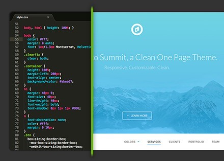
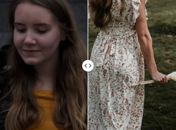
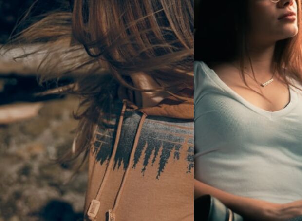
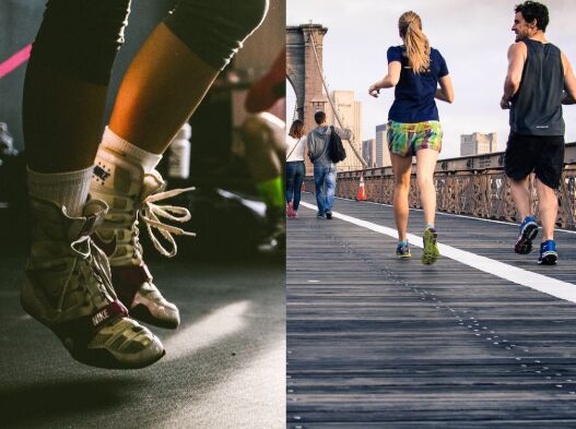
This is a jQuery & CSS3 based image comparison tool which allows you to compare two overlapping images with a smooth slider that follows your mouse movements.
How to use it:
1. Build the html structure for the image comparison tool.
<div class="slider-wrapper">
  <div class="before-wrapper">
    <div class="after-wrapper">
      <div class="after-image"></div>
    </div>
  </div>
  <div class="comparison-slider"></div>
</div>
2. Style the image comparison slider and add the before / after images to the image comparison tool.
.slider-wrapper {
  width: 500px;
  height: 270px;
  margin: 0 auto;
  position: relative;
}

.slider-wrapper:hover { cursor: none; }

.comparison-slider {
  position: absolute;
  width: 4px;
  left: 50%;
  top: -10px;
  bottom: -15px;
  background-image: -webkit-linear-gradient(top, rgba(59,144,203,0) 0, #64b700 2%, #64b700 98%, rgba(59,144,203,0) 100%);
  background-image: -moz-linear-gradient(top, rgba(59,144,203,0) 0, #64b700 2%, #64b700 98%, rgba(59,144,203,0) 100%);
  background-image: -o-linear-gradient(top, rgba(59,144,203,0) 0, #64b700 2%, #64b700 98%, rgba(59,144,203,0) 100%);
  background-image: linear-gradient(to bottom, rgba(59,144,203,0) 0, #64b700 2%, #64b700 98%, rgba(59,144,203,0) 100%);
  -webkit-box-shadow: 0 0 10px 1px rgba(0,0,0,0.4);
  -moz-box-shadow: 0 0 10px 1px rgba(0,0,0,0.4);
  box-shadow: 0 0 10px 1px rgba(0,0,0,0.4);
}

.before-wrapper {
  border-radius: 8px;
  -moz-border-radius: 8px;
  -webkit-border-radius: 8px;
  border: 2px solid #222;
  display: block;
  overflow: hidden;
  width: 100%;
  height: 100%;
  position: relative;
  background: url("before.png") no-repeat;
}

.after-wrapper, .after-image {
  border-radius: 0 8px 8px 0;
  -moz-border-radius: 0 8px 8px 0;
  -webkit-border-radius: 0 8px 8px 0;
}

.after-wrapper {
  overflow: hidden;
  position: absolute;
  top: 0;
  left: 0;
  right: 0;
  bottom: 0;
  -webkit-transform: translateX(50%);
  transform: translateX(50%);
}

.after-image {
  display: block;
  width: 100%;
  height: 100%;
  position: relative;
  -webkit-transform: translateX(-50%);
  transform: translateX(-50%);
  background: url("after.png") no-repeat;
}
3. Include the latest version of jQuery library from a CDN.
<script src="//code.jquery.com/jquery-2.1.4.min.js"></script>
4. The core JavaScript to enable the image comparison tool.
(function($){
$(function(){
  $('.before-wrapper').on( "mousemove", function(e) {
    var offsets = $(this).offset();
    var fullWidth = $(this).width();
    var mouseX = e.pageX - offsets.left;

    if (mouseX < 0) { mouseX = 0; }
    else if (mouseX > fullWidth) { mouseX = fullWidth }


    $(this).parent().find('.comparison-slider').css({
      left: mouseX,
      transition: 'none'
    });
    $(this).find('.after-wrapper').css({
      transform: 'translateX(' + (mouseX) + 'px)',
      transition: 'none'
    });
    $(this).find('.after-image').css({
      transform: 'translateX(' + (-1*mouseX) + 'px)',
      transition: 'none'
    });
  });
  $('.slider-wrapper').on( "mouseleave", function() {
    $(this).parent().find('.comparison-slider').css({
      left: '50%',
      transition: 'all .3s'
    });
    $(this).find('.after-wrapper').css({
      transform: 'translateX(50%)',
      transition: 'all .3s'
    });
    $(this).find('.after-image').css({
      transform: 'translateX(-50%)',
      transition: 'all .3s'
    });
  });

});
})(jQuery);
This awesome jQuery plugin is developed by mewowa. For more Advanced Usages, please check the demo page or visit the official website.