jQuery Plugin To Create Fast Wizard For Your Webpage - Simple Step
| File Size: | 14.3 KB |
|---|---|
| Views Total: | 1605 |
| Last Update: | |
| Publish Date: | |
| Official Website: | Go to website |
| License: | MIT |
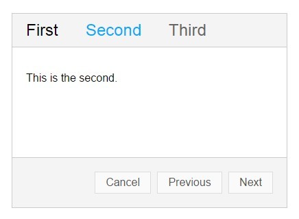
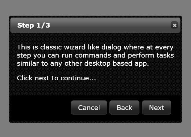
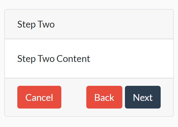
Simple Step is a jQuery plugin for creating a fast and easy wizard to display your step by step progress.
How to use it:
1. The markup structure to create a wizard.
<div id="wizard-demo" class="step-wrapper">

  <ul class="step-header cf">
    <li class="step-header-item active" data-body="#step1">First</li>
    <li class="step-header-item" data-body="#step2">Second</li>
    <li class="step-header-item" data-body="#step3">Third</li>
  </ul>

  <div class="step-body">
    <div id="step1" class="step-body-item active">
      <p>This is the first.</p>
    </div>
    <div id="step2" class="step-body-item">
      <p>This is the second.</p>
    </div>
    <div id="step3" class="step-body-item">
      <p>This is the third.</p>
    </div>
  </div>

  <div class="step-footer">
    <a href="javascript:void(0)" class="step-btn step-cancel">Cancel</a>
    <a href="javascript:void(0)" class="step-btn step-prev">Previous</a>
    <a href="javascript:void(0)" class="step-btn step-next">Next</a>
    <a href="javascript:void(0)" class="step-btn step-finish">Finish</a>
  </div>

</div>
2. Include jQuery library and the jQuery simple step plugin at the bottom of the web page.
<script src="//ajax.googleapis.com/ajax/libs/jquery/1.11.2/jquery.min.js"></script>
<script src="step.js"></script>
3. The basic CSS to style the wizard interface.
.cf:after {
  content: ' ';
  height: 0;
  visibility: hidden;
  display: block;
  clear: both;
}

.cf { zoom: 1; }

.step-wrapper {
  width: 400px;
  border: 1px solid #ccc;
  margin: 150px auto;
}

.step-wrapper .step-header {
  list-style: none;
  margin: 0;
  padding: 0;
  width: 100%;
  background-color: #f4f4f4;
  border-bottom: 1px solid #ccc;
}

.step-wrapper .step-header-item {
  float: left;
  padding: 10px 20px;
  font-size: 24px;
  text-align: center;
  color: #666;
}

.step-wrapper .step-header .activated { color: #000; }

.step-wrapper .step-header .active { color: #0af; }

.step-wrapper .step-body .step-body-item {
  display: none;
  height: 120px;
  padding: 20px;
}

.step-wrapper .step-body .active { display: block; }

.step-wrapper .step-footer {
  padding: 20px 15px 20px 0;
  text-align: right;
  background-color: #f4f4f4;
  border-top: 1px solid #ccc;
  cursor: default;
}

.step-wrapper .step-footer .step-btn {
  display: inline-block;
  margin-right: 5px;
  height: 30px;
  padding: 0 15px;
  font-size: 16px;
  line-height: 30px;
  text-decoration: none;
  background-color: #fafafa;
  color: #555;
  border: 1px solid #ddd;
}

.step-wrapper .step-footer .step-btn:hover {
  color: #000;
  border-color: #d0d0d0;
  box-shadow: 0 1px 2px -1px #ccc;
}
4. Call the plugin to initialize the wizard.
$('#wizard-demo').step();
5. Default plugin options & callbacks.
$('#wizard-demo').step({

// The container element or selector.
el: '',

// The switch effect, 'none' and 'slide' are supported.
effect: 'none',

// The effect duration.
duration: 350,

// The index (zero-based) of the initial step.
startAt: 0,

// Whether to show the "Cancel" button.
showCancel: true,

// Whether to show the "Previous" button, which is hidden on the first step.
showPrev: true,

// Whether to show the "Next" button, which is hidden on the last step.
showNext: true,

// Whether to show the "Finish" button on every step.
showFinish: false,

// The current step.
activeCls : 'active',

// The steps in front of the current step.
activatedCls: 'activated',

// Called after switching to the previous step.
onprev: $.noop,

// Called after switching to the next step.
onnext: $.noop,

// Called when trigger the "Cancel" button.
oncancel: $.noop,

// Called when trigger the "Finsh" button.
onfinish: $.noop,

// Called before switching to the previous step.
onbeforeprev: $.noop,

// Called before switching to the next step.
onbeforenext: $.noop

});
Change log:
2017-02-22
- Fix the this argument
This awesome jQuery plugin is developed by Alex1990. For more Advanced Usages, please check the demo page or visit the official website.