Animated 3D Cube Slider with jQuery and CSS3
| File Size: | 2.13 KB |
|---|---|
| Views Total: | 23527 |
| Last Update: | |
| Publish Date: | |
| Official Website: | Go to website |
| License: | MIT |
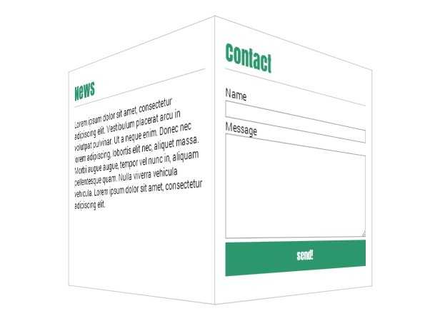
An animated 3D flipping cube content slider with navigation, built on top of jQuery and CSS3 transitions, transforms and perspectives.
See also:
- Animated 3D Cube Slideshow
- Simple jQuery Slider Plugin with 3D Flip Effect - Impulse Slider
- Creating A 3D Flipping Gallery with jQuery and CSS3
- Simple 3D Flipping Cube Slideshow with jQuery and CSS3 - BoxRoll Slider
- Responsive jQuery Slideshow with 3D CSS3 Transforms - Refine Slide
- Flexible 3D Flipping Cube Pluigin - HexaFlip
How to use it:
1. Create a navigation which allows you to control the 3D cube slider out of the box.
<nav>
  <ul>
    <li><a href="#" id="homelink">Home</a></li>
    <li><a href="#" id="aboutLink">About</a></li>
    <li><a href="#" id="newsLink">News</a></li>
    <li><a href="#" id="contactLink">Contact</a></li>
  </ul>
</nav>
2. Create Html elements that will be transformed into cubes.
<div id="cube">
  <div class="face one"></div>
  <div class="face two"></div>
  <div class="face three"></div>
  <div class="face four"></div>
  <div class="face five"></div>
  <div class="face six"></div>
</div>
3. The required CSS styles for the 3D cube slider.
#cube {
  position: relative;
  margin: 0 auto;
  height: 400px;
  width: 400px;
  -webkit-transform-style: preserve-3d;
  -webkit-transition: all 2s ease;
  transform-style: preserve-3d;
  transition: all 2s ease;
}

.face {
  position: absolute;
  height: 360px;
  width: 360px;
  padding: 20px;
  background-color: white;
  border: solid 1px #ccc;
}

#cube .one {
  -webkit-transform: rotateX(90deg) translateZ(200px);
  transform: rotateX(90deg) translateZ(200px);
}

#cube .two {
  -webkit-transform: translateZ(200px);
  transform: translateZ(200px);
}

#cube .three {
  -webkit-transform: rotateY(90deg) translateZ(200px);
  transform: rotateY(90deg) translateZ(200px);
}

#cube .four {
  -webkit-transform: rotateY(180deg) translateZ(200px);
  transform: rotateY(180deg) translateZ(200px);
}

#cube .five {
  -webkit-transform: rotateY(-90deg) translateZ(200px);
  transform: rotateY(-90deg) translateZ(200px);
}

#cube .six {
  -webkit-transform: rotateX(-90deg) translateZ(200px) rotate(180deg);
  transform: rotateX(-90deg) translateZ(200px) rotate(180deg);
}
4. Include the necessary jQuery library at the end of the document.
<script src="//ajax.googleapis.com/ajax/libs/jquery/2.1.1/jquery.min.js"></script>
5. The Javascript to enable the 3D cube slider with navigation.
$(document).ready(function(){

$("#homelink").click(function(){
   calcRotation(0);
});

$("#aboutLink").click(function(){
  calcRotation(90);
});

$("#newsLink").click(function(){
   calcRotation(180);
});

$("#contactLink").click(function(){
calcRotation(270);
});

function calcRotation(rot){
   $("#cube").css("transform", "rotateY(-" + rot + "deg)");
}
});
This awesome jQuery plugin is developed by geertjanhendriks. For more Advanced Usages, please check the demo page or visit the official website.