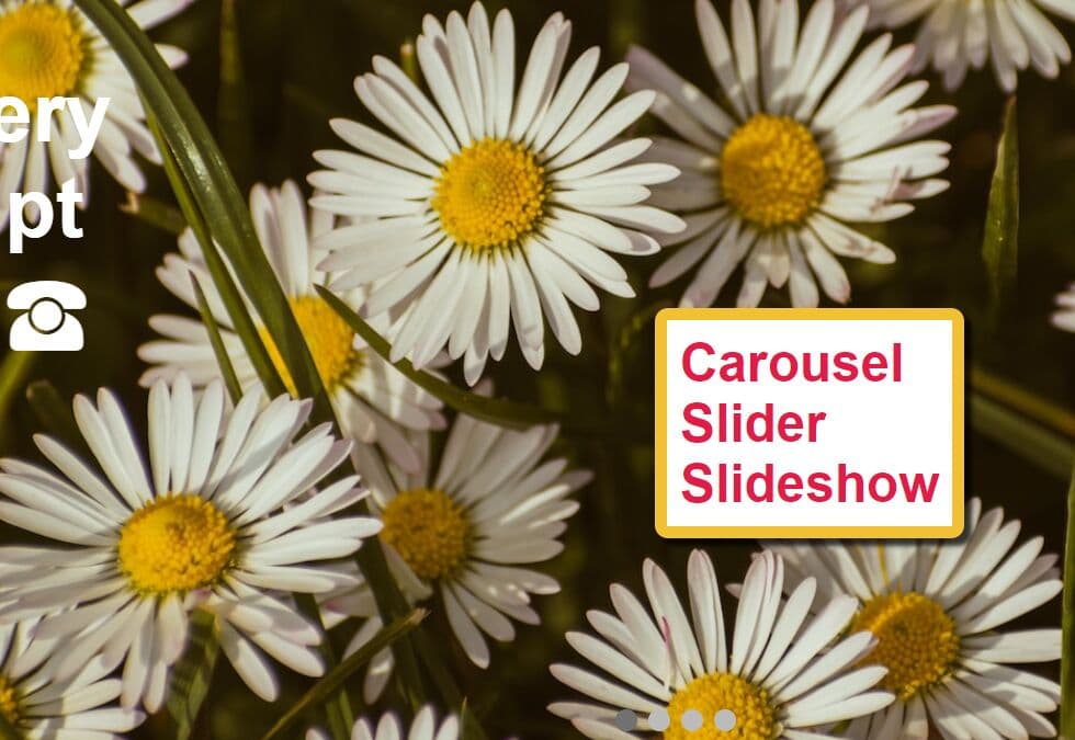
Minimal Fullscreen Responsive Carousel Plugin With jQuery
| File Size: | 7.9 KB |
|---|---|
| Views Total: | 15978 |
| Last Update: | |
| Publish Date: | |
| Official Website: | Go to website |
| License: | MIT |

Yet another jQuery based fullscreen responsive carousel plugin which rotates through a group of background images with custom text using CSS3 transforms and transitions. The plugin automatically resizes and centers the background images to fit any screen size.
How to use it:
1. Place the jQuery Slider.js plugin's stylesheet slider.css in the document's head section.
<link rel="stylesheet" href="css/slider.css">
2. Create your own slide content for the carousel.
<div class="slider" id="slider">
  <div class="slItems">
    <div class="slItem" style="background-image: url('1.jpg');">
      <div class="slText">
        Slide 1
      </div>
    </div>
    <div class="slItem" style="background-image: url('2.jpg');">
      <div class="slText">
        Slide 2
      </div>
    </div>
    <div class="slItem" style="background-image: url('3.jpg');">
      <div class="slText">
        Slide 3
      </div>
    </div>
  </div>
</div>
3. Place the jQuery Slider.js plugin's JavaScript slider.js after jQuery library but before we close the body tag.
<script src="//code.jquery.com/jquery-latest.min.js"></script>
<script src="js/slider.min.js"></script>
4. Initialize the carousel and make it fullscreen.
$('#slider').rbtSlider({

  height: '100vh',

  // displays dots pagination
  'dots': true,

  // displayes arrows navigation
  'arrows': true,

  // autoplay interval
  // 3 = 3 seconds
  'auto': 3

});
Change log:
2016-09-15
- JS update
2016-03-15
- Animation correction
This awesome jQuery plugin is developed by umkka. For more Advanced Usages, please check the demo page or visit the official website.