Pretty Nice Parallax Card Slider With jQuery And CSS3
| File Size: | 2.58 KB |
|---|---|
| Views Total: | 4346 |
| Last Update: | |
| Publish Date: | |
| Official Website: | Go to website |
| License: | MIT |
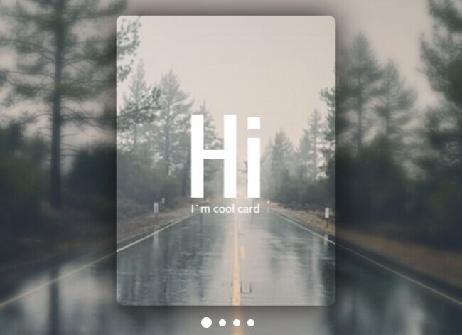
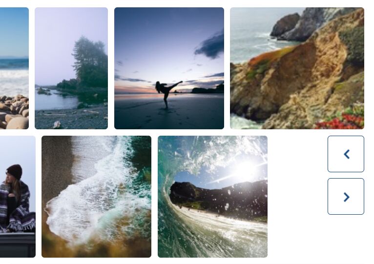
A pretty cool, full screen, fully responsive, jQuery & CSS image slider where part of the image pops out on each slide, with an interactive parallax effect on mouse hover & move, as well as blurring the original background.
How to use it:
1. Build the HTML structure for the card slider which contains 4 slides and custom text container.
<div class="slider">
  <div class="items-group">
    <div class="item">
      <div class="block">
        <span class="circleLight"></span>
        <div class="text">
          <h2>Slide 1</h2>
          <p>This is slide 1</p>
        </div>
      </div>
    </div>
    <div class="item">
      <div class="block">
        <span class="circleLight"></span>
        <div class="text">
          <h2>Slide 2</h2>
          <p>This is slide 2</p>
        </div>
      </div>
    </div>
    <div class="item">
      <div class="block">
        <span class="circleLight"></span>
        <div class="text">
          <h2>Slide 3</h2>
          <p>This is slide 3</p>
        </div>
      </div>
    </div>
    <div class="item">
      <div class="block">
        <span class="circleLight"></span>
        <div class="text">
          <h2>Slide 4</h2>
          <p>This is slide 4</p>
        </div>
      </div>
    </div>
  </div>

  <div class="navigations">
    <ul class="dots"></ul>
  </div>
</div>
2. The primary CSS / CSS3 styles for the card slider.
.slider {
  width: 100%;
  height: 100vh;
}

.slider .items-group {
  width: 100%;
  height: 100%;
  position: relative;
}

.slider .items-group .item {
  top: 0px;
  left: 0px;
  opacity: 0;
  width: 100%;
  height: 100%;
  display: -webkit-box;
  display: -ms-flexbox;
  display: flex;
  overflow: hidden;
  -webkit-transition: 0.5s;
  transition: 0.5s;
  visibility: hidden;
  position: relative;
  padding: 50px 20px;
  position: absolute;
  -webkit-box-align: center;
  -ms-flex-align: center;
  align-items: center;
  -webkit-box-pack: center;
  -ms-flex-pack: center;
  justify-content: center;
  box-sizing: border-box;
}

.slider .items-group .item:hover .bg { opacity: 0.2; }

.slider .items-group .item:hover .block { box-shadow: 0px 0px 50px #333; }

.slider .items-group .item.active {
  opacity: 1;
  visibility: visible;
}

.slider .items-group .item .bg {
  top: 0px;
  left: 0px;
  opacity: 1;
  z-index: -1;
  width: 100%;
  height: 100%;
  -webkit-transition: 0.5s;
  transition: 0.5s;
  position: absolute;
  -webkit-transform: scale(1.03);
  transform: scale(1.03);
  background-size: cover;
  background-position: center;
  background-attachment: fixed;
}

.slider .items-group .item .blur {
  top: 0px;
  left: 0px;
  z-index: -1;
  width: 100%;
  height: 100%;
  -webkit-transition: 0.5s;
  transition: 0.5s;
  -webkit-filter: blur(5px);
  filter: blur(5px);
  position: absolute;
  -webkit-transform: scale(1.03);
  transform: scale(1.03);
  background-size: cover;
  background-position: center;
  background-attachment: fixed;
}

.slider .items-group .item .block {
  width: 100%;
  height: 100%;
  padding: 20px;
  color: #ffffff;
  -webkit-transition: box-shadow 0.5s;
  transition: box-shadow 0.5s;
  max-width: 300px;
  overflow: hidden;
  max-height: 450px;
  border-radius: 10px;
  -webkit-transform: scale(1.03);
  transform: scale(1.03);
  box-sizing: border-box;
  background-size: cover;
  background-position: center;
  background-attachment: fixed;
  box-shadow: none;
}

.slider .items-group .item .block .circleLight {
  top: 0px;
  left: 0px;
  opacity: 0;
  content: '';
  width: 100%;
  height: 100%;
  display: block;
  -webkit-transition: 0.5s;
  transition: 0.5s;
  position: absolute;
  border-radius: 10px;
  background: -webkit-radial-gradient(80px 40px, circle, #ffffff, rgba(0, 0, 0, 0));
  background: radial-gradient(circle at 80px 40px, #ffffff, rgba(0, 0, 0, 0));
}

.slider .items-group .item .block .text {
  width: 100%;
  height: 100%;
  display: -webkit-box;
  display: -ms-flexbox;
  display: flex;
  text-align: center;
  -webkit-box-orient: vertical;
  -webkit-box-direction: normal;
  -ms-flex-direction: column;
  flex-direction: column;
  -webkit-box-pack: center;
  -ms-flex-pack: center;
  justify-content: center;
  background-position: center;
  background-attachment: fixed;
}

.slider .items-group .item .block h2 {
  font-family: 'Oswald', sans-serif;
  font-size: 130px;
  margin-bottom: 0px;
}

.slider .items-group .item .block p {
  font-family: 'Open Sans', sans-serif;
  font-size: 15px;
}

.slider .items-group .item .block:hover { box-shadow: 0px 0px 70px #111; }

.slider .items-group .item .block:hover .circleLight { opacity: 0.4; }
3. The CSS / CSS3 styles for the navigation dots.
.slider .navigations {
  bottom: 0px;
  width: 100%;
  position: absolute;
}

.slider .navigations .dots {
  height: 20px;
  padding: 10px 0px;
  text-align: center;
}

.slider .navigations .dots li {
  width: 10px;
  height: 10px;
  cursor: pointer;
  -webkit-transition: 0.3s;
  transition: 0.3s;
  background: #fff;
  border-radius: 50%;
  display: inline-block;
  vertical-align: middle;
}

.slider .navigations .dots li + li { margin-left: 10px; }

.slider .navigations .dots li:hover {
  -webkit-filter: blur(2px);
  filter: blur(2px);
}

.slider .navigations .dots li.active {
  width: 15px;
  height: 15px;
}

.slider .navigations .dots li.active:hover {
  -webkit-filter: blur(0px);
  filter: blur(0px);
}
4. Load the latest jQuery library (Slim build) at the end of the html document.
<script src="//code.jquery.com/jquery-3.1.1.slim.min.js"></script>
5. The main JavaScript (jQuery script) to active the card slider & parallax effect. Don't forget to replace the slide images with your owns (defined in the imges array as shown below).
var mouse = {
      X   : 0,
      Y   : 0,
      CX  : 0,
      CY  : 0
    },
    block = {
      X   : mouse.X,
      Y   : mouse.Y,
      CX  : mouse.CX,
      CY  : mouse.CY
    },
    imags = [
      '1.jpg',
      '2.jpg',
      '3.jpg',
      '4.jpg'
    ];

$('.block').on('mousemove', function(e) {
  mouse.X   = (e.pageX - $(this).offset().left) - $('.block').width() / 2;
  mouse.Y   = (e.pageY - $(this).offset().top) - $('.block').height() / 2;
})

$('.block').on('mouseleave', function(e) {
  mouse.X   = mouse.CX;
  mouse.Y   = mouse.CY;
})

setInterval(function(){

  block.CY   += (mouse.Y - block.CY) / 12;
  block.CX   += (mouse.X - block.CX) / 12;

  $('.block .circleLight').css('background', 'radial-gradient(circle at ' + mouse.X + 'px ' + mouse.Y + 'px, #fff, transparent)')
  $('.block').css({
    transform : 'scale(1.03) translate(' + (block.CX * 0.05) + 'px, ' + (block.CY * 0.05) + 'px) rotateX(' + (block.CY * 0.05) + 'deg) rotateY(' + (block.CX * 0.05) + 'deg)'
  })

}, 20);

$('.slider .item').each(function(i){

  if(i == 0){

    $(this).addClass('active');
    $(this).next().addClass('next');
    $(this).prev().addClass('prev');
  }

  $(this).attr('id', 'slide-'+i);

  $(this).prepend(
    $('<div>', {class: 'blur', style: 'background-image: url(' + imags[i] + ');'}),
    $('<div>', {class: 'bg', style: 'background-image: url(' + imags[i] + ');'})
  )

  $(this).find('.block').css('background-image', 'url(' + imags[i] + ')')

  $('.navigations .dots').append(
    $('<li>', {class: i == 0 ? 'active' : '', id: i}).on('click', function(){
    var cSlide = $('.slider #slide-'+$(this).attr('id'));

      $('.navigations .dots li').removeClass('active');
      $(this).addClass('active');

      $('.slider .item').removeClass('active prev next');
      cSlide.addClass('active');
      cSlide.next().addClass('next');
      cSlide.prev().addClass('prev');
    })
  )
})
This awesome jQuery plugin is developed by MoorLex. For more Advanced Usages, please check the demo page or visit the official website.