Simple jQuery Step Wizard Plugin - steps
| File Size: | 660 KB |
|---|---|
| Views Total: | 32728 |
| Last Update: | |
| Publish Date: | |
| Official Website: | Go to website |
| License: | MIT |
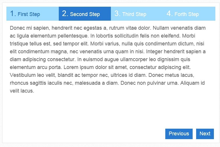
steps is a simple jQuery plugin to create a Step Wizard UI component that is good for creating a sign-up wizard on your website. When you click the next/prev buttons, the wizard will slide to next/previous steps. The demo is extremely simple and you can style and customize it using CSS and Html.
You might also like:
- Powerful jQuery Form Wizard Plugin - formwizard
- jQuery Plugin For Simple Wizard Interface - jWizard
- jQuery Wizard Plugin - Stepy
- jQuery Form Wizard Plugin - Smart Wizard
Basic Usage:
1. Include jQuery library and jQuery steps on the page
<script src="http://ajax.googleapis.com/ajax/libs/jquery/1.9.1/jquery.min.js"></script>
<script src="jquery.steps.js"></script>
2. Markup html structure
<div id="wizard">
<h2>First Step</h2>
<section>
<p>...</p>
</section>
<h2>Second Step</h2>
<section>
<p>...</p>
</section>
<h2>Third Step</h2>
<section>
<p>...</p>
</section>
<h2>Forth Step</h2>
<section>
<p>...</p>
</section>
</div>
3. The CSS
<div id="wizard">
<h2>First Step</h2>
<section>
<p>...</p>
</section>
<h2>Second Step</h2>
<section>
<p>...</p>
</section>
<h2>Third Step</h2>
<section>
<p>...</p>
</section>
<h2>Forth Step</h2>
<section>
<p>...</p>
</section>
</div>.wizard {
width: 600px;
}
/* Common */
.wizard a {
outline: 0;
}
.wizard ol, .wizard ul {
list-style: none;
}
/* Accessibility */
.wizard > .steps .current-info {
position: absolute;
left: -999em;
}
.wizard > .steps {
width: 600px;
height: 30px;
}
.wizard > .steps .number {
font-size: 22px;
font-weight: bold;
}
.wizard > .steps > ol > li, .wizard > .actions > ul > li {
float: left;
}
.wizard > .steps a {
background: #999;
}
.wizard > .steps .disabled a {
background: #ccc;
cursor: default;
}
.wizard > .steps .current a {
background: rgb(241, 101, 41);
cursor: default;
}
.wizard > .steps .done a {
background: #4cff00;
}
.wizard > .steps .error a {
background: #f00;
}
.wizard > .content {
width: 600px;
height: 300px;
}
.wizard > .content > .title {
position: absolute;
left: -999em;
}
.wizard > .content > .body {
border: 1px solid #CCC;
float: left;
position: absolute;
width: 600px;
height: 300px;
}
.wizard > .content > .body > iframe {
border: 0 none;
width: 100%;
height: 200px;
}
.wizard > .actions {
width: 600px;
}
.wizard > .actions a.disabled {
background: #ccc;
}
.wizard > .loading {
}
.wizard > .loading .spinner {
}
4. Initialize the plugin with some options
$(function (){
  $("#wizard").steps({
    headerTag: "h2",
    bodyTag: "section",
    transitionEffect: 'slideLeft'
  });
});
5. All configuration options to customize the plugin.
headerTag: "h1", // The header tag is used to find the step button text within the declared wizard area.
bodyTag: "div", // The body tag is used to find the step content within the declared wizard area.
contentContainerTag: "div", // The content container tag which will be used to wrap all step contents.
actionContainerTag: "div", // The action container tag which will be used to wrap the pagination navigation.
stepsContainerTag: "div", // The steps container tag which will be used to wrap the steps navigation.
cssClass: "wizard", // The css class which will be added to the outer component wrapper.
clearFixCssClass: "clearfix", // The css class which will be used for floating scenarios.
stepsOrientation: stepsOrientation.horizontal, // Determines whether the steps are vertically or horizontally oriented.
titleTemplate: "<span class=\"number\">#index#.</span> #title#", // The title template which will be used to create a step button.
loadingTemplate: "<span class=\"spinner\"></span> #text#", // The loading template which will be used to create the loading animation.
autoFocus: false, // Sets the focus to the first wizard instance in order to enable the key navigation from the begining if `true`.
enableAllSteps: false, // Enables all steps from the begining if `true` (all steps are clickable).
enableKeyNavigation: true, // Enables keyboard navigation if `true` (arrow left and arrow right).
enablePagination: true, // Enables pagination if `true`.
suppressPaginationOnFocus: true, // Suppresses pagination if a form field is focused.
enableContentCache: true, // Enables cache for async loaded or iframe embedded content.
enableFinishButton: true, // Shows the finish button if enabled.
preloadContent: false, // Not yet implemented.
showFinishButtonAlways: false, // Shows the finish button always (on each step; right beside the next button) if `true`.
forceMoveForward: false, // Prevents jumping to a previous step.
saveState: false, // Saves the current state (step position) to a cookie.
startIndex: 0, // The position to start on (zero-based).
transitionEffect: transitionEffect.none, // The animation effect which will be used for step transitions.
transitionEffectSpeed: 200, // Animation speed for step transitions (in milliseconds).
onStepChanging: function (event, currentIndex, newIndex) { return true; }, // Fires before the step changes and can be used to prevent step changing by returning `false`.
onStepChanged: function (event, currentIndex, priorIndex) { }, // Fires after the step has change.
onFinishing: function (event, currentIndex) { return true; }, // Fires before finishing and can be used to prevent completion by returning `false`.
onFinished: function (event, currentIndex) { }, // Fires after completion.
labels: {
current: "current step:", // This label is important for accessability reasons.
pagination: "Pagination", // This label is important for accessability reasons and describes the kind of navigation.
finish: "Finish", // Label for the finish button.
next: "Next", // Label for the next button.
previous: "Previous", // Label for the previous button.
loading: "Loading ..." // Label for the loading animation.
Changelog:
v1.1.0 (2014-09-05)
- Added event onInit which is fired when the component is completely initialized.
- Added event onContentLoaded which is fired when the step content is loaded (only in async cases relevant).
v1.0.8 (2014-09-02)
- Small fix.
- Changed jquery support conditions
v1.0.7 (2014-05-07)
- Small fix.
- Set the default value of `enableCancelButton` for backward compatibility reasons to `false`
v1.0.6 (2014-04-28)
- Small fix.
v1.0.4 (2013-12-17)
- fixed: currentIndex variable is undefined for onFinishing and onFinished Events
v1.0.3 (2013-10-20)
- Add improvement for unique ID handling
v1.0.2 (2013-10-16)
- Add destroy method to remove control behavior
- Add basic css theme
v1.0.1 (2013-08-24)
- Fixed an iframe border and scrolling issue for older browsers (IE8 and lower)
v1.0.0 (2013-08-19)
- Fixed typo which caused the slider to not woNested tags which have the same node name as the body tag cause an exception.
- Separated data and UI changes from each other and improved code for testability
- Optimized code for better minification
- Configurable clearfix css class
- Vertical step navigation (default: horizontal)
- Removed "use strict"; because of an ASP.Net tracing issue related to FF rk in Firefox.
v0.9.6 (2013-05-22)
- Make css class for the outer component wrapper editable
- Add saveState option flag to persist last active step position
- Add current class to step title and body for convinient css targeting #2
- Fixed a bug related to startIndex
- Fixed a bug related to focusing after stepChanges
v0.9.5 (2013-05-20)
- Add small visualization fixes and some tests
v0.9.4 (2013-05-19)
- FIXED: Can't pass in a labels property without the rest becoming undefined
- Add auto focus option and complete api documentation
This awesome jQuery plugin is developed by rstaib. For more Advanced Usages, please check the demo page or visit the official website.