Smooth Accordion Slider with jQuery and CSS3 - Showcase Panels
| File Size: | 2.62 KB |
|---|---|
| Views Total: | 3289 |
| Last Update: | |
| Publish Date: | |
| Official Website: | Go to website |
| License: | MIT |

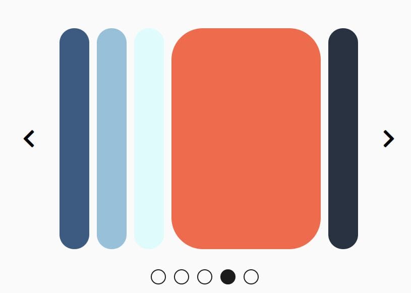
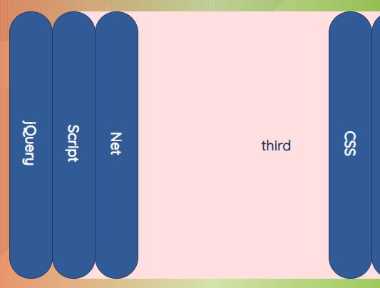
A simple jQuery based responsive content slider that allows you to smoothly expand the slides with CSS3 transition & transform based animations when hover over, similar to the horizontal accordion interface.
Basic Usage:
1. Build the Html structure for the accordion slider.
<div class="showcase-panels-container has-shadow">
  <ul>
    <li class="panel1 showcase-panel"> Slide 1 </li>
    <li class="panel2 showcase-panel"> Slide 2 </li>
    <li class="panel3 showcase-panel"> Slide 3 </li>
    <li class="panel4 showcase-panel"> Slide 4 </li>
  </ul>
</div>
2. The Basic CSS styles for the accordion slider.
.showcase-panels-container { overflow: hidden; }

.showcase-panels-container:after { clear: both; }

.showcase-panels-container > ul {
  width: 100%;
  height: 100%;
  padding: 0;
  margin: 0;
  list-style: none;
}

.showcase-panels-container > ul > li {
  display: block;
  height: 100%;
  width: 100%;
  float: left;
  position: relative;
  -moz-transition: width 0.8s ease 0.2s, background 0.8s ease;
  -o-transition: width 0.8s ease 0.2s, background 0.8s ease;
  -webkit-transition: width 0.8s ease, background 0.8s ease;
  -webkit-transition-delay: 0.2s, 0s;
  transition: width 0.8s ease 0.2s, background 0.8s ease;
}

.showcase-panels-container > ul > li:nth-of-type(1) { z-index: 1; }

.showcase-panels-container > ul > li:nth-of-type(2) { z-index: 2; }

.showcase-panels-container > ul > li:nth-of-type(3) { z-index: 3; }

.showcase-panels-container > ul > li:nth-of-type(4) { z-index: 4; }

.showcase-panels-container > ul > li:nth-of-type(5) { z-index: 5; }

.showcase-panels-container > ul > li:nth-of-type(6) { z-index: 6; }

.showcase-panels-container > ul > li:nth-of-type(7) { z-index: 7; }

.showcase-panels-container > ul > li:nth-of-type(8) { z-index: 8; }

.showcase-panels-container > ul > li:nth-of-type(9) { z-index: 9; }

.showcase-panels-container > ul > li:nth-of-type(10) { z-index: 10; }

.showcase-panels-container .showcase-panel-title {
  position: absolute;
  margin: 0;
  padding: 0 20px;
  bottom: 0;
  left: 0;
  right: 0;
  text-align: center;
  opacity: 1;
  -moz-transform: translateY(0);
  -ms-transform: translateY(0);
  -webkit-transform: translateY(0);
  transform: translateY(0);
  -moz-transition: all 0.2s ease 1s;
  -o-transition: all 0.2s ease 1s;
  -webkit-transition: all 0.2s ease;
  -webkit-transition-delay: 1s;
  transition: all 0.2s ease 1s;
}

.showcase-panels-container[data-hover] .showcase-panel-title {
  opacity: 0;
  -moz-transform: translateY(10px);
  -ms-transform: translateY(10px);
  -webkit-transform: translateY(10px);
  transform: translateY(10px);
  -moz-transition: all 0.2s ease;
  -o-transition: all 0.2s ease;
  -webkit-transition: all 0.2s ease;
  transition: all 0.2s ease;
}

.showcase-panels-container .showcase-panel-content {
  opacity: 0;
  -moz-transition: all 0.4s ease;
  -o-transition: all 0.4s ease;
  -webkit-transition: all 0.4s ease;
  transition: all 0.4s ease;
}

.showcase-panels-container[data-hover] .hovered .showcase-panel-content {
  opacity: 1;
  -moz-transition: all 0.4s ease 1s;
  -o-transition: all 0.4s ease 1s;
  -webkit-transition: all 0.4s ease;
  -webkit-transition-delay: 1s;
  transition: all 0.4s ease 1s;
}

.showcase-panels-container.has-shadow > ul > li { box-shadow: 0px 0 20px rgba(0, 0, 0, 0.4); }

.showcase-panels-container {
  width: 90%;
  margin: 0 auto;
}
3. The custom CSS to style the accordion slider.
.panel1 { background: red; }

.panel2 { background: #7f8c8d; }

.panel3 { background: #2ecc71; }

.panel4 { background: #9b59b6; }

.showcase-panels-container { height: 300px; }

.showcase-panels-container > ul > li { width: 25%; }

.showcase-panels-container > ul > li:last-of-type { width: 25%; }

.showcase-panels-container[data-hover] > ul > li { width: 120px; }

.showcase-panels-container > ul > li.hovered {  width: calc(100% - 120px * 3);
}
4. Add the jQuery javascript library to the bottom of your document.
<script src="//ajax.googleapis.com/ajax/libs/jquery/1.11.1/jquery.min.js"></script>
5. A little jQuery script to active the smooth accordion slider.
jQuery(document).ready(function($) {
$('.showcase-panels-container > ul > li').hover(
function() {
  $(this).parents('.showcase-panels-container').attr('data-hover', $(this).index());
  $(this).addClass('hovered');
  var $this = $(this);
  $(this).siblings().each(function() {
if ($(this).index() < $this.index()) {
  $(this).addClass('right-was-hovered');
} else if ($(this).index() > $this.index()) {
  $(this).addClass('left-was-hovered');
}
  });
},
function() {
  $(this).parents('.showcase-panels-container').removeAttr('data-hover')
  .find('> ul > li').removeClass('hovered right-was-hovered left-was-hovered');
}
  );
});
This awesome jQuery plugin is developed by bfintal. For more Advanced Usages, please check the demo page or visit the official website.