Feature-rich Responsive Data Grid Plugin With jQuery - Grid.js
| File Size: | 38.6 KB |
|---|---|
| Views Total: | 9615 |
| Last Update: | |
| Publish Date: | |
| Official Website: | Go to website |
| License: | MIT |
Grid.js is a simple, flexible and highly customizable jQuery data grid plugin that features inline editing, AJAX loading, responsive design, paging, sorting, top toolbar and collapsible grid rows. Compatible with Bootstrap and jQuery UI frameworks.
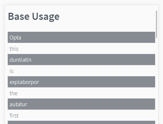
Basic usage:
1. Include jQuery library, jQuery Grid.js plugin and a UI framework of your choice in the html page.
<script src="//code.jquery.com/jquery-1.12.1.min.js"></script>
<script src="grid.js"></script>
<link href="grid.css" rel="stylesheet">
2. Create an empty table element for the data grid.
<table id="grid"></table>
3. Load local data into the data grid and initialize the plugin.
var data, grid;
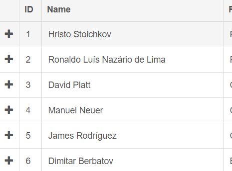
data = [
{ 'ID': 1, 'Name': 'Hristo Stoichkov', 'PlaceOfBirth': 'Plovdiv, Bulgaria' },
{ 'ID': 2, 'Name': 'Ronaldo Luís Nazário de Lima', 'PlaceOfBirth': 'Rio de Janeiro, Brazil' },
{ 'ID': 3, 'Name': 'David Platt', 'PlaceOfBirth': 'Chadderton, Lancashire, England' },
{ 'ID': 4, 'Name': 'Manuel Neuer', 'PlaceOfBirth': 'Gelsenkirchen, West Germany' },
{ 'ID': 5, 'Name': 'James Rodríguez', 'PlaceOfBirth': 'Cúcuta, Colombia' },
{ 'ID': 6, 'Name': 'Dimitar Berbatov', 'PlaceOfBirth': 'Blagoevgrad, Bulgaria' }
];
grid = $('#grid').grid({
dataSource: data,
columns: [
{ field: 'ID', width: 32 },
{ field: 'Name' },
{ field: 'PlaceOfBirth', title: 'Place Of Birth' }
]
});
4. Load data from an external source via AJAX.
$('#grid').grid({
  dataSource: 'GetPlayers',
  columns: [
      { field: 'ID', width: 32 },
      { field: 'Name' },
      { field: 'PlaceOfBirth', title: 'Place Of Birth' }
  ]
});
5. All configuration options.
/** The data source of the widget which is used table rows.
*/
dataSource: undefined,

/** An array that holds the configurations of each column from the grid.
*/
columns: [],

/** Auto generate column for each field in the datasource when set to true.
*/
autoGenerateColumns: false,

/** An object that holds the default configuration settings of each column from the grid.
*/
defaultColumnSettings: {

    /** If set to true the column will not be displayed in the grid. By default all columns are displayed.
    */
    hidden: false,

    /** The width of the column. Numeric values are treated as pixels.
     * If the width is undefined the width of the column is not set and depends on the with of the table(grid).
    */
    width: undefined,

    /** Indicates if the column is sortable.
     * If set to true the user can click the column header and sort the grid by the column source field.
    */
    sortable: false,

    /** Indicates the type of the column.
    */
    type: undefined,

    /** The caption that is going to be displayed in the header of the grid.
    */
    title: undefined,

    /** The field name to which the column is bound.
     * If the column.title is not defined this value is used as column.title.
    */
    field: undefined,

    /** This setting control the alignment of the text in the cell.
    */
    align: 'left',

    /** The name(s) of css class(es) that are going to be applied to all cells inside that column, except the header cell.
    */
    cssClass: undefined,

    /** The name(s) of css class(es) that are going to be applied to the header cell of that column.
    */
    headerCssClass: undefined,

    /** The text for the cell tooltip.
    */
    tooltip: undefined,

    /** Css class for icon that is going to be in use for the cell.
     * This setting can be in use only with combination of type icon.
    */
    icon: undefined,

    /** Configuration object with event names as keys and functions as values that are going to be bind to each cell from the column.
     * Each function is going to receive event information as a parameter with info in the "data" field for id, field name and record data.
    */
    events: undefined,

    /** Format the date when the type of the column is date.
     * This configuration setting is going to work only if you have implementation of format method for the Date object.
     * You can use external libraries like http://blog.stevenlevithan.com/archives/date-time-format for that.
    */
    format: undefined,

    /** Number of decimal digits after the decimal point.
    */
    decimalDigits: undefined,

    /** Template for the content in the column.
     * Use curly brackets "{}" to wrap the names of data source columns from server response.
    */
    tmpl: undefined,

    /** If set to true stop event propagation when event occur.
    */
    stopPropagation: false
},

mapping: {
    /** The name of the object in the server response, that contains array with records, that needs to be display in the grid.
    */
    dataField: 'records',

    /** The name of the object in the server response, that contains the number of all records on the server.
    */
    totalRecordsField: 'total'
},

params: {},

defaultParams: {

    /** The name of the parameter that is going to send the name of the column for sorting.
     * The "sortable" setting for at least one column should be enabled in order this parameter to be in use.
    */
    sortBy: 'sortBy',

    /** The name of the parameter that is going to send the direction for sorting.
     * The "sortable" setting for at least one column should be enabled in order this parameter to be in use.
    */
    direction: 'direction',

    /** The name of the parameter that is going to send the number of the page.
     * The pager should be enabled in order this parameter to be in use.
    */
    page: 'page',

    /** The name of the parameter that is going to send the maximum number of records per page.
     * The pager should be enabled in order this parameter to be in use.
    */
    limit: 'limit'
},

/** The name of the UI library that is going to be in use. Currently we support only jQuery UI and bootstrap.
*/
uiLibrary: 'base',

style: {
    wrapper: 'gj-grid-wrapper',
    table: 'gj-grid-table gj-grid-base-table',
    loadingCover: 'gj-grid-loading-cover',
    loadingText: 'gj-grid-loading-text',
    header: {
        cell: undefined,
        sortable: 'gj-cursor-pointer',
        sortAscIcon: '',
        sortDescIcon: ''
    },
    content: {
        rowHover: undefined,
        rowSelected: 'gj-grid-base-active'
    }
},

/** The type of the row selection.<br/>
 * If the type is set to multiple the user will be able to select more then one row from the grid.
*/
selectionType: 'single',

/** The type of the row selection mechanism.
*/
selectionMethod: 'basic',

/** When this setting is enabled the content of the grid will be loaded automatically after the creation of the grid.
*/
autoLoad: true,

/** The text that is going to be displayed if the grid is empty.
*/
notFoundText: 'No records found.',

/** Width of the grid.
*/
width: undefined,

/** Minimum width of the grid.
*/
minWidth: undefined,

/** The size of the font in the grid.
*/
fontSize: undefined,

/** Name of column that contains the record id.
*/
primaryKey: undefined
6. All configuration options.
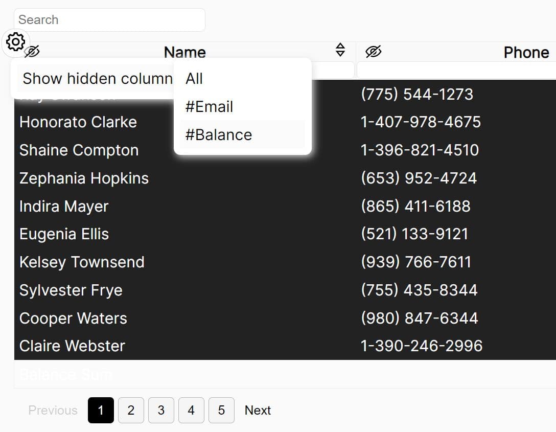
addRow: Add new row to the grid.clear: Clear the content in the grid.count: Return the number of records presented on the screen.destroy: Destroy the grid. This method remove all data from the grid and all events attached to the grid.get: Return record from the grid based on position.getAll: Return an array with all records presented in the grid.getById: Return record by id of the record.getChanges: Return array with all changesgetSelected: Return the id of the selected record. If the multiple selection method is one this method is going to return only the id of the first selected record.getSelections: Return an array with the ids of the selected record.hideColumn: Hide column from the grid.makeResponsive: Make the grid responsive based on the available space. Show column if the space for the grid is expanding and hide columns when the space for the grid is decreasing.reload: Reload the data in the grid from a data source.removeRow: Remove row from the gridrender: Render data in the gridselectAll: Select all records from the grid.setSelected: Select a row from the grid based on id parameter.showColumn: Show hidden column.title: Get or set grid title.unSelectAll: Unselect all records from the grid.updateRow: Update row data.
7. Events.
beforeEmptyRowInsert: Event fires before addition of an empty row to the grid.cellDataBound: Event fires after insert of a cell in the grid during the loading of the datacellDataChanged: Event fires after inline edit of a cell in the grid.columnHide: Event fires when column is hiddingcolumnShow: Event fires when column is showingdataBinding: Event fired before data binding takes place.dataBound: Event fires after the loading of the data in the grid.destroying: Event fires when the grid.destroy method is called.detailCollapse: Event fires when detail row is hidingdetailExpand: Event fires when detail row is showinginitialized: Event fires when grid is initialized.pageChanging: Triggered before the change of the page.pageSizeChange: Triggered when the page size is changed.resize: Event fires when the grid width is changed. The "responsive" configuration setting should be set to true in order this event to fire.rowDataBound: Event fires after insert of a row in the grid during the loading of the data.rowRemoving: Event fires before deletion of row in the grid.rowSelect: Event fires on selection of rowrowUnselect: Event fires on un selection of row
About Author:
Author: Gijgo.Com
Website: http://gijgo.com/Grid
This awesome jQuery plugin is developed by gijgo.com. For more Advanced Usages, please check the demo page or visit the official website.