Versatile and Responsive jQuery Slider Plugin - RTP Slider
| File Size: | 4.59 MB |
|---|---|
| Views Total: | 1737 |
| Last Update: | |
| Publish Date: | |
| Official Website: | Go to website |
| License: | MIT |
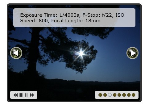
RTP Slider is a flexible and touch-enabled jQuery plugin for creating versatile and responsive sliders with lots of config options on your website.
Features:
- Carousel/Endless mode
- Support for touch events
- Simulated touch events via mouse
- Support for fluid viewports
- Also works in vertical mode
- Various widgets and plugins
- Autosliding with control widget
- Extensible through plugin hooks
- Custom animations for sliding
- Experimental 3d carousel widget
Basic Usage:
1. Include necessary javascript files on your website
<script src="../dependencies/jquery-1.7.2.js"></script>
<script src="../dependencies/jquery.easing.1.3.js"></script>
<script src="../dependencies/jquery.imagesloaded.js"></script>
<script src="../rtp.slider.js"></script>
2. Include required CSS file on your website
<link rel="stylesheet" href="styles.css">
3. Markup html structure
<div class="rtp-slider-viewport">
<div class="rtp-slider-panel"> <img src="pics/pic-01-big.jpg" alt="Pic 01"/> </div>
<div class="rtp-slider-panel"> <img src="pics/pic-02-big.jpg" alt="Pic 02"/> </div>
<div class="rtp-slider-panel"> <img src="pics/pic-03-big.jpg" alt="Pic 03"/> </div>
</div>
4. Call the plugin with options
sizer: option (default: false)
// How should the slider be layouted / sized. Valid options are 'panelsByViewport' or 'viewportByPanels'. We will either adjust the panels to a fluid viewport or set the viewport to the size of the actual panel.

setFloat: bool (default: true)
// Set panels to float if vertical is not enabled. Enable vertical sliding. Default is horizontal.

vertical: bool (default: false)
// Enable vertical sliding. Default is horizontal.

shrinkViewport: bool (default: false)
// Shrink the viewport on the current layout. Option is seldomly usefull and only available if there is no sizer set.

fillViewport: bool (default: false)
// Try to avoid any empty spots in the viewport if possible. Option is seldomly usefull and only available if there is no sizer set.

carousel: bool (default: false)
// Enable the carousel or endless swipe mode.

panelsVisible: float (default: 1)
// How many panels should be visible at once.

align: float (default: 0.5)
// This is a shared value for both align options (alignPanel and alignViewport). It does not do anything on it's own, but normally you want both align options to be the same. You may also use 'left', 'center' or 'right' (only the first letter is important).

alignPanel: float (default: 0.5)
// Offset the panel to align it to the viewport position. If you align it to the right (1), the right side of the panel will be shown at the viewport position.

alignViewport: float (default: 0.5)
// Offset the shown position into the viewport. Align it to left (0), center (0.5) or right (1). Use alignPanel to offset the panel itself to align the active slide as you want.

autoVpOpp (default: true)
// Automatically adjust the opposite dimension of the viewport to match the current shown panel.

autoVpOppDeadZone: float (default: 0.5)
// How far has the panel to be into view until adjusting the viewport to the full opposite dimension.

autoslide: bool (default: false)
// Start the autoslider after slider has been initialized.

autoslideAction: action (default: +1)
// The action to execute on each autoslide.

autoslidePauseOnHover: bool (default: false)
// Pause the autoslider when the mouse hovers over the viewport. Will be restarted after the mouse moves out of the viewport again (see autoslideResumeDelay).

autoslideStopOnHover: bool (default: false)
// Stop the autoslider when the mouse hovers over the viewport.

autoslideStopOnAction: bool (default: false)
// Stop the autoslider when the user executes an action like clicking on a navigation item.

autoslideDelay: integer (default: 3500)
// Default delay between slide steps.

autoslideFirstDelay: integer (default: 1000)
// Delay after initialization or any other autoslide resume/start call.

autoslideResumeDelay: integer (default: false)
// Special delay when the autoslider is resumed from the paused state.

curClass: string (default: 'current')
// Mark the currently active panel with this class.

curClassDeadZone: float (default: 0.25)
// How much has the active panel to be visible until setting the current class.

easeDuration: integer (default: 1200)
// The duration of one slide step.

easeFunction: string (default: 'easeInOutExpo')
// Easing function for the slide step.

firstSlideToLoad: float (default: 0)
// The first slide to load on initialization. Can also be a function which should return the value.

fps: integer (default: 25)
// Try to acheive that many frames per second when doing animations. This is mainly used when resizing or updating the layout otherwise, which will also happen when doing swipes and other actions.

vsync: bool (default: false)
// Do layout and other updates as soon as we receive the corresponding events.

swipe: bool (default: false)
// Enable the swipe functionality.

mouseSwipe: bool (default: false)
// Enable the mouse for swiping.

touchSwipe: bool (default: false)
// Enable touch devices for swiping.

swipeVsync: bool (default: false)
// Update the user interface as soon as the swipe event is triggered. If disabled we will defer the updates and try to achieve as many frames per second as defined in swipeFps.

swipeThreshold: integer (default: 5)
// Minimum amount of pixels before the swipe events are triggered.

linkWrapperToViewportDim: bool (default: true)
// Link the dimension of the outer wrapper to the dimension of the viewport.

linkWrapperToViewportOpp: bool (default: false)
// Link the opposite dimension of the outer wrapper to the opposite dimension of the viewport.

navArrows: bool (default: false)
// Enable the navigation arrows widget.

navArrowAttach: option (default: 'wrapper')
// Where to attach the navigation arrows. Valid options are 'wrapper' or 'panels'.

navArrowNextText: string (default: 'right »')
// Set the text or html for the next nav arrow.

navArrowPrevText: string (default: '« left')
// Set the text or html for the previous nav arrow.

navArrowPosition: option (default: 'default')
// Where to attach the nav arrows. By default we prepend the prev arrow and append the nav arrow. Other options are to 'prepend' or to 'append' both arrows. Or 'reverse' the default position.

navDots: bool (default: false)
// Enable the navigation dots widget.

navDotAltFormat: function (slide)
// Return the alt text for the nav dot image.

navDotTitleFormat: function (slide)
// Return the title text for the nav dot image.

navDotStepFunction: function (slide, progress)
// Function is called to update the nav dots when visibility is changing. By default we adjust the opacity of the image.

navKeyboard: bool (default: false)
// Enable the keyboard navigation plugin.

navKeyboardPrev: keycode (default: [37/38])
// The charcode to trigger the prev action (use 'up' key if vertical mode is enabled).

navKeyboardNext: keycode (default: [39/40])
// The charcode to trigger the next action (use 'down' key if vertical mode is enabled).

navToolbar: bool (default: false)
// Enable the navigation toolbar (mainly for autoslider).

navToolbarButtons (default: 'rewind, toggle-stop, toggle-pause, forward')
This awesome jQuery plugin is developed by rtp-ch. For more Advanced Usages, please check the demo page or visit the official website.