jQuery Plugin For Responsive & Dynamic Text Size - flexFont.js
| File Size: | 6.03 KB |
|---|---|
| Views Total: | 1299 |
| Last Update: | |
| Publish Date: | |
| Official Website: | Go to website |
| License: | MIT |

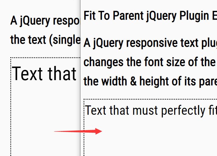
flexFont.js is a tiny jQuery plugin that automatically adjusts the font size of your text to fit within its parent element. Great for responsive design that makes your text as big as possible to fit within its parent container which has dynamic widths.
How to use it:
1. Place jQuery library and the jQuery flexFont.js script at the bottom of your html.
<script src="//code.jquery.com/jquery-1.11.3.min.js"></script>
<script src="flexFont.js"></script>
2. Wrap your text into a container element.
<div id="container">
  <p class="flex">
    Text here
  </p>
</div>
3. Call the function to make your text responsive on all platforms.
$(".flex").flexFont();
4. Config the plugin with the following options.
// maximum font size of your text
maxFontSize   : 100,

// minimum font size of your text
minFontSize   : 1,

// maximum width of your text container
maxWidth   : 9999,

// minimum width of your text container
minWidth   : 1,

// Ratio of containing element's width to font-size
sizeRatio : 20,

// [className,parentLevel]
// Only change font-size if the element's parent has the mentioned 'className'.
// The second item 'parentLevel' in the array defines the level in hierarchy of DOM tree.
ifparentClass: [null,1],

// Only change font-size if the containing element has the specified 'className'
ifclass: null,

// Values: atMinWidth, atMinFontSize, atAny
textEllipsis : false,

// Can be used when text goes out of the parent's borders if height is fixed.
overflowHidden: false
This awesome jQuery plugin is developed by royswastik. For more Advanced Usages, please check the demo page or visit the official website.